shape
carat
color
clarity

Setting Design Help for Mahenge Spinel

Status
Not open for further replies. Please create a new topic or request for this thread to be opened.

BlingObsession

Shiny_Rock
Premium
Joined
Aug 17, 2012
Messages
493
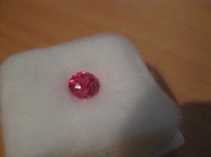
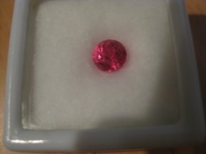
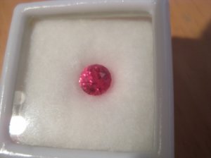
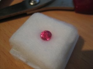
Ladies (and gents) - I need your valuable input please. I received this really gorgeous spinel from a friend for a "big" birthday over a year ago.

It's one of Gene's. It is 1.05 carat and measures 5.5mm. It totally glows IRL - not sure I've done a very good job of capturing in the pics - absolutely hot pink in some lights and very red in others.

Anyway, I'm very embarrassed to admit that I have not been able to come up with a setting which I think would do it justice. It has to be a ring (not a pendant) so I can look at it.

I do have a preference for antique jewellery, art deco, Victorian, Edwardian but a open to any suggestions you might have to, perhaps, try something new. I do want to set with diamonds, either melee or something bigger but perhaps want to avoid the standard melee halo as I already have a lot of settings like that.

So please, feel free to share your creative talents with me.
img_1385.jpg

img_1386.jpg

img_1387.jpg

img_1388.jpg
 
Nice color! A little more info would be helpful -- what is your budget for the setting? Do you prefer white gold or platinum, or yellow or rose gold? More elaborate settings or simpler? Only diamonds, or would you be open to other colored stones in the setting?

I'm sure plenty of people can come up with ideas!

--- Laurie
 
Hi Laurie - I like and wear yellow, white and rose gold as well as platinum so don't have any limitations with respect to the metal except I don't have a huge passion for platinum simply because of the price.

I do lean towards more elaborate settings - love millgrain and fancy bands and extra bits of pretty in the gallery whenever I can get away with it.

I had only thought of diamonds but would love some suggestions for other coloured stones.

No particular budget, to be honest, so please be as creative as you want!

:D
 
Since you have no metal preference, does the spinel look better in yellow, white or rose / reddish metal?
 
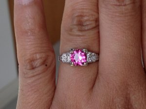
I would ask Chrono to post a photo of her pink tourmaline in the art deco setting as it sounds like it might be a good starting point for a design for you. I fought Chrono tooth and nail (okay, well slight exaggeration) on setting the vivid pink in an art deco setting because I thought the stone would not sit well with the art deco look. I am happy to eat crow on this one, as it looks fabulous!
 
Do you have any jewelry stores around you that have empty mountings that you can plop your stone into to see what really sings to you? I have a hard time visualizing and it seems like that's been the only way I've been able to set something and be completely happy with it.
 
I diamond halo in white gold is my preference. Perhaps with some milgrain around the diamonds. I know this is a generic suggestion, but due to the size of the stone, I think it will be excellent setting option. Or a split shank halo with diamonds.
 
Ladies - thank you for your input.

The stone is truly hot pink in the hand - the actual photos also only show dazzling pink - I don't see any of the brownish tones that are showing on my monitor and my ipad.

Metal colour - I'm kind of leaning towards white gold with maybe a bit of pink gold.

I think my dilemma comes from the fact that the stone is quite small - if it were larger, I think the choices for setting would be easier - especially as I like my rings to bling.

I do have some 0.08 round diamonds which I considered placing around the stone in a large type of halo but still havent' been able to find a design I like that would work with them.

Chrono - woud you be kind enought to post a pic of your pink tourmaline art deco setting for me?

Normally I have no trouble coming up with settings I like - but this is the first stone bought for me by someone other than my husband so I think I must be feeling the pressure to create something extra special. :confused:

All input is valued greatly.
 
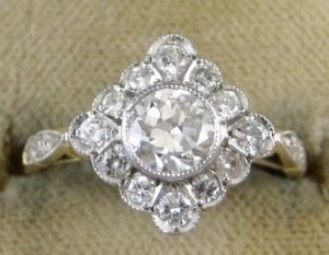
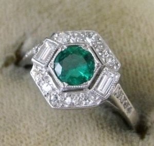
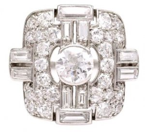
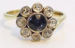
Here are some of the pictures in my inspiration folder that I was considering - do you think any of these would work? Do you have anything nicer you can show me?

thank you :)

diamond_shape_setting.jpg

hexagonal_setting.jpg

multi_diamond_setting.jpg

sapphire_offset_band.jpg
 
I'd almost forgotten your request.

pink_tourm_0.jpg
 
Sighhhhh.....I never get tired at looking at Chrono's ring. :cheeky:
 
Thanks Chrono

Any thoughts on the designs I posted?
 
1st - Diamond shape
Nice looking - a slight antique departure from the usual halo. The melees are quite large relative to the centre stone though so that's going to be a bit painful on the budget. The scalloped edging is very soft and feminine

2nd - Hexagonal
Almost the opposite of the first because this one is all straight lines and "harder".

3rd - Multi diamond
Not my cup of tea as it is very busy and the centre stone looks swallowed up by the ring. This will be the most expensive of the group due to the amount of stones to be set and design.

4th - Sapphire offset
A funkier version of 1. Personally, I'm not sure if I like that much separation between the centre stone and halo. With so much bezeling, it looks busy yet simple at the same time...I'm cannot quite put it into words.

You appear to gravitate towards bezel settings or is that a coincidence?
 
Hi Chrono

Thanks so much for your feedback.

I like designs one and two best but my dilemma is that they are both bezel set and I'm mindful that I don't want to do anything that would darken the stone - it's such a perfect colour that I want to avoid doing anything that will alter that significantly.

Do you think setting number 2 (the hexangonal one) with the sort of bezel with the sort of claws setting would affect the colour?
 
You can do a test or two to see if the colour will be affected:
1. The easiest - cup the pavilion of the stone completely and walk everywhere with it to note any changes.
2. Foil test - "wrap" the pavilion in aluminium foil to mimic an enclosed bezel
3. Chain test - sit the spinel is a nest of pooled white metal to mimic a white metal bezel.
 
Thanks Chrono - will try that when I get home from work.

By the way, I'm in Singapore so next time you are over this way - let's try and catch up!
 
Oh my, there are more Singaporeans here on PS that I ever imagined. I should start a little GTG when I head there the next time. :wavey:
 
Well, technically, I'm not Singaporean. I'm Australian but live and work here - supposedly temporarily but it's been almost a decade now!

I did the thing you suggested with the chains and foil on the pavillion. It doesn't like rose gold at all. It's a bit blah with yellow gold. White gold is better but actually the pure "whiteness" of platinum actually seems to work best.

The stone didn't darken in any real discernable way so I guess it will be OK to do a bezel - will need to make sure it is very fine work though as the stone is already small - I don't want to do anything to make it appear smaller.

I will play with my spare melee on the weekend see what size stones balance best with the spinel before deciding on the design - it will be a choice between or combination of my design 1 and design 2, I think, as I like them both and I haven't seen anything else I like as much.

I'm not a fan of round stones and find it a real challenge to set them into something I like so thanks, Chrono, for your valuable input. I will post pics when I've had it set which, hopefully, will be sometime in the next couple of months! :)
 
Not to worry, I am not Singaporean either. As long as anyone happens to be Singapore at that time is good enough. :cheeky:

Yup, doing this test helps decrease the risk of not loving the stone after it is test. It is surprising how certain stones seem to do much better with certain metal colours. I find that stones with very high saturation do best with a white metal. It is funny that you find round shapes a challenge to set. Although round isn't my favourite shape either, I think it is the easiest to find inspiration designs / settings since most cater to round diamonds. I look forward to what you come up with, hopefully sooner than a few months.
 
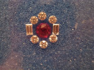
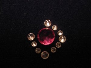
So.... had an evening home alone so decided to "play" with my melee. Hmm - those stories of little diamonds shooting out of the tweezers and playing hide and seek - yup - that's how I spent the night - looking for the damn things when they shot out of the display box I was trying to place them in.

The pictures are a bit rough cos I got fed up with trying to get them to sit right, stay right and photograph right. And I have no idea where the yellow in the diamonds came from - they are white, white, white!

One is with 0.08 round diamonds and 2 x .10 baguettes.

One is with 0.05 round diamonds with 0.02 in between (didn't have quite enough to go all the way around but you get the idea).

I could have played with a combination of 0.08 and 0.05 or 0.05 and 0.03 but I was losing patience by then (it's getting late here).

Are the 0.8 pointers too big for the centre stone? I like my bling but I don't want to overwhelm the centre stone either. I do have some small 0.05 baguettes which would probably match reasonably well in size to 0.05 round as a scaled down alternative?

I'm a bit worried that the 0.05 /0.02 combo will be swamped by the millgrain once they are set so maybe I should consider something in between all these? These are just the "spare" diamonds I have (I know, I know - only PSrs have "spare diamonds"). :oops: It's nice to use what I have already but have no problem buying more if I need to in order to get it just perfect!

Thoughts?

8pts.jpg

5_pts.jpg
 
Blingo, What a fun project. We should all have summer projects like this. Regarding your examples (and I know I'm late to this) I like the first one and the last one. Had to look at the last one after I read Chrono's observation and she's right --- again!!! :twirl: The separation is more than in other "blossom/flower" rings I've seen. How do you think it would look on your hand? When I first saw that style I didn't like it but when I tried it on I really liked it's dainty appearance.

I like the color combo on the your first arrangement! Even though you didn't intend it the tawny color I see is kind of nice with the mahenge. I prefer the second and it looks like it's set up like your first example with larger stones anchoring the points and smaller stones filling in. It lets the mahenge be the star whereas the first arrangement the mahenge would be integrated into the design more... if that makes sense.
 
Hmmm....very different looks, neither good nor bad, but is more of a personal preference. I feel your pain because I've dropped stones on the rug before and thankfully there's a rug present otherwise the stones would be damaged! Understandably, you are too tired to have them lined up just right for photo-taking. :bigsmile: The yellow could be your home lighting.

The first one is a very big look. Lots of bling and the entire ring will stand out but the spinel is less of the star. It will still be the star but not as much as with the smaller melees. I think a slightly scaled down alternative will look better. If done correctly and done well, milgraining will not overpower the melees. I have a halo ring with 1.1 mm stones with milgrain on both the inner and outer edges and they look great. I think 1.1 mm works out to be 0.005 ct?
 
Thank you both for your very valuable input. I will play some more on the weekend with the other size melee I have and see what I can come up with. It would be nice to use some of the stones I already have but won't compromise if they aren't quite right - I will just have to buy some more :mrgreen:
 
Status
Not open for further replies. Please create a new topic or request for this thread to be opened.
GET 3 FREE HCA RESULTS JOIN THE FORUM. ASK FOR HELP

Featured Topics

Top