shape
carat
color
clarity

Received my spinel from Barry Today

Status
Not open for further replies. Please create a new topic or request for this thread to be opened.

aggal06

Shiny_Rock
Joined
Sep 8, 2005
Messages
123
6mm Tunduru pinkish mauve spinel. 1.03 carats :)

I have it pictured with my 5.7 mm spinel from Dan just because I wanted to see how much difference the sizes were. I think it''s actually much more sparkly than Dan''s, but is that because of the color or because of the cut?

img_0984 (Modified in GIMP Image Editor).jpg
 
It''s cloudy here today. I wish the sun would have been out
7.gif


img_0979 (Modified in GIMP Image Editor).jpg
 
lovely, and it does look very very sparkly!!!
 
By itself

img_0958 (Modified in GIMP Image Editor).jpg
 
Wow! Its beautiful; well, they both are! Do you have one on the blue as well? The two colors together remind me somewhat of Mariedtiger''s mother''s ring. They compliment each other very well.
 
https://www.pricescope.com/forum/colored-stones/finally-received-my-spinel-from-dan-t137065.html this is the thread with the pictures of Dan''s spinel. It''s a purple color indoors and outside it''s that pretty blue color. I''m fascinated with the color change of it!
 
I love Barry''s rounds. I bet they sparkle like mad. Enjoy!
 
I still don''t know if I should bezel it or put it in a lotus. I can''t make up my mind about it. Would putting it in a bezel setting make it too dark and diminish the sparkle?
 
I probably wouldn't bezel them myself. I know Freke has many of Barry's spinels, and I don't think she's ever bezeled one, but prong set them. I could be wrong. Maybe she'll chime in hopefully if she sees this thread.

Do they tend to darken a lot if you cup them in your fingers? If so, I probably wouldn't bezel.
 
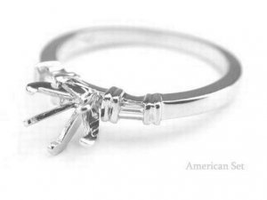
I''m putting Dan''s (the blue/purple color shifter) in this setting when I finally get it. I should hopefully get it on Monday since it was ordered the last Tuesday in February from Americanset.

The pink one does look a little dark when it''s in my hand. I think I''d probably be better off putting it in a prong setting.

1112284401507_DSCN1886w.jpg
 
Date: 3/6/2010 2:38:04 PM
Author:aggal06
6mm Tunduru pinkish mauve spinel. 1.03 carats :)

I have it pictured with my 5.7 mm spinel from Dan just because I wanted to see how much difference the sizes were. I think it''s actually much more sparkly than Dan''s, but is that because of the color or because of the cut?
Different cutters may use different facet patterning and placement for a different look.

Some gem cutters experiement with what best works for them.

Both lotus and bezels are nice settings.

Personally I would bezel it. You could go with a Half bezel for the added unique look and exposure to light.

White gold would provide a good contrast for your colors.
37.gif


Nice stones!
 
Date: 3/6/2010 10:22:03 PM
Author: aggal06
I''m putting Dan''s (the blue/purple color shifter) in this setting when I finally get it. I should hopefully get it on Monday since it was ordered the last Tuesday in February from Americanset.

The pink one does look a little dark when it''s in my hand. I think I''d probably be better off putting it in a prong setting.
That''s a very pretty and classic setting.
 
Very pretty stones.
 
Date: 3/6/2010 8:19:12 PM
Author: tourmaline_lover
I probably wouldn't bezel them myself. I know Freke has many of Barry's spinels, and I don't think she's ever bezeled one, but prong set them. I could be wrong. Maybe she'll chime in hopefully if she sees this thread.

Do they tend to darken a lot if you cup them in your fingers? If so, I probably wouldn't bezel.
Do I ever! Um, I have set four of Barry's spinels (that I can think of anyway) and they are all prong set. So I'd set it in a prong setting.

I will say that this has less to do with the stones and much more to do with the fact that I don't particularly like bezels for rings all that much. With the added side effect that it often darkens the set stone...
38.gif


Ditto TL's question and following comment.

Now that I think about it, I know Barry facets his girdles, and I LOVE to show that off (look up Big Blue's setting for a prime example of that) and bezeling defeats that purpose. Plus I would worry too much about the stone and the integrity of that fabulous girdle.
 
Seems like the reason why you see one of them as more sparkly is because it has a slightly better degree of transparency. I could be wrong and it could be just a trick of the photos, but it seems like the case here. Both are very pretty, and I''d also vote against bezeling, to keep this transparency as one of the stone''s qualities. But since you already have a prong setting planned for the other one, maybe something like a "fake tension setting" (if you know what I mean) would look nice, or maybe even a semi bezel of some sort. A full bezel could darken this stone too much IMO and I also wouldn''t use white gold so that the stone keeps as much of it''s nice shade of pink as possible - I worry white gold could wash out the color and make it seem blackish, unless you use a setting with a lot of white diamonds as accent stones.
 
Date: 3/7/2010 3:34:37 AM
Author: ma re
Seems like the reason why you see one of them as more sparkly is because it has a slightly better degree of transparency. I could be wrong and it could be just a trick of the photos, but it seems like the case here. Both are very pretty, and I''d also vote against bezeling, to keep this transparency as one of the stone''s qualities. But since you already have a prong setting planned for the other one, maybe something like a ''fake tension setting'' (if you know what I mean) would look nice, or maybe even a semi bezel of some sort. A full bezel could darken this stone too much IMO and I also wouldn''t use white gold so that the stone keeps as much of it''s nice shade of pink as possible - I worry white gold could wash out the color and make it seem blackish, unless you use a setting with a lot of white diamonds as accent stones.

I was actually wondering if it should go in a rose gold setting instead of white to bring out the pink more.

I do think bezeling it would make it darker. I pulled it out again in the living room and the stone was much darker in color at night time. I think a bezel might hurt the color if I went with that.
7.gif


I''m also not sure what a fake tension setting looks like. I didn''t know there was such a thing.

Thank you all for the lovely comments and suggestions!
 
The setting that I mentioned isn''t really called that way, it''s a term I constructed cause I don''t know if that setting really has a name... To explain what I mean, it''s the setting which, from above, looks almost identical to the tension setting, so something like this: http://www.diamondvues.com/archives/Tension%20Setting.jpg, but when you look from the side, you notice it''s also supported from below, so there''s just an illusion of the stone being set in a real tension setting, something like this: http://www.walshbrothers.co.uk/Stock001/ring/HNDR266s.jpg It''s often done in less expensive jewellery and/or with gemstones less durable than diamonds or sapphires (which are usually the only stones used in "real" tension settings).
 
I would see it in real life with a piece of copper/rose gold/a new penny and make sure you like it before putting it in rose gold. Because rose gold is so bright and coppery, I would worry that it would make the stone look gray in comparison.
 
Both are lovely. The new purple spinel does seem to have some good light return in the pics!
 
I think it''s a great stone. I have a tiny pink spinel from Barry and it is an amazing sparkler!
 
The American set setting is very pretty! As for the new Barry stone, I''d prong set it as well to make the most out of the pretty cutting.
 
My camera batteries are charging at the moment but I will take some more pictures of it later with my rose gold trombone bell (yes, this makes me nerdy, but hey at least I have a huge chunk of rose colored brass to compare it to), my yellow gold aggie ring, and my grandmother''s white gold engagement ring/wedding ring set so you guys can help me decide what metal to pick lol. My grandmother''s ring is very blingy so I don''t know if it''s a good representation of white gold with all of the diamonds.
 
Here it is with my grandmother''s white gold ring.

img_1033 (Modified in GIMP Image Editor).jpg
 
next to yellow gold.

img_1016 (Modified in GIMP Image Editor).jpg
 
another with the stone facing up so you can see the color better.

img_1023 (Modified in GIMP Image Editor).jpg
 
This is the best picture I could get with it next to something rose colored. The thing is hard to photograph!

img_1002 (Modified in GIMP Image Editor (2)).jpg
 
Since the stone is more of a lilac shade (at least it''s like that in many of the pictures), I think rose gold might turn out great. I don''t have a feeling that it will blend with the metal, if that''s what you worry about.
 
I''d say rose or yellow. The American Set prong setting looks very nice; do they have something similar in YG or RG?
The spinel is very sparkly. Lovely color, too.
 
I agree with the rest that yellow or rose seems to complement the stone best because white gold made the gray undertone more apparent.
 
Status
Not open for further replies. Please create a new topic or request for this thread to be opened.
GET 3 FREE HCA RESULTS JOIN THE FORUM. ASK FOR HELP

Featured Topics

Top