shape
carat
color
clarity

Painting Downstairs Bathroom, Vote Color

Which color??

  • Sisal

    Votes: 1 100.0%
  • Crab Apple

    Votes: 1 100.0%
  • Tangier Island

    Votes: 1 100.0%

  • Total voters
    1
Status
Not open for further replies. Please create a new topic or request for this thread to be opened.

Mara

Super_Ideal_Rock
Joined
Oct 30, 2002
Messages
31,003
I need some assistance here...I'm painting our downstairs bathroom this weekend. It's a cream basic color right now. Accents are cranberry color (rug and stripes in towels), taupes in towels, and black iron wall items and picture frames. Sink is a white pedestal, mirror is a large oval frameless and floor is a 12x12 creamish, whitish tile with taupe and brown veins.

The purpose is to make the room look warmer, right now it looks very stark with the pale walls and black and cranberry colors.

I painted the Burlap color on a small area behind the door to test it, it's much too dark and looks very 'flat' and almost like dead wood. The bathroom is pretty small, about 4x4 squarish so this would make it seem miniscule and I don't want to depress anyone!


So there are three other options I am considering now knowing what Burlap looks like on the wall. See image below.

If I want something that is lighter, but not too light (aka not cream!), and slightly more warm than the burlap, which ??? Oh and the paint swatches may look a bit lighter than in real life, using the Burlap paint sample as a guide. I want to stay with more of a taupe feel but a bit warmer and lighter than the Burlap.


I think I know which one I am going for, but curious to see what others say! Friday afternoon/evening fun.

Thanks for the assist!

1.gif


paint options downstairs copy.JPG
 

KimberJEB

Shiny_Rock
Joined
Nov 19, 2004
Messages
123
I voted the tangier (can''t remember the other word, lol). Anyway, I have been surprised over and over in painting my house how the colors that I worried would be "too light" ended up pretty darn dark. Once it gets on the wall, as you already saw it gets darker, and in a small room...

My BF works for Sherwin Williams (asst. mgr) and we are tending to stick on the top half of the color options on those little strips of 5 or6. Normally the 2nd or 3rd down. (the top one being virtually colorless on or off the walls:) ).

It appears, at least on my monitor, that the three other colors are VERY different (not just in light/dark but in, oh I''m not good at these terms, but in WHAT COLOR IT IS, LOL). So, I would probably, pick the lightest of those...

Oh - and not to "advertise the enemy"
28.gif
but...Ben Moore paints sells teensy - like 2 oz, big enough for a 3x3 spot on a wall - tester cans, so if you still aren''t sure, they could match your colors and for a couple bucks you could take them home and try them out. And then buy from either Ben, your original store, or...if youw ant the better paint, Sw
31.gif
(since I am advertising for other co''s I had to stick that in!)
 

Mara

Super_Ideal_Rock
Joined
Oct 30, 2002
Messages
31,003
Thanks for the info Kimber, Ralph Lauren (which is the paint I am using) also has tester ones for $3.99...you can get them at Home Depot or order online, but the amount is ALOT...aka I did a 3x3" swatch on the wall and used like 1/100 of the paint sample. They need to make these things smaller (and cheaper too so I could justify trying more...hehee).

Thing is, I'd have to order the other RL colors off their website and I need to get this done this weekend, procrastination will set in otherwise and I have a holiday party at our house next wkd and am hosting Xmas this year, so this is part of the 'pretty up' to get ready.

Sooooo having seen what Burlap looks like in person...my problem is that I tend to choose too light of a color and then I am disappointed because it hardly shows up. So I went other extreme with Burlap (though in the package it looked lighter) and was really shocked at how dark it was.

Interestingly enough I conducted this same poll with my best girlfriends and 3 of them said Sisal so far, the other 3 have not voted yet. In contrast, the Pscope vote is for Tangier so far.

The Tangier is one that I find vaguely interesting, but feel will be too 'warm' in a cream way whereas Sisal has more taupe seemingly. So hard to tell though. Sisal is actually the one I am leaning towards and Tangier was the one I was least interested in!

Thanks for the help so far and any other painting or color comments are helpful.

Oh and also...we had our house painted when we moved in and the painter used Ben Moore, the only paint he would ever use. We really love the results and I use it for touchups all the time...my original plan was to take our internal paint into BM and have them match it but darken it about 4 shades to keep that same 'feel' but create more contrast in the bathroom, but I chose RL because I have used it in the past and loved the results, and also because they had those tester paint samples and I thought that was perfect! I didn't realize BM had them too!

Uh oh I may get distracted now.
9.gif
 

Jennifer5973

Ideal_Rock
Joined
Oct 18, 2003
Messages
4,107
1.gif
hey, are these Benjamin moore colors? I used Burlap in my living room. if you want, I can post a picture. it's very pretty & I love it, but definitely on the pinkier side vs. a yellow undertone.
1.gif


Edited: never mind! Oops--didn't see the 2nd post. OK--then I think the tangiers might be nice.

PS How married are you to the cranberry accents?
2.gif
 

KimberJEB

Shiny_Rock
Joined
Nov 19, 2004
Messages
123
Well, I actually was looking at the Sisal after I voted and like that color a lot. In a room as small in a bathroom I would definitely go in the lighter ranges, you know? I''m certainly not an expert, BF is with SW, not me, but we have been painting our house and my mom and I did hers last year (and my mom prefers her house to resemble a dungeon...lol...her bedroom walls are literally blood red, her old room was dark, dark green...we like darkish colors). In our house the one room we did as the 2nd to darkest on one of those paint sheets of 6 (in SW anyway) is DARK! I love the color, but really it would be better with several windows, not one, and better lighting (sill have builder generic in this room). The others definitely gave COLOR but not stuck in a crypt. In your little Bathroom we did a mossy green (grassland at SW) and I worried it would be too light. It''s perfect in their. Those little rooms just don''t seem to be able to go as dark.

Anyway - I''ve never used Ben Moore paint, more a Lowe''s Olympic kind of girl until I started getting 40% off at Sherwin Williams. I have to say though, I REALLY like this paint better than what I have done before. Much, much smoother finish. In real life Ben Moore and Colorwheel (they are who did the builders paint in our house) are probably just as good - but I have to say the Sherwin Williams Cashmere is INCREDIBLE! I am a bad bad painter and there are no marks on our walls from different layes and touchups and whatnot. Although I was whining to Daniel today that I can''t decide b/w two colors and I find it REALLY annoying that they don''t sell little mini containers. I can''t afford $10 on a quart as a tester. We''re poor and he BETTER be using his extra money on my darn ring!

Ok, I have now written a book on paint and I really know nothing about it. So...good luck. And I just came up with the brilliant idea of doing a similar poll for the living room color I can''t decide on...thanks:)
 

Mara

Super_Ideal_Rock
Joined
Oct 30, 2002
Messages
31,003
The cranberry accents are new. They are actually more of a dark cranberry, almost like a burgundy. It's just a rug and then the towels have taupes, cranberries, and tans in them (from Pottery Barn) and I have another set of towels that are white with taupe and burgundy stripes on them. I wanted some color in the room for fall/winter and I love the deep reds. So far it looks nice in there but the white walls are driving me insane. The black iron on the walls are candle holder accents that go across most of one wall, and then 2 picture frames in black.

I love taupes and neutrals for walls because then I can vary color from season to season. I don't plan to keep the cranberry for that long. Aka I love blues for spring and summer so I'd do something like a light wedgewood blue for accents with white come next year.

So I wanted a darker taupe color to add some contrast to the white toilet and basin and the whitish tile floor.

That's the thought process behind it. I'll see if I can find some pix to post of the towels so hopefully it will make more sense.
9.gif
 

Mara

Super_Ideal_Rock
Joined
Oct 30, 2002
Messages
31,003
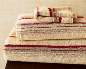
Here's the fallish towels I was talking about. The cranberry is like in this towel. I wanted to do a color that is like the taupe stripe in the picture (next to the red stripe...its hard to see that it's actually taupe!)...it's a bit different in real life.

manchester.jpg
 

Jennifer5973

Ideal_Rock
Joined
Oct 18, 2003
Messages
4,107
Deep cranberry/burgundy is a beautiful complement to creams/beiges/taupes. I am just biased--I've seen some bathrooms recently done in all taupes or beiges (different shades/depths--tone on tone ranging from light to deep with white/cream trim) and I really like that look. I guess it can be perceived as boring but in bathrooms I really like simplicity, so don't go by me.

I voted tangiers but I can see the sisel working well as a more traditional color, esp. with the burgundy accents and black touches in the room. I think the with scheme you've chosen, though, you really can't go "wrong" with any of these.
1.gif


Remember to post the after pics too!

PS Nice towels.
 

Mara

Super_Ideal_Rock
Joined
Oct 30, 2002
Messages
31,003
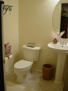
Here is the 'before' shot....the towel rack is behind the door and over the toilet and across on the facing wall are matted & framed black pictures--of some photographs that a friend took at our wedding in Hawaii of the landscape and hammock ...but I have not decided the art is 'final' for the bathroom just yet, but do like having something on the wall until I really figure it out.
9.gif


I actually love neturals, aka taupes and creams and whites....that is what most of our house is (and black white matted artsy frame collages ala Pottery Barn), and its hard for me to use color...so I am trying to infuse some color into areas where it feels very stark to me. Red and blue are colors I feel comfortable using, oh and greens in the family room. Funny, looking at this picture...it looks nice enough...but when I am in the bathroom, it just feels like it needs some color and jazzing up.

Anyhow, we'll see I guess!!

I think Sisal is the winner, Greg approves too.
9.gif
Thanks!!


downstairs bath1.jpg
 

fire&ice

Ideal_Rock
Joined
Jul 22, 2002
Messages
7,828

You know F&I - always playing the devil's advocate. It's a small bathroom. You can't hide that fact. Is it an under the steps bathroom? If so, traditionally, these are taken dark for the very reason you stated "homey". It's really a powder room. I'd take it cranberry w/ the large mirror you mentioned & the basically light towels. It's richer looking. A while back we took our little bathroom downstairs A warm adobe color. It's really homey w/o feeling tight.


If you don't want to go there, how about Sherwin Williams Ruskin Room Green. It's a taupe green - nearly an exact match to the stripe in your towel *from the pic* which you say may not be so great.


Funny, we are painting our dining room in the little house today. Hubby does all the rolling. I'm ice with a brush; so, I do all the cut in work. We are painting it Ruskin Room Green. Our living room is Hubbard Squash. These are very Arts &Crafts colors though - warm hues though. For interior latex wall paint, we would use *nothing* else BUT Sherwin Williams. BN makes good interior trim paint (and the best oils); but, for wall paint - nothing beats Sherwin Williams. I love their "Preservation Pallette". We've been painting our own walls & trim (interior only) since our first house. It's relaxing, cheaper & a great sense of accomplishment when done! I better get to work!

But, if my only choice is the ones listed - then Sisal is the closest to what you want to accomplish.

Don't do blue. My parents made that mistake. It's an awful color for a bathroom unless it's a richer jewel color blue.

Kimber - can I get the "family" discount!
28.gif
9.gif
We should own stock in Sherwin Williams.

Edited to add: I really can't get a feel for the cranberry color - does it have a rose tint? If so, I like that. Tangiers is too hard core taupe for me. Most of our little house is with a linen/taupe color. It's really nothing special.


Mara

Super_Ideal_Rock
Joined
Oct 30, 2002
Messages
31,003
Unfortunately, I'm still not comfortable enough with color to use it on the walls by myself just yet. We had our bedroom done in a light blue when we moved in and at first it was darker than I thought it would be, so it's a true light blue with a grayish purple tinge. I adore it now and it works so well with our other items (white linens and dark dark mahogany colored plantation style furniture)....but obviously I was not the genius in choosing the color (though it turned out well in the end), I drove our painter insane with trying to match a magazine picture. which apparently is hard to do due to gloss--the color came out about 2 shades darker than I wanted but in the end, the contrast was nice.

We had most of the interior house done in a light taupe when we moved in and it was a tad too light for my taste though Greg likes it, and I have to remember that I wanted a slightly homier feel without having it be 'dark', but turns out the house gets so much light in it that its hard to tell sometimes that the walls are any color at all! But at night, yes you can see the color and I really do love the color, just wish it was that tad bit darker. This was also done off a magazine page and its amazing it went as well as it did. Both blue and taupe were custom mixes by BM and the paint is really beautiful, you don't see a thing when I do touchups which is pretty often now that we have the white rat getting the place all dirty.

So anyhow, I seem to have this mental slowdown whenever it comes to choosing paint and colors...hence wanting to try the swatch sample thing before I used it. The downstairs bathroom is the real first experiment on my own that I am attempting here...when I mentioned cranberry and blues, those were accents, so the idea is to have the walls be neutral then accent with color over the seasons so that I only have to paint once!

Speaking on green, I adore it....in fact if this bathroom thing goes well I plan to paint the guest bath aka Greg's bathroom a very very pale grayish green to go with a stripe in a shower curtain I have there. Again the creme walls just not doing it for me--even though he likes it.

I had the painters do every room in the house except the guest bath, downstairs bath, guest room, office and our bathroom. I had plans for all those rooms myself (though planned to leave master bath alone..I like the contrast it provides to the blue in the bedroom).

Then the next project will be the office walls. I want them to be a Ralph Lauren Suede in a slightly darker Grayish Green. My girlfriend did the Suede texture in her LR and it looks amazing and actually does look like Suede! The green suede will make the office seem more homey but also it just seems perfect for using in an office! Also the darker color will allude to the fact that YES a man lives here too...hehee.

So hopefully this first bathroom paint goes well. I figure it's 4 walls, no windows and relatively little taping, so hopefully there won't be any fiascos! Better to start out small, esp since hawk-eye Greg will be checking in to look for disaster probably every other minute.
9.gif
 

moremoremore

Ideal_Rock
Joined
Mar 15, 2004
Messages
6,825
Sisal!!!! Totally! I think tangiers is too orangy. I really like the sisal color. Not too light. Not too dark. Not too beige. Not too gray. Since I go CRAZY picking paint, I like to put the choices in front of me. Close my eyes and then open, paying careful attention to the color that my eye goes to first. Your gutt is usually right! And if you're nervous about it beeing too dark, go with white crown moulding to draw the eye up!!!

J-Flo I want to see a pix!
 

moremoremore

Ideal_Rock
Joined
Mar 15, 2004
Messages
6,825
F&I- don''t do blue for a bathroom! Yikes! OK, I''m going to pm you now! LOL
 

KimberJEB

Shiny_Rock
Joined
Nov 19, 2004
Messages
123
I actually have blue in one of my bathrooms. And it looks great - BUT the vounters are white marble, the floor is white/gray, the towel bars and brushed nickel, we painted the walls (do you have teh SW Color wheel?) it was called Swimming. Which pretty much explains it. We got mosaic glass bath accessories and baskets and it really looks good. In a tropical, underwater kind of way - which is TOTALLY our thing. But we are now cut off the blue. 3 of the rooms in our 3/2 house are now blue. VERY different blues, but blue. I have to stop painting blue. THe Master Bedroom and bath are blue, the office is blue, the 2nd bath is greent (Grassland) the third bedroom I want to paint bright (not TOO bright) yellow, and we are painting the kitchen/living room Humble Gold.

I wanted to paint something Red, not too red, but a reddish. Daniel wouldn''t go for that. So blkue, green and yellow are my options. Fortunately that is still a wide range.
 

Mara

Super_Ideal_Rock
Joined
Oct 30, 2002
Messages
31,003
I adore blue as well. Blue and green are my two favorite colors. But not together of course.
2.gif
I have seen a beautiful bathroom in a PB catalog or two that was done in a dark warm green and one in a kind of gray blue. The blue is more fresh of course, the green was very calming and kind of cozy. Depends on the room...but our bathroom actually looks good as is, it''s very ''spaish feeling with neutrals, looks very ''clean'' (even when it''s not!), and we figured we wouldn''t mess around with that. But the other rooms are fair game esp the small box bathroom downstairs.
9.gif


It''s just so hard to commit to colors....but I tend to err on the side of not using enough color as accents and staying TOO neutral. This holiday season (decorating today and getting the tree) I am trying out a bit more color (burgundies and golds) than normal to balance out all the taupes and naturals in the rest of the house (aka couch is a suede soft cocoa and with walls being taupe, room needs some serious spicing up that I tend to neglect the rest of the year!).

I love using the PB catalogs as decorating guides...they have some beautiful rooms in there. Also on their website they have some ''how-to'' kind of guides which are helpful for us that are impaired with how to put things together, aka tips on holiday and how to dress up the most important rooms for a party etc.
 

fire&ice

Ideal_Rock
Joined
Jul 22, 2002
Messages
7,828
Most people are afraid of color. Not that that''s a bad thing! I tend to err on the conservative except in very small spaces (like little bathrooms) & huge rooms I want to be brought back in.

Also, I tend to do things in reverse. Since we do all the wall ourselves, I Neutralize the walls, decorate - then figure out a color I like & can live with that won''t be a distraction. Remember my motto - the walls should be wearing the color - the color should be wearing the walls! It''s easier for me to do the reverse.

It''s prudent to do the color test drive. A tiny little tidbit in the store can''t really look correct in the room with various lighting, etc. Swatches can really be deceiving. From a swatch, I never would have picked this Ruskin Room Green. It''s too much a shade of 70''s Avocado Green
6.gif
39.gif
. But looking at it on the walls & blending with the color of our living room, it looks great. I''m glad we made this choice. We did a test prior & was still on the fence.

Our choices are rather easy as they do tend to correlate with the colors used for the periods we collect. But, I like the paint to match to decor style. I''m dying to buy a open floor plan 1950''s house & paint the kitchen Turqouise!

O.K. - just to clarify - this is a 1/2 bath powder type room? I''d still go cranberry or rich dark color (no browns - true color). It makes the small bathroom a private room all to itself & not just an accessory to the downstairs. Yes, it''s harder to paint over if you don''t like it; but, it really makes a statement. BTW, our little bathroom downstairs that we went with a rich adobe color has a white pedestal sink & toilet w/ iron accessories. Flooring is wood though as is all downstairs. We put a nice small persian rug & it really is a separate room. I wouldn''t want to do a master. But, the dark color fits the little space. That''s my story & I''m stickin to it!

I don''t mind blue for a regular bathroom - just the right shade.

And, it''s only paint. Use newspaper on the floor & old sheets to drape the toilets, etc. As long as you use latex, nothing can really go wrong. If you don''t like it, paint over it.
 

moremoremore

Ideal_Rock
Joined
Mar 15, 2004
Messages
6,825
Kimber- that sounds beautiful! I went to home depo today to pickout colors for my bathroom renovation and I''m definitely going with blue. It''s the same blue as my den- it''s a gray/blue called Mariana''s Aria. Took my forever to pick then...so I''m going with it again. Also going to do gray grout with white tiles! I showed hubby a light taupe but it''s just not the look I want and it gives me grout issues.

I saw sisal. It def looks like the swatch on my computer screen. Def not a ''light'' color but very pretty and rich without being too yellow. I think that darker colors can add depth to a room sometimes so I say go or it. I
 

Mara

Super_Ideal_Rock
Joined
Oct 30, 2002
Messages
31,003
Yep it's a 1/2 bath. Funny I was cleaning up some stuff from last weekend hanging around our kitchen island and uncovered the tiny paper swatches I brought home last week for the bathroom that I thought looked like what I wanted. I had chosen some odd color called Walnut and .... Crab Apple. In contrast, I painted the Burlap (the only similar taupish real paint sample they had there) and then went online to look at the RL palette and chose Sisal, Crab Apple and Tangier as better possibilities knowing what Burlap looked like on the wall. Crab Apple paper swatch looks slightly lighter than the online version. Interesting...but I think Sisal is still my best bet. I'm going tomorrow to buy it and do the dirty deed!
 

moremoremore

Ideal_Rock
Joined
Mar 15, 2004
Messages
6,825
F&I- why do you think that blue is not ok for a powder room but ok for a regular (full) bathroom? Thanks!
 

fire&ice

Ideal_Rock
Joined
Jul 22, 2002
Messages
7,828
Date: 12/4/2004 11
6.gif
4
6.gif
1 PM
Author: moremoremore
F&I- why do you think that blue is not ok for a powder room but ok for a regular (full) bathroom? Thanks!
Most blues are very cold & not condusive to small spaces. It''s also a hard color to stand alone or blend w/ the rest of the house. Plus, I don''t like blue & it reminds me of something that should be in a little boys room. To each his own. I wear mostly black.
9.gif


BTW, speaking of Restoration Hardware & their 20% coupon for today & tomorrow - I''ve never used their paint - but they have a wonderful selection of great neutral colors.
 

moremoremore

Ideal_Rock
Joined
Mar 15, 2004
Messages
6,825
LOL F&I....I AM the "princess of darkness"....There is almost nothing in my closet that''s not black. Really, I want to wear colors...it just never works out...I DID buy a pink T the other day and a coat with blues in it the other day. I''m in a black 12 step program. Oddly enough, I love my house bright with neutrals. The colors restor hardware has in the store are so pretty, but I don''t do designer paints. I trust my buddy ben moore :)
 

Mara

Super_Ideal_Rock
Joined
Oct 30, 2002
Messages
31,003
I also wear tons of black, but I love the trend of adding a bit of color to the outfit, aka pink...I adore pink though up until two years ago I never would have admitted it. Pink was for GIRLS. and Trista. Now I'm putting a pink Kenneth Cole bag on my Xmas list.
9.gif
along with *gasp* a Tiffany silver necklace!

Anyhow, a very light baby blue has been one of my favorites for a long time, my car is a light blue and I have always felt it's a happy color that doesn't scream girly pink. Plus I have seen some amazing rooms in mags and catalogs done in blues which is what inspired us to do the master in it. For a bathroom I would do it if the other accents were all white, there was a cool tub (not the typical one but maybe clawfoot), and things like tiles and baseboards, etc could be used in white to give that special contrast. It would look fresh...which actually are what bathrooms ideally could look like...all the time. hehee.

Being a black lover, I like some color in the house, though I'm more of a neutral person in the house with color accents. I think I may slowly be moving towards more color,I think alot of it for me is actually using it and seeing the results to make me feel more comfortable the next time around. aka next house.
9.gif


How did the painting go F&I? Mine will commence in a few hours. Hopefully won't take longer than an hour to actually paint...Greg is responsible for most of the prep to ensure it's done right.
31.gif
 

Mara

Super_Ideal_Rock
Joined
Oct 30, 2002
Messages
31,003
Okay it''s done, the bathroom is now Sisal. I saw Crab Apple at the store and was tempted to switch but Greg wanted to continue with Sisal so we did and it looks fabulous. A bit different from the swatch but really great and nice contrast. It''s a tad bit more ''brown'' aka closer to Tangier but it looks very good. Now just waiting for it to dry completely, will have to do a brush touchup in a few areas. Took about 20 minutes to tape, Greg started on the painting when my parents dropped by to visit, painted by himself (mostly baseboarding and corners so I could do big areas) for an hour and then we both worked for an hour. Not bad at all!

Thanks for the help everyone! I will take and post pictures later this week after everything is dry and we put all the fixtures and items back in!
36.gif
 

strmrdr

Super_Ideal_Rock
Joined
Nov 1, 2003
Messages
23,295
buy 300 6.5mm h&a czs have them set in sterling and string them on one wall and install spot lighting.
You will never leave the room.
hehehehehehehehehehe
 

Mara

Super_Ideal_Rock
Joined
Oct 30, 2002
Messages
31,003
well strm I do have this hanging iron candelabra thing in there that has faceted crystal drops hanging from it. so those are kind of like diamonds...hehee.

we put everything back in last nite and it looks fabulous, i love the darker richer color!! i''ll try to get some pix this wkd.

:) thanks all.
 

fire&ice

Ideal_Rock
Joined
Jul 22, 2002
Messages
7,828
Pics please. Isn''t so rewarding to paint yourself! Also, think about the money you save with the cheap labor. When''s that 3c upgrade?

Now, on ward to more home projects! And, learn to use an edger. Saves on masking tape.
28.gif
9.gif
 

Mara

Super_Ideal_Rock
Joined
Oct 30, 2002
Messages
31,003
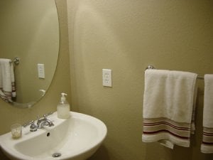
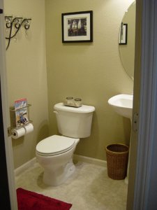
okay here are two pictures i got. the bathroom is so tiny it''s hard to take a good picture because i can''t stand in it but have to stand outside mostly!

New Bath1.JPG
 

Mara

Super_Ideal_Rock
Joined
Oct 30, 2002
Messages
31,003
and picture #2. it's hard to see the color but if you look at the baseboard, the contrast is very nice. the towels and rug look great too and the black accents look much more together and less 'stark' than before.

36.gif
success!

now onto painting and cleaning up the guest bathroom and guest bedroom! we most likely will have some guests in jan/feb of 2005 so gotta get working on it now!
9.gif


New Bathroom2.JPG
 

Mara

Super_Ideal_Rock
Joined
Oct 30, 2002
Messages
31,003
Yes, Greg finds that comes in very handy!
31.gif
Note the magazine rack attached as well. It''s made for a man!!

We got it at Pottery Barn...it''s only available online. I want to get another one for the upstairs master bathroom too! The ultimate in laziness.
9.gif
 
Status
Not open for further replies. Please create a new topic or request for this thread to be opened.
Be a part of the community Get 3 HCA Results
Top