shape
carat
color
clarity

Opinions please....

yennyfire

Ideal_Rock
Premium
Joined
Jun 6, 2010
Messages
6,903
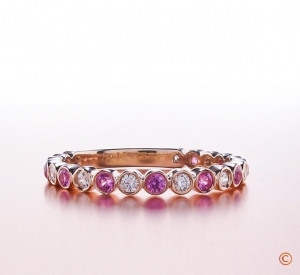
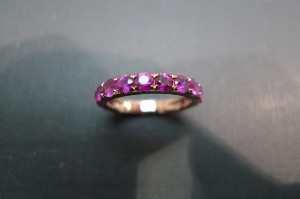
I just received photos of the pink sapphire 3/4 eternity band I had made by an artist on Etsy. I've attached a photo of the BGD pink sapphire/diamond band that I sent as an example of the ring I was inspired by...what are your thoughts on the ring I had made? I'm not going to comment on what I'm hesitant about because I would like unbiased opinions. Thanks for your opinions!

sapphire2_0.jpg
sapphire1.jpg
sapphire3.jpg
rose%20gold%20sample%20(2).jpg
 
the ring you had made is ok.....but there is something about the bezeling and workmanship on the inspiration ring that is "finer" and therefore more pleasing to my eye.

MoZo
 
The etsy ring is very pretty, but even putting to one side the prong set vs bezel issue, I don't think it "reads" as being that similar to the BGD ring. I actually have the BGD band in the diamond version, and it's the most amazingly delicate ring, with very refined bezel work. The etsy ring has a different aesthetic, IMO. How wide is it?
 
One is bezelled and the other is prong set - personally I much prefer the prong set - but you're asking us to compare apples with oranges: the two rings have little in common. I'm a bit confused... :confused:
 
What they said. The Etsy ring is nice, shows the stones well but doesn't somehow have the delicacy and good flow of the BGD ring. Is that your doubt?

--- Laurie
 
I take it you wanted it prong set rather than bezel set like the original? And also you didn’t want it alternating like the original?
While the two are different in design, the BGD ring is better executed, which I’m sure is the reason why it costs more as well. The Etsy ring is very thick (shank) and the stones used probably are larger than the original as well, hence it doesn’t look as delicate.
 
Is the way the sapphires are set not consistent as you move down the shank? The ones on top look prong set but towards the bottom look bezel.
 
The BGD ring *seems* to have much smaller stones and seems much more delicate to me. But it does seem like you are
trying to compare apples with oranges since one is prong set and one is bezel set.
 
The stones appear to be wider than the band, and so the sides of them hang over the front and back of the ring. the prongs are set too close to the center line of the ring, which, combined with the overhang of the stone's girdles seems potentially vulnerable. The prongs look nice from the top; from the sides they seem a bit clunky and tab-like, almost like the fold over tabs on the garments of paper dolls.
 
Sorry for not being clear. I didn't want a bezeled ring, I simply sent the jeweler on Etsy that photo to show him the colors of the sapphire and rose gold that I wanted. I agree that there is something unrefined about the Etsy ring but I am having trouble putting it into words so that the jeweler can modify it before he sends it to me.
 
YF,
To get the refined look, I’m afraid the setter has to remake the entire ring. The metal (shank) is too thick, and the stones too large and thus overhang the band. I also don’t like the overhang because it increases the risk of the sapphire getting chipped.
 
Chrono|1296061194|2833597 said:
YF,
To get the refined look, I’m afraid the setter has to remake the entire ring. The metal (shank) is too thick, and the stones too large and thus overhang the band. I also don’t like the overhang because it increases the risk of the sapphire getting chipped.

what she said.

MoZo
 
Chrono|1296061194|2833597 said:
YF,
To get the refined look, I’m afraid the setter has to remake the entire ring. The metal (shank) is too thick, and the stones too large and thus overhang the band. I also don’t like the overhang because it increases the risk of the sapphire getting chipped.

+2 If the only inspiration you drew from the BGD band was the color combination (rose gold and pink sapphires) then I think the etsy band would probably not be bothering you. It's a pretty enough band. But, in comparison with the BGD band, it looks heavy, so I am guessing that it wasn't color alone that drew you to the BGD band. That's why I asked how wide the etsy band is, because that might also be contributing to whatever seems "off" to you. Also, since the BGD band is bezeled, the prong set stones on the etsy band are packed closer together, which I also think adds to the heavy look. Perhaps if the sapphires were separated a bit more it would help, but that would involve a total remake.

edited for awkward word choice
 
Chrono, MoZo, etc.... thanks for pointing out that the sapphires may be in jeopardy because they hang over. I didn't really notice that. The band is 2.2mm wide, the same as my diamond eternity band. I wanted this ring to stack in the middle of my two diamond eternity bands (photos are coming, as Luann just mailed the diamond bands yesterday). My thought was that if I wanted it to look "right" the sapphires needed to be a similar size as the diamonds, which are .15 point stones.

Is there any hope of fixing this ring or am I better off trying to get him to sell it on Etsy and then re-imbursing me when he does sell it and starting over with a new vendor (like ID or Eternity)? Thanks!
 
yennyfire|1296064325|2833662 said:
Chrono, MoZo, etc.... thanks for pointing out that the sapphires may be in jeopardy because they hang over. I didn't really notice that. The band is 2.2mm wide, the same as my diamond eternity band. I wanted this ring to stack in the middle of my two diamond eternity bands (photos are coming, as Luann just mailed the diamond bands yesterday). My thought was that if I wanted it to look "right" the sapphires needed to be a similar size as the diamonds, which are .15 point stones.

Is there any hope of fixing this ring or am I better off trying to get him to sell it on Etsy and then re-imbursing me when he does sell it and starting over with a new vendor (like ID or Eternity)? Thanks!

Was this a commissioned piece and did you sign off on the design before he started to make it?

If so and there is no technical issue with the ring but it's just not how you imagined, then I would say that the seller has no obligation to try and sell the piece and reimburse you and it would be very nice of him to do so.

If there is a technical issue with an overhang with the sapphires - I'm not 100% certain that there is, I would want more photos especially one taken from directly above to be sure - that might be fixable. If it's that you find the ring overly heavy then it really would be a total redesign and remake.
 
yennyfire|1296064325|2833662 said:
Chrono, MoZo, etc.... thanks for pointing out that the sapphires may be in jeopardy because they hang over. I didn't really notice that. The band is 2.2mm wide, the same as my diamond eternity band. I wanted this ring to stack in the middle of my two diamond eternity bands (photos are coming, as Luann just mailed the diamond bands yesterday). My thought was that if I wanted it to look "right" the sapphires needed to be a similar size as the diamonds, which are .15 point stones.

I think that the sapphires are probably not overhanging, but are close and the angle of the shot makes it look like they overhang. If the sapphires are 2mm stones, then you're O.K. If you're diamond eternity band is 2.2mm wide, then it probably holds 1.5 point diamonds at 1.5mm each. I think that you'd find those stones to be too small when using sapphire like this, since sapphire doesn't have the same "intensity" of diamond. I have a feeling that what you are missing in terms of a refined look is that the bezel set ring follows the curvature of each stone so that the sides are scalloped, with a ruffled appearance that the straight sides of the ring shown does not have.

The trick in getting what you want is in making a list and seeing a sketch or render before work starts. I think that you ought to make a list and get some images together. From my experience I would suggest that you want a more rounded appearance which is more in keeping with the example band. This would include:
1. Band sides following the stones for a scalloped edge and a bit more separation between the stones.
2. Round beads to retain the stones.
3. Maybe a touch wider band.

Nothing I'm saying here should be taken as a comment about this vendor, as I think their work is quite acceptable. I just think that there was a communication gap at the design phase that was missed.
 
The Etsy ring doesn't look delicate but that's because the sapphires look big in relation to the band. However, it only looks like that because we've seen your comparison ring. If we hadn't seen that then the only issue I would have is the size of the sapphires look like they overwhelm the setting a bit. I don't think they overhang and think it's just the angle of the photo. A simple side on shot would show whether they do or not.

Do you think because it's all pink instead of alternating pink/white, you may not find the end result as attractive? Is there any way of removing every other sapphire and replacing with a diamond?
 
i would echo Michael E that is a communication problem. the inspiration ring is indeed inspiring.....for bezels. perhaps a picture of a ring more like what the OP is looking for would have helped....meaning small width with sapphires set in prongs.

before saying anything to the vendor it might be a good idea to see the ring IRL? it could be that the picture just does not do it justice and you will love it, especially when it is on your finger.

MoZo
 
The color is great :) but I think there needs to be a more definite separation in the stones to get the feeling of the bezel w/o a bezel. I think the tiniest strip of gold separating the stones would make a world of difference to achieve the look of your inspiration piece.
 
Thanks everyone. Since it appears to be a communication error on my part I guess I'll wait to see it in person and go from there.
 
All in all I think it looks like a lovely ring.

You might be pleasantly surprised when you see it in person, I think most hand crafted pieces look much better in person than in photographs.
 
MakingTheGrade|1296076386|2833950 said:
All in all I think it looks like a lovely ring.

You might be pleasantly surprised when you see it in person, I think most hand crafted pieces look much better in person than in photographs.

I see that type of prongs on a lot of older jewellery, I always thought it is a chunkier look. Were you looking for a shared prong ring like the one below? Nonetheless your new ring is pretty and I love that shade of pink.

http://thefacetscollection.com/item.cfm?item_id=2458
 
GET 3 FREE HCA RESULTS JOIN THE FORUM. ASK FOR HELP

Featured Topics

Top