shape
carat
color
clarity

Old Mine Brilliant Cushion, which setting do you like better ?

Status
Not open for further replies. Please create a new topic or request for this thread to be opened.

pauly1

Shiny_Rock
Joined
Jan 11, 2007
Messages
381
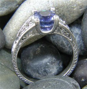
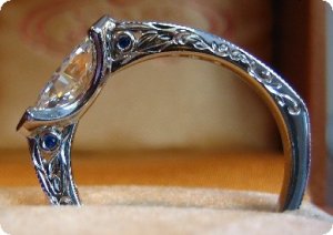
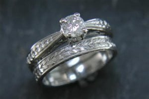
I''ll be starting a custom engagement ring with Greenlake jewelers pretty soon. I posted here a while back, https://www.pricescope.com/community/threads/going-custom-greenlake-but-i-need-your-help.63393/ and will still be using a lot of the details found in Machicks rings for my own. However I''m considering changing the shank and would like opinions on these two settings (Strictly the shape, as all the detail will be different) As you will see, one of the shank tapers in, and the other tapers out. Thoughts?
8877hhtg.jpg
 
Or

MTGA8833.jpg
 
what size is the cushion?
 
At least 1.5 , could be as big as 1.75
 
then I vote setting #2...
 
In that case, I''d take the tapered setting, unless the lady likes a more substantial/thicker band. The second one would end up the same width of the diamond, so it may be 6 mm or more. Most ladies tend to gravitate towards a thinner band.
 
Date: 7/30/2007 4:56:25 PM
Author: Chrono
In that case, I''d take the tapered setting, unless the lady likes a more substantial/thicker band. The second one would end up the same width of the diamond, so it may be 6 mm or more. Most ladies tend to gravitate towards a thinner band.

I agree in principle, that women like slightly thinner bands generally. But if you know she likes the antique look AND chunkier bands, I think the second one would look more antique (and better!) with a cushion like that.

But both would be very pretty!
 

Thanks!


Just in case you didn''t check the link I posted, which band do you think would work better with the engraving and surprise sapphires of the ring below. This will be my starting point. What I like about setting # 2 is the high polished platnium under the stone. Do you you think I can achieve that same look with setting # 1?


hhgg889.jpg
 

Do you have a profile shot of the first one??


My gut says #2 - but I''d love to have more info before I vote

2.gif

 
Unfortunately I don''t. The picture came from Greenlake''s website, but there was only that 1.
 
Date: 7/30/2007 4:56:25 PM
Author: Chrono
The second one would end up the same width as the diamond
#2 *absolutely* does NOT have to "end up" the same width of the diamond. Especially a diamond of 1.5+. My own e-ring has a shank that tapers toward the stone but the stone still juts out above & below the shank ... offering up the stone ... letting the stone "bloom". Designs like this can be made in any size, with any degree of taper ... it's CUSTOM after all. And whereas thin bands are trendy NOW, there's a long history of wider tapered rings that have appealed for centuries.

FWIW - I generally dislike bands that taper IN towards the stone, as it seems such an obvious attempt to make the center stone look larger ... and the resulting dramatic gaps between e-ring and w-band bother me. But that's my personal opinion.
 
Thanks Deco. I will post pictures when I finalize a design.
 
Anyone else have any thoughts?
1.gif
 
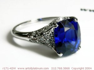
I actually really like rings that taper in--they have a lovely delicacy to them--and I don''t like the #2 ring at all. That said, I *do* like your inspiration ring in the third picture, which is bold without being as wishy-washy between being bold and ornate as the #2 one. Similarly, here''s a Leon Mege I like that reminds me of your inspiration ring.

r171-42W.jpg
 
Having an OMC, I think the second setting would lend itself better to that cut. I also happen to like thicker bands.

A lot of women prefer thinner bands to make the stone stand out, or "pop". So you might ask yourself if you think she falls into that category, or the other, which doesn't mind a thicker one.
 
Is this a square cushion or a rectangular cushion?

The second setting would look very nice with at square cushion. I would do something different for a rectangular cushion.
 
Date: 7/30/2007 10:04:35 PM
Author: Stone Hunter
Is this a square cushion or a rectangular cushion?

The second setting would look very nice with at square cushion. I would do something different for a rectangular cushion.
Good question, I was "assuming" square. And I agree with you.
 
i definitely prefer the first setting - unless you know that she likes thicker bands. i think that some girls might think that a really thick band is a bit too masculine looking for an e-ring. also, there is a better chance of the diamond getting a little bit lost in the sea of platinum and filigree that would totally engulf it (which isn''t the case if it is a colored stone in that setting). I think it would just look a bit clunky. just my two cents!
 
From the 2 pics that you posted, I would chose #2...I would like to see a profile shot of #1 though (if it were me ordering the ring).
 
Thanks for all the comments! I would love to hear more. In answering your questions though:

- The stone will be approximately 1.10 L/W

- I''m not sure what she would prefer, but I will say this. Her ring size is a 4. She''s a tiny girl with small features, which is one of the reasons I was leaning towards setting # 1. I do think the taper is a bit much, and would have Greenlake widen it slightly, but it would still retain the overall look.

Thanks for all the comments, and I would love to hear more.
 
I agree with deco. I like them better when they get wider toward the stone. I do like the ones that get thinner but it really depends on the ring/stone and for a 1.5 carat cushion I don''t think it would qualify. It''s a very delicate feature, tapering in at the stone, and I personally don''t see cushions as a delicate cut. They really do lend themselves to being up on a pedistal though ala getting wider toward the stone. I''m having my ring done with no taper either way. That''s always an option too.
 
Thanks Sara! Do you have any examples you can share? I love the engraving (Machicks ring) and the naked front and back bezel in the 2nd ring I posted. I want to work from there.
 
Anyone else have any thoughts. Sorry to be a pain but I like as much feedback as I can get. That whole 2 heads thing.......
1.gif
 
Date: 7/31/2007 1:48:41 PM
Author: pauly1
Thanks Sara! Do you have any examples you can share? I love the engraving (Machicks ring) and the naked front and back bezel in the 2nd ring I posted. I want to work from there.
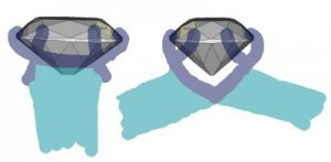
Not really... my ring won''t be done for a few more weeks. I wanted naked stone AND 8 prongs... its like a basket ring without the metal band that goes around holding the basket sturdy. You can only see 1/2 way up the pavillion from the side, but from the front you can see most of the diamond.

Here I tried to sketch it but I am really bad at it.... I am very familiar with machick''s ring and I''ve personally been to greenlake jewelers (set foot in the store and everything) and that naked side look is one of the things that was important to me. Bezel tips worked better with the marquise for me... I wanted an entwined cage of prongs. Here''s what I drew - its really bad but you can see the front view of the stone is fairly unubstructed and the side view is half obstructed. The head of my ring is probably 9.5 mm because my stone is... but the band is 6-7mm. It doesn''t taper. At least not from the top visual.

dbhead.jpg
 
Wow, thanks for sharing Sara. It sounds like it''s going to be a pretty amazing ring. I''m still kicking around some different ideas, but I''m getting pretty close. Will keep you posted!
 
Status
Not open for further replies. Please create a new topic or request for this thread to be opened.
GET 3 FREE HCA RESULTS JOIN THE FORUM. ASK FOR HELP
Top