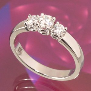
shape
carat
color
clarity

nicer of these two settings

Status
Not open for further replies. Please create a new topic or request for this thread to be opened.

nbreau

Rough_Rock
Joined
Nov 23, 2005
Messages
9
Just wondering which if the following two settings everyone prefers ?

I was originally thinking of going with the following setting with pink saphires instead of the blue (attached s1.jpg) but then realized that the sides of the diamond arent exposed, so now I''m thinking i should go with somehting more simillar to the 2nd image (with pink saphires instead of the diamonds on the extremeties)

what does everyone thing ?
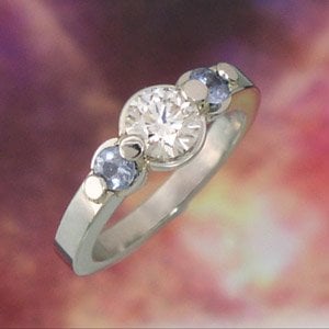
s1nb.jpg
 
2nd image.

s2nb.jpg
 
I like the second one. It''s very classic. I don''t like the prongs on the first ring -they hide too much of the stones. JMHO
 
I like number 2. As with WTNLVR , I don''t care for the prongs on the first one.
9.gif
 
Date: 11/24/2005 9:48:51 AM
Author:nbreau

then realized that the sides of the diamond arent exposed
Why would you want the sides exposed ?
20.gif


The styles are pretty different. The first one is somewhat unusual - aparently the stones are ''floating'' above the bezels underneath, but it is hard to guess exactly how much without a side photo. If set high I''d wonder if this is safe.

Anyway, I just wanted to mention that the first style is close to the signature rings of a well known desigtner - Witney Boin.

Here''s what I am talking about LINK.
 
...no expert here, ...but I like #2 as well. ...very nice setting
emsmile.gif
 
wow, those are amazing...
 
I actually prefer #1...I like the unique setting, yet it''s not too modern or heavy. I really like it!
 
definately the second one
 
The second one is gorgeous and classic. I think the prongs on the first one are a bit funky, but that''s just me.
2.gif
 
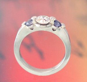
here is a side pic of the 2nd one, does this change anyones mind ?

s1no2nb.jpg
 
No. Those prongs are flat and too funky for me. Sorry, just my 0.2.
2.gif
 
I love them both. #1 is unique, #2 is traditional/classic.......both are beautiful in my opinion. You seem to like the first one better (?)....go with your gut feeling. Please let us know which one you choose!
 
I like #2. I think those weird circle things really detract attention away from the stones. #2 is gorgeous.
 
Date: 11/24/2005 9:34:02 PM
Author: nbreau
here is a side pic of the 2nd one, does this change anyones mind ?
Yes, mine
14.gif
 
I would like the first one if the prongs weren''t there and all three stones were bezel set. Otherwise I would go with the second.
 
Date: 11/24/2005 11:37:10 PM
Author: monarch64
I would like the first one if the prongs weren''t there and all three stones were bezel set. Otherwise I would go with the second.

yep
 
Date: 11/24/2005 9:34:02 PM
Author: nbreau
here is a side pic of the 2nd one, does this change anyones mind ?

unless im blind thats actualy a side view of the first one?

I wouldnt consider it safe, one hit and those stones are outa there.
 
At first glance, I liked the first one - it is something different than we usually see. And it''s nice to see different styles occasionally.

But.... I think that I like number 2 better.

Not a big fan of pink sapphires though, I''d pick something blue!
 
I agree w/ fisiogirl - I think all the pink is a trend and will get old - I prefer the blue myself! I like that 2nd setting much better, more traditional with very clean lines. Yeah, it;t not as unique, but years into the future, I could see #1 seeming dated but NOT #2.
Who is the manufacturer?
 
Status
Not open for further replies. Please create a new topic or request for this thread to be opened.
GET 3 FREE HCA RESULTS JOIN THE FORUM. ASK FOR HELP
Top