shape
carat
color
clarity

Wedding Invites are bothering me, your assistance with paper please.

Status
Not open for further replies. Please create a new topic or request for this thread to be opened.

Gypsy

Super_Ideal_Rock
Joined
Aug 8, 2005
Messages
40,250
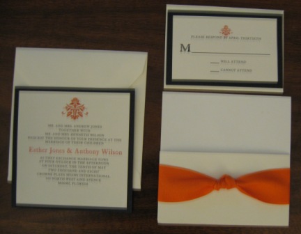
I love the damask and paisley print borders some of you are doing on your invites. I want to see if I can find something like that to work with mine. But other than papersource, I don''t know of paper sites. And papersource doesn''t have what I want. Something like Sap''s border or a damask print would be perfect.

Can you help me?

I would like a print that has a deep (burnt) orange tone to it. Needs to be cardstock (so thick paper) please.

THANK YOU!
 
I love those too honey!!

But I have the invites chosen already and have been working with a vendor. I just want a explore different border paper options as they are being custom made for me.

We've tried solid tangerine border paper and it looked cheap. We've tried solid chartruse (colors are green and orange) but that's the only green and it looks strange and incomplete. And we've tried black (winner right now). I'm just ready to throw in the towel and get black. But saps invites are so lovely, I wanted to see if I could find a nice printed border paper as a last ditch attempt. The ribbon has been changed to a vivid deep tangerine satin, and it looks fabulous.

I should have included a pic. Sorry!
Gypsy%20Ebay%20Invites.jpg
 
Here they are with the green border. And new ribbon.

leyla 001.jpg
 
I did a little looking online and found Paper Mojo (http://www.papermojo.com/). Maybe something there will work? Never used them or heard of them, though.
 
I LOVE the black border. Hands down. It is very sophisticated and sutied for a wedding. I think when you start mixing some colors on invitations it
starts looking like it is for a younger persons'' affair...like a sweet sixteen or bar mitvah.. I like the black and white with a touch of your color.

Just my thoughts..
 
Date: 4/29/2008 1:06:35 PM
Author: crystalheart1
I LOVE the black border. Hands down. It is very sophisticated and sutied for a wedding. I think when you start mixing some colors on invitations it
starts looking like it is for a younger persons'' affair...like a sweet sixteen or bar mitvah.. I like the black and white with a touch of your color.

Just my thoughts..
It''s not too Halloween??
 
I like the black border, but I honestly think it would look better with some kind of an orange border that matches the other orange in the invitation. I''m not at home so I don''t have Photoshop with me, but I''m gonna try doing a mock up in GIMP of that orange paper you like as the border with the invitations you have. Give me a few.
 
I also really like the black. It looks very elegant and IMO really fits the feel and decor of your wedding. However, I am a firm believer in trying out different combos until YOU are absolutely happy because otherwise you''ll always wonder if you made the right choice. That''s why it took me 4 months to finalize my invites. The woman I used had lots of patterns available to her. So I chose a pattern and it was printed on plain cardstock. Would that be an option for you? I really like the graphic at the top of your invite, using something similar, or even perhaps enlarging and duplicating that graphic several times so arranged it fits on one page might work. Because it''s used as a border, you wont see the entire image. Try out some options, if you don''t like it you have a beautiful option to go back to.
 
I agree that the dark color (black) is more striking, but I can see where you might worry about the Halloween-type look.

What about midnight blue instead? Blue is the complementary color to orange, and I think a midnight blue would accomplish the same striking look as the black without crossing into halloween overtones.
 
If you can get past the craptastic navigation, and the silly talking head, California Paper Goods has quite a selection of colored and print cardstocks. Lots of different textures too. Reasonably priced, I think. CPG Paper Menu
 
Date: 4/29/2008 1:21:27 PM
Author: sap483
I also really like the black. It looks very elegant and IMO really fits the feel and decor of your wedding. However, I am a firm believer in trying out different combos until YOU are absolutely happy because otherwise you''ll always wonder if you made the right choice. That''s why it took me 4 months to finalize my invites. The woman I used had lots of patterns available to her. So I chose a pattern and it was printed on plain cardstock. Would that be an option for you? I really like the graphic at the top of your invite, using something similar, or even perhaps enlarging and duplicating that graphic several times so arranged it fits on one page might work. Because it''s used as a border, you wont see the entire image. Try out some options, if you don''t like it you have a beautiful option to go back to.

Ohhhhh. That''s a great idea. I wonder if she can do that. I might have to ask. A little larger version of existing graphic is not something that occured to me. Sounds less expensive than buying amazing paper too. I wonder how it would look.

Espressa, I have a mock up at home with a solid tangerine paper and it looks awful. Really cheap and chinzy.

I don''t know about the blue Alj. I agree about the complimentary colors on the wheel. But it''s so far from my wedding colors over all. Maybe chocolate brown? I don''t know.
 
Yeah, the mock up that I just tried to do turned out really bad as well, so I won''t bother to post it (like unbelievably horrible looking).

The idea of using a graphic that''s enlarged or duplicated sounds really good. Hope you get it figured out.
1.gif
 
Oh BORDER paper. I am so confused, lol. I will keep looking for you Gypsy!
 
I understand your concern about the Halloween look... but I think you will get loads of compliments...

The only other thing I would recommend would be a very dark brown... How about the papers that have a bit of a shimmer to them?

I still think the black looks very elegant and classy...Can you change orange to a more reddish orange to get away from the black/orange look....but it really does not appear to be an issue.

The invitations look gorgeous.. I would love something like this
 
Date: 4/29/2008 1:23:18 PM
Author: Selkie
If you can get past the craptastic navigation, and the silly talking head, California Paper Goods has quite a selection of colored and print cardstocks. Lots of different textures too. Reasonably priced, I think. CPG Paper Menu
WOW. you weren''t kidding about hard to navigate. That''s gonna take some time investment.
 
Date: 4/29/2008 2:27:02 PM
Author: crystalheart1
I understand your concern about the Halloween look... but I think you will get loads of compliments...

The only other thing I would recommend would be a very dark brown... How about the papers that have a bit of a shimmer to them?

I still think the black looks very elegant and classy...Can you change orange to a more reddish orange to get away from the black/orange look....but it really does not appear to be an issue.

The invitations look gorgeous.. I would love something like this
Ebay. Serously. Let me know if you want her information. She''s really nice and friendly and attentive. Plus her mock ups she sent me are lovely in person.
 
Ebay??? I am looking to spend around not more than $5.00 per set... plus I don''t think I even need a reception card since we are having everything at the same venue.

If you don''t mind - that would be great.. I would love to check out her website

Thanks Gypsy
9.gif
 
She doesn''t do envelope printing, that''s the only catch, so you have to figure out how to get your return address on the invite envelopes yourself. But her prices are really good. I''m paying around 3.25 a set.

http://search.ebay.com/_W0QQsassZekt4 If you tell her Layla referred you, she''ll know it''s me.
 
Date: 4/29/2008 1:55:33 PM
Author: neatfreak
Oh BORDER paper. I am so confused, lol. I will keep looking for you Gypsy!
9.gif
I was unclear. I''m sorry.
 
Date: 4/29/2008 6:43:40 PM
Author: Gypsy
She doesn''t do envelope printing, that''s the only catch, so you have to figure out how to get your return address on the invite envelopes yourself. But her prices are really good. I''m paying around 3.25 a set.

http://search.ebay.com/_W0QQsassZekt4 If you tell her Layla referred you, she''ll know it''s me.
Just wanted to offer a solution to the return address on the envelopes problem. I ordered an address stamp from this etsy seller:
http://www.etsy.com/shop.php?user_id=5180519§ion_id=5139491

I haven''t received my stamp yet since it takes forever and a day to ship stuff to Canada, but she was super nice and flexible, and we''ll definitely use it again for christmas cards and thank you cards!!
 
karasue, that is one of the options we strongly considered, and it''s a very good one.

Okay, I ordered them (YIKES!). Chocolate brown and orange. The black had me Halloweening. They are going to be lovely. I''m letting go. LOL.
 
They''re going to be lovely, Gypsy! Everything looks fantastic!
 
Thank you Harleigh! Honestly, I''m just happy to have another task complete!
 
Status
Not open for further replies. Please create a new topic or request for this thread to be opened.
GET 3 FREE HCA RESULTS JOIN THE FORUM. ASK FOR HELP
Top