shape
carat
color
clarity

Help with finalizing my ACA ring

user1602755

Rough_Rock
Joined
Feb 24, 2022
Messages
3
Hi everyone!

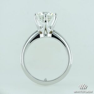
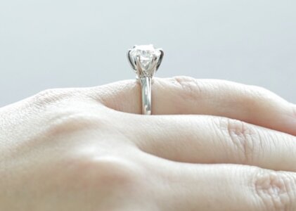
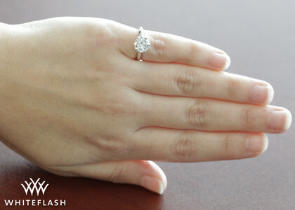
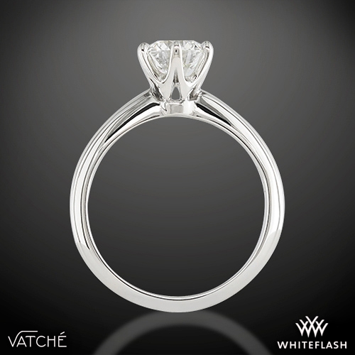
After months of research and discussion, we’re in the last stage of finalizing our Whiteflash ACA ring before it ships out.

We decided on a 1.6 ct on a size 3.5 WF 6 prong knife edge setting. Medium set to avoid the squatty look.

From the 4 photos, is there anything you’d request to change? Is the setting too high for what should be a “medium set diamond”?

4F2C6B36-9CEF-4023-AF06-E2E5F2F3C7E3.jpeg
 

Attachments

  • D958744B-E479-46DC-BDE0-701E535EEF7B.jpeg
    D958744B-E479-46DC-BDE0-701E535EEF7B.jpeg
    23.6 KB · Views: 20
  • F36691BA-2CDF-48E9-B6E3-B3ADE2CB27F7.jpeg
    F36691BA-2CDF-48E9-B6E3-B3ADE2CB27F7.jpeg
    30.8 KB · Views: 21
  • A018B3FC-65B8-45D9-AC7E-518A97DBC850.jpeg
    A018B3FC-65B8-45D9-AC7E-518A97DBC850.jpeg
    95.5 KB · Views: 19
It might be the photography, but can you ask them to make sure the head is aligned properly with the shank? It almost looks like the head needs to be rotated a tad clockwise.

Did you make any requests regarding the prongs?

The diamond does look to be set too high. Personally I prefer it to be set more like this so it looks more balanced.

Vatche-U113-6-Prong-Solitaire-Engagement-Ring-in-Platinum_gi_1991_th-164874.jpg


Hi Kim,

Thanks for your feedback! I really appreciate it. It may just be the photography as I did rotate it (attached is original photo below). Was this the photo you were referring to?

My request was for tab prongs and I asked them to double check the finishing and alignment of them so they all look uniform. They said everything from normal viewing distance looks fine. I might ask them to rotate the stone a bit clockwise so the tabs are touching the arrow heads in the same place. The 10 o’clock arrow and prong are not touching while the rest of them are.

I think it’s high for what should be a medium setting. I photoshopped the picture to how I envisioned the height (photo below, original is the left pic). I’d like there to still be some space to have access to clean the pavilion and have the illusion of the stone looking bigger. A smidge lower would be perfect for me.

D56B8E12-D032-4CA6-9C57-28246B859420.jpeg9C8E744D-C89A-4B40-863E-72C4D7822A78.jpeg
 
I like the lower height how you've Photoshopped it, and I think rotating the stone a bit will be good.

I was referring to the first photo regarding the alignment of the head, but again, it may just be the photography.

ring.jpg
 
I like the lower height how you've Photoshopped it, and I think rotating the stone a bit will be good.

I was referring to the first photo regarding the alignment of the head, but again, it may just be the photography.

ring.jpg

Thank you, I’ll show them that photo with the green lines as well!
 
GET 3 FREE HCA RESULTS JOIN THE FORUM. ASK FOR HELP
Top