shape
carat
color
clarity

Help with colour match / clash

Ionysis

Brilliant_Rock
Joined
Oct 1, 2015
Messages
1,908
So I bought this spinel thinking it would go with some melee I already had. But now I’m not sure. The melee is PINK pink but they spinel is reddish pink. Am I going to spoil the spinel if I set it with these because the colours aren’t perfectly matched? Or am I being too OCD?

DAB0F195-BA0B-49A7-8FF2-359AE3948839.jpeg 75613CA6-BCB3-43B7-B0CC-49EE34F12AB8.jpeg 925E008A-680E-4B41-9E7E-18A1A0D9CABC.jpeg 74B55CFF-A340-4832-B623-F1F95554B174.jpeg
 

missy

Super_Ideal_Rock
Premium
Joined
Jun 8, 2008
Messages
53,986
This is a tough one because it is impossible to accurately determine color from a computer monitor IMO.
I generally like red and pink together depending though on the specifics of each color. There is such a variation between all shades of red and pink.

In your top photo I like them together but not as much in the second and third photos.

Just looking at what I see on my screen I don't think I love the colors together. I'm sorry. But maybe IRL they go very well together so I wouldn't listen to what we have to say as much as determining if you like these colors together IRL or not.

Good luck.
 

Ionysis

Brilliant_Rock
Joined
Oct 1, 2015
Messages
1,908
I’m not convinced IRL either. If I was going to add a second colour like yellow diamonds in yellow gold for instance, instead of white I think I might get away with it. But I think white might highlight the difference.... ugh! Nothing is ever simple is it?!
 

Ionysis

Brilliant_Rock
Joined
Oct 1, 2015
Messages
1,908
Oh dear..... should definitely not have googled for ideas. This Harry Winston monster would be amazing - but in yellow gold, with the yellow rounds as my pinks and the purple pears as yellow diamonds.... might not need the last row of white pears. This simple little project looks like it might end up spiralling.
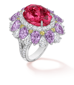
5B519CC0-D2EA-437F-8968-9FED2A500E95.png
 

icy_jade

Ideal_Rock
Joined
May 1, 2009
Messages
6,131
Oh dear..... should definitely not have googled for ideas. This Harry Winston monster would be amazing - but in yellow gold, with the yellow rounds as my pinks and the purple pears as yellow diamonds.... might not need the last row of white pears. This simple little project looks like it might end up spiralling.

5B519CC0-D2EA-437F-8968-9FED2A500E95.png

Ohhhh... so exciting. Pls keep us posted
 

dk168

Super_Ideal_Rock
Premium
Joined
Jul 7, 2013
Messages
12,492
Echoing what missy had said, it would be very difficult to match the colours exactly, however, not impossible.

IMHO, the colours are a good match as they are.

The alternative is to go for a contrasting colour for the melees, and my own personal choices would be purple, blue, blue-green as in Paraiba colour, or emerald green for this lovely centre stone of yours (thanks for sharing BTW :kiss2:)

DK :))
 

Rfisher

Ideal_Rock
Premium
Joined
Oct 19, 2013
Messages
5,487
I agree with missy and dk168. Lighting where you will be wearing the ring mostly, would matter if you think the mismatch at times will irk. Would knowing it matched in other lighting lessen the OCD?
But do think it might be more obvious in white/platinum than a 18k yellow, maybe?
Your sketched design looks pretty and there’s enough space between the centerstone and melee - I think I’d proceed as is.
Gorgeous stones!
 

voce

Ideal_Rock
Joined
May 13, 2018
Messages
5,161
I love the Harry Winston inspiration idea.

The pink melee does not match with the center stone, but neither do they clash. I see them as a color gradation. I challenge you to use other colors and not go matchy matchy. That's as uninteresting in bling as it is in fashion. Regarding yellow diamonds, I suspect you're right in that they'll highlight the difference. I would go with white diamonds like your original design. The pink melee scattered at the edge of the diamonds will look good to my eyes but only you can decide if they'll look good to you.

Another suggestion is to get a lighter pink shade for a graduated tone-on-tone.
 

Arcadian

Ideal_Rock
Premium
Joined
Sep 17, 2008
Messages
9,086
Its a no for me. based on the image, cancel each other out, and kinda look muddy together. (its the undertones which are not matching up)

If you wanted pink, I would go with a much lighter pink or, go with completely opposite color with much more bang for the buck.
 

dk168

Super_Ideal_Rock
Premium
Joined
Jul 7, 2013
Messages
12,492
I like the idea of less intense pink melees too, however, I would probably prefer contrasting colours myself.

Personal preferences and all that.

DK :))
 

dk168

Super_Ideal_Rock
Premium
Joined
Jul 7, 2013
Messages
12,492
This is my own tiny inexpensive Spinel from JD, with Tsavorite melees from him - I love red and green together in clothers, as well as my cars!

Apologies for the bad photos in advance!

576052

577335

577224

DK :))
 

Ionysis

Brilliant_Rock
Joined
Oct 1, 2015
Messages
1,908
I do have demantoid melee too... but tiny weeny ones. Maybe the demantoid added in would work.... I will have to have a play around I think
 

voce

Ideal_Rock
Joined
May 13, 2018
Messages
5,161
IMG_20200921_121740.jpg
One example where I tried to match all the stones, versus one where I popped the center stone with contacting colors in the inner halo. The non-matching color doesn't matter in the outer halo as long as it looks harmonious with the stones in the inner halo.
IMG_20200807_122042.jpg
 

Ionysis

Brilliant_Rock
Joined
Oct 1, 2015
Messages
1,908
Thank you @voce thats really helpful to have the image with the multiple colours - looks amazing! Although the matched one is very pretty too.
 

Rfisher

Ideal_Rock
Premium
Joined
Oct 19, 2013
Messages
5,487
I do have demantoid melee too... but tiny weeny ones. Maybe the demantoid added in would work.... I will have to have a play around I think

not the same -
But I put demantoid melee with my Ruby and I love that idea for your design :love:
Although two of the six melee of mine are blue undertone, the others are yellow undertone - that bothered me for maybe a minute. Not anymore - but it’s not in a surrounding the center type application. I think as halo type would be a much more different situation.

I think examples of closely matching melee/centerstone (monotone) and not exactly matching to centerstone can be pretty.
I think the actual colors themselves matter more. By your pictures, on my monitor, the color shift doesn’t look bad next to your center.
 

Cerulean

Ideal_Rock
Joined
Sep 13, 2019
Messages
5,077
I'd go with your gut honestly.

The color similarity is distracting to me personally (they are all lovely stones in themselves). Your eye wants to resolve the difference - but can't. I agree with @Arcadian - the undertones are not the same. More violet in the melee. If they were different levels of saturation of the same hue...I am also someone who doesn't just like matchy-matchy. If the spinel had more orange, or the melee leaned a bit more violet...I'd be all over it.

Of course, it is personal preference so I don't mean to discourage if you end up finding it a pleasing combo. But I am totally neurotic / sensitive to color and if the goal was to match they'd drive me bananas.
 

Ionysis

Brilliant_Rock
Joined
Oct 1, 2015
Messages
1,908
Ok so now I think we are getting somewhere on the colour front.

I’m tempted to just throw the box at the lady who designs my jewellery and ask her to get creative.

82CD939B-ACA1-4E4C-BA5E-EFB572C9F97E.jpeg DA49A4D8-8E43-4FAA-A015-34B1FAAA8F21.jpeg A8F09761-5CBC-4FE8-8154-1C1BA4211BE4.jpeg

Maybe something along the lines of Anabella Chan (bit cheaper on additional gemstones than the Harry Winston style DE0BCB41-B50E-4500-9A46-69C59ADD21C1.jpeg !)
 

missy

Super_Ideal_Rock
Premium
Joined
Jun 8, 2008
Messages
53,986
Ok so now I think we are getting somewhere on the colour front.

I’m tempted to just throw the box at the lady who designs my jewellery and ask her to get creative.

82CD939B-ACA1-4E4C-BA5E-EFB572C9F97E.jpeg DA49A4D8-8E43-4FAA-A015-34B1FAAA8F21.jpeg A8F09761-5CBC-4FE8-8154-1C1BA4211BE4.jpeg

Maybe something along the lines of Anabella Chan (bit cheaper on additional gemstones than the Harry Winston style DE0BCB41-B50E-4500-9A46-69C59ADD21C1.jpeg !)

Swoon!!!
I absolutely love this!!!❤️
 

ForteKitty

Ideal_Rock
Joined
Oct 7, 2004
Messages
5,239
I absolutely love orange with pink and reds, more than any other combo, and I adore Anabella Chan's designs. Orange melee definitely makes the center pop more than just pink alone!
 

Ionysis

Brilliant_Rock
Joined
Oct 1, 2015
Messages
1,908
I recon throw in some lighter pink sapphire melee and some diamonds in yellow or pink gold and this could look pretty exciting.
 

elizat

Ideal_Rock
Joined
Mar 23, 2013
Messages
4,000
Ok so now I think we are getting somewhere on the colour front.

I’m tempted to just throw the box at the lady who designs my jewellery and ask her to get creative.

82CD939B-ACA1-4E4C-BA5E-EFB572C9F97E.jpeg DA49A4D8-8E43-4FAA-A015-34B1FAAA8F21.jpeg A8F09761-5CBC-4FE8-8154-1C1BA4211BE4.jpeg

Maybe something along the lines of Anabella Chan (bit cheaper on additional gemstones than the Harry Winston style DE0BCB41-B50E-4500-9A46-69C59ADD21C1.jpeg !)

Now this is a visually pleasing mix of you want multi-color.
 

Cerulean

Ideal_Rock
Joined
Sep 13, 2019
Messages
5,077
Ok so now I think we are getting somewhere on the colour front.

I’m tempted to just throw the box at the lady who designs my jewellery and ask her to get creative.

82CD939B-ACA1-4E4C-BA5E-EFB572C9F97E.jpeg DA49A4D8-8E43-4FAA-A015-34B1FAAA8F21.jpeg A8F09761-5CBC-4FE8-8154-1C1BA4211BE4.jpeg

Maybe something along the lines of Anabella Chan (bit cheaper on additional gemstones than the Harry Winston style DE0BCB41-B50E-4500-9A46-69C59ADD21C1.jpeg !)

Love this color combo - there’s no attempt at monochrome and it pushes the melee in the “this is pink” direction
 

voce

Ideal_Rock
Joined
May 13, 2018
Messages
5,161
:appl:
Now you're getting somewhere! Excited to see where this design goes!
 

CSpan

Brilliant_Rock
Joined
Mar 7, 2016
Messages
1,293
Love it!
 
Be a part of the community Get 3 HCA Results
Top