shape
carat
color
clarity

Fickle Pad - Opinion Requested

Luna_Sage

Rough_Rock
Joined
Nov 14, 2021
Messages
8
I recently took the plunge and bought my first pad remotely, without seeing the gem in person (2.60ct; heated; certified by GRS to be "natural orangy-pink sapphire", with origin: Madagascar).

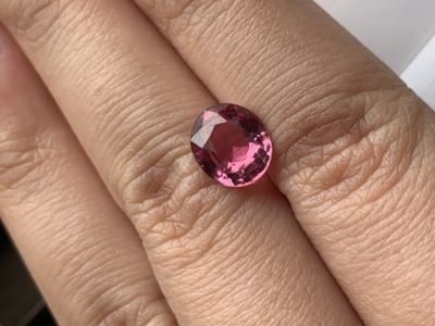
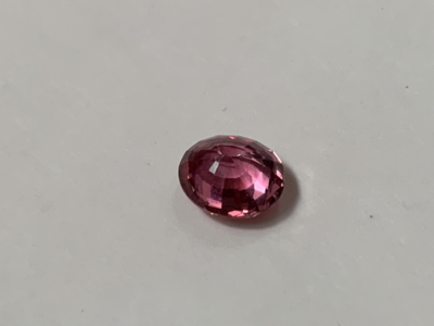
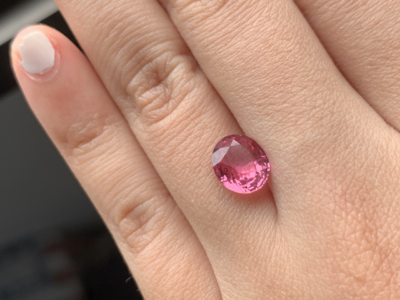
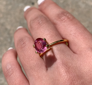
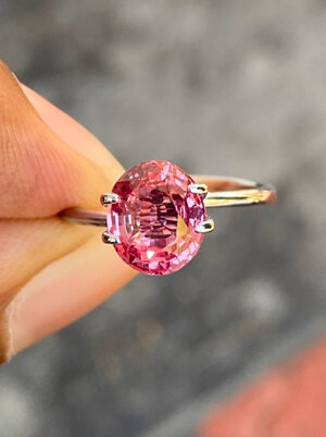
I had a bit of a shock when it arrived, as the gem seemed to be a little dark and turned out differently under slight variations of natural lighting. These are a few of the photographs I got for the same pad in natural daylight (all taken via iPhone X, without any edits). The darker gem photo was taken slightly further away from the window.
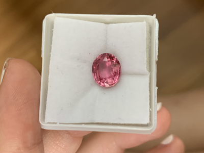
tempImageYdNTZe.pngtempImage6DfSta.pngtempImageDg3kFT.pngtempImageyTWsmz.png

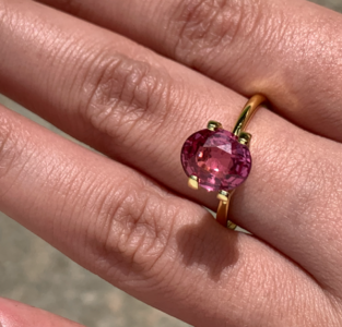
Even then, this photograph isn't entire accurate as this gem seems to be pinker than it looks in real life. This is a screen grab from a video of me wearing it - again, the colours are differently represented (no edits to the video as well).
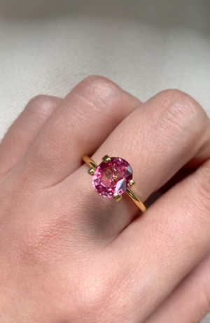
Screenshot 2021-11-19 at 1.34.14 PM.png

I seek the forum's collective knowledge on whether (i) this is an issue that happens with pads and (ii) whether I should keep this gem. I've only advanced part of the agreed price to the seller (who seemed quite earnest) and there is some room for negotiated returns; though I think I will have to bear the cost of the cert. Any views would be very much appreciated!
 
It looks pale pink to me, with a warm-ish pull. Not called a a "pad" by GRS, sounds like -- and they would make that call. They are not the pickiest of the labs, either, but they are reputable, imo.

Is it you or the vendor who refers to it a pad? I think it's a little sus to sell this as a pad when the report clearly indicates that it is not. Maybe that is the vendor's cover. But then they could also sell it as 10 cts because the report clearly shows it's 2.6 so you must have been aware of that at the time of purchase. :mrgreen2:

The color for pads can be moody, as you suggest. I have one that I never know what to do with, in part for that reason. I think they are among the hardest stones to buy. Seems to work well with your skin tone -- some of the more orange ones "disappear" on lighter skin.

Looks like a window under the table but I can not say for sure.

It is pretty -- and pretty good. It is also heated, a little undersaturated, perhaps windowed, not an actual pad, and an origin that would not command a premium. It all comes down whether you enjoy it more than you enjoyed having the dollars in your account. =)2

"Unedited" iPhone photos may bear little relation to what the gem looks like IRL. (There is a massive amount of editing taking place invisibly to you.) I infer it is even less saturated than this in person -- but I may be wrong. In fact, all of this may be wrong...
 
I have no insights other than that it looks beautiful and as @LilAlex wrote, seems nice on your skin tone. It looks gorgeous on your hand. I got a very small orangey one and it completely disappeared on my hand. Not at all nice and I instantly gave up on pads then and there. Same with light blue sapphires... beautiful to look at, but not on my skin... sad.
The real question is if you love it?
 

@LilAlex, @ acaw2015

Thanks very much, this is very helpful. My apologies - I must confess I forgot add the most important bit of information in the GRS Cert: it says "Natural Padparadscha" under the words "Natural Orangy-Pink Sapphire". Yikes!!

In real life, it's a tad darker and more saturated (veering off into the slight orange territory). It's a bit difficult to describe tones as we all see colours a little differently. All the photos that I posted were taken by me, not the seller.

I've been waiting quite patiently for a patch of sunlight to appear but so far it's been quite cloudy over here. (I suspect it might turn out differently under the strong sunlight). I feel like I just wandered off (unknowingly) into the deep end of gem buying!

As to whether I like it, I really can't decide because it was a bit of a shock to find such a moody gem (excellently put by @LilAlex)! Have decided to wear it for a bit to see how I feel about this gem.

---

Update - This is how it appears under the sun. To caveat, there are flashes of orange and lighter pink when I shift my hand but my iPhone can't seem to capture it at all.

Screenshot 2021-11-19 at 3.59.19 PM.pngScreenshot 2021-11-19 at 3.59.06 PM.png
 
Last edited:
Pictures show it as very pink on my monitor. For me, I would want the stone to show more orange, regardless of what the lab memo might state. The cut issue on the stone would be another strike against. As you said, it might perform better when the sun is out. Is the vendor from a sunny locale?
 
Would you still have reservations about liking the stone if it were not labeled a pad?
If it were priced without the pad label up charge - would it be more acceptable to you?
Does it ever go mauve or purplish to your eye? Or ever desaturate too much? Does this bother you?

If you don’t have a budget for top tier Padparadscha, you have to find out what you are willing to compromise on with no regrets, or just not at all.
Unfortunately - seeing a few in real life (and paying return costs) I think is what it takes to find out where your tastes are and lines in the sand are drawn of what you are willing to pay for.

Phone picture amping up pink in a sapphire isn’t uncommon. I just take 1000 shots to find one or two that happen to come out the same (or very similar) as what I see with naked eye. Delete the rest. :D
I’ve had a lab report pad in my hands before and also do own a pseudo-pad peach sapphire. So not as experienced as some who have fistfuls of pad experience - but do have some. They both were/are incredibly shifty. I feel that anything not top tier price will be shifty - and the lower priced you go, the colors it shifts to (or desaturates) gets less and less pink-orange, orange-pink, pinkish-orange, orangish-pink like.
A pink-orange stone that shifts to straight pink isn’t going to get a lab designation as a pad, but might be an incredible option for someone who loves the shift but doesn’t want to pay the pad price.
Looking for a pad without any window or even slight window, will need an increased budget by a substantial amount.

Getting wonderfully colored pictures that look nothing like these stones in real life is incredibly easy. And Frustrating!

I agree - the stone’s color as pictures show looks lovely on your hand - but if it doesn’t look that way to you in real life …..it’s hard to comment further

Edited to add- post the vendors pictures if you will?
 
Pictures show it as very pink on my monitor. For me, I would want the stone to show more orange, regardless of what the lab memo might state. The cut issue on the stone would be another strike against. As you said, it might perform better when the sun is out. Is the vendor from a sunny locale?
@chrono thanks! Yes - the vendor’s from Sri Lanka, so they get quite a bit of sun there.
 
Would you still have reservations about liking the stone if it were not labeled a pad?
If it were priced without the pad label up charge - would it be more acceptable to you?
Does it ever go mauve or purplish to your eye? Or ever desaturate too much? Does this bother you?

If you don’t have a budget for top tier Padparadscha, you have to find out what you are willing to compromise on with no regrets, or just not at all.
Unfortunately - seeing a few in real life (and paying return costs) I think is what it takes to find out where your tastes are and lines in the sand are drawn of what you are willing to pay for.

Phone picture amping up pink in a sapphire isn’t uncommon. I just take 1000 shots to find one or two that happen to come out the same (or very similar) as what I see with naked eye. Delete the rest. :D
I’ve had a lab report pad in my hands before and also do own a pseudo-pad peach sapphire. So not as experienced as some who have fistfuls of pad experience - but do have some. They both were/are incredibly shifty. I feel that anything not top tier price will be shifty - and the lower priced you go, the colors it shifts to (or desaturates) gets less and less pink-orange, orange-pink, pinkish-orange, orangish-pink like.
A pink-orange stone that shifts to straight pink isn’t going to get a lab designation as a pad, but might be an incredible option for someone who loves the shift but doesn’t want to pay the pad price.
Looking for a pad without any window or even slight window, will need an increased budget by a substantial amount.

Getting wonderfully colored pictures that look nothing like these stones in real life is incredibly easy. And Frustrating!

I agree - the stone’s color as pictures show looks lovely on your hand - but if it doesn’t look that way to you in real life …..it’s hard to comment further jury’s still out on this;
@Rfisher thanks for sharing your pad photography experience! And I’m heartened to know that I’m not the only one experiencing this … I took so many photos of the same gem today in my (failed) bid to communicate an accurate photograph of the colours!!

I picked a window pad as I was thinking of setting it in a more antique style; and these styles tend to have windowed gems. I acknowledge that it will cause the gem to lose more colour. This could be the trade off that I might make for the pad since I don’t own rings of this style (yet!)

I think the jury’s still out on whether I like the pad. It has a very serene shade of pink-orange (more pink than orange) under the afternoon light but seems to be missing some pad colours under other lighting (see the odd mauve one - which again isn’t an entirely accurate reflection of how it looks).
 
Last edited:
@Rfisher thanks for sharing your pad photography experience! And I’m heartened to know that I’m not the only one experiencing this … I took so many photos of the same gem today in my (failed) bid to communicate an accurate photograph of the colours!!

I picked a window pad as I was thinking of setting it in a more antique style; and these styles tend to have windowed gems. I acknowledge that it will cause the gem to lose more colour. This could be the trade off that I might make for the pad since I don’t own rings of this style (yet!)

I think the jury’s still out on whether I like the pad. It has a very serene shade of pink-orange (more pink than orange) under the afternoon light but seems to be missing some pad colours under other lighting (see the odd mauve one - which again isn’t an entirely accurate reflection of how it looks).

How does what you see in real life ( ever and taking into consideration color shifty- ness) compare to the vendors photos?
 
I'm surprised no one has mentioned the significant window. You can see straight through to the placeholder setting in the fifth photo. That would make it a no from me, unless I were quite confident about moving forward with a recut.
 
How does what you see in real life ( ever and taking into consideration color shifty- ness) compare to the vendors photos?

Hmm the vendors’ photos also edge towards the pink side. I requested a number of photos as they told me that it was difficult to capture the pad colour and had a con call with them (at high noon). however, I never got any with the mauve tone - even during the call. The colour veered towards pink. I think their photos to me were sent under very specific lighting conditions so they reflect the best possible colour. This was one of the bunch of photos I got from the vendor:

C690582E-3584-4FA9-80FD-7AF174379C2A.jpeg
 
I'm surprised no one has mentioned the significant window. You can see straight through to the placeholder setting in the fifth photo. That would make it a no from me, unless I were quite confident about moving forward with a recut.

The OP is aware of the window and chose it because the intention was to go for the antique style setting. It’s not stated but I imagine price is also factored in. There’s no point recutting anyway if the colour is not truly what is desired.

IMO it doesn’t sound like you love it, OP. So you should try again. However it may be tricky returning the pad to Sri Lanka. Pads are some of the hardest gems to buy, not to mention match with one’s skin tone, which is why I’ve never even tried.
 
I personally really like the color! I think it’s fantastic and a great size. But you have to love it :)
 
On my monitor this looks very dark pink and I can't see any hint of orange unfortunately. On that basis I would send it back because Pads hold a premium and it seems to me that labs are giving stones the designation when years ago they wouldn't have. Just my thoughts but I think you could find a nicer stone. However, if you love the moodiness of the stone and you feel it was a fair price then keep it.
 
I'm very grateful for all PS-ers' frank comments. You were right on the ultimate question being - whether I like this gem.

To update, I took the gem to a trusted gemologist and he confirmed it to be a pad. I think I was quite struggling for some time with the idea of not letting a "pad" go. A pad has always been one of the three gem types that I've wanted to acquire. And acquiring the first gem of this type felt a little bit special.

I've decided to trigger the refund, as, while it doesn't look too bad on me - it doesn't quite fulfil the combination of colours that I'm seeking in my ideal pad (i.e., something with a touch more orange). It is a little bit subjective, as there is some allowance for pads to be labelled as such within an acceptable window of pink/orange shades.

Fingers crossed for a smooth refund - as I've read some horror stories here of returns to/refunds from Sri Lankan sellers!
 
GET 3 FREE HCA RESULTS JOIN THE FORUM. ASK FOR HELP

Featured Topics

Top