Finally!
Rough_Rock
- Joined
- Jul 3, 2008
- Messages
- 70
First off, I am grateful to the PS community for all the informative - and civilized - discussion! It''s been a pleasure to read and learn from.
I''m fortunate to have a BF who wants me to have exactly the E-ring I want, within his budget. He said once I pick it out, he''ll get it for me.
Well - after looking for six months, learning what catches my eye, what I think looks good on my finger, etc., I still do not have a setting! I am clearly too picky.
Early on, I realized I like a sparkly RB, and I like the look of cathedral mountings. I like a four prong head. I like a setting to be around 6mm wide at the center stone, and taper toward the sides of the finger. I find knife-edged rings uncomfortable. That narrowed the field somewhat, but the choices were still overwhelming.
I learned I am attracted to tapered baguettes as accents since they give a little shine but don''t steal the focus from the "star attraction." However, I HATE the clumsy architecture I have seen underneath most baguette rings. That is to say, the side view stinks on nearly all of them. Most have baguettes too narrow for the 1.25 - 1.5 carat stone I hope to get. Proportion between baguettes and center stone is very important, as is the angle of the baguettes relative to it. Also, most baguettes are bar-set, which is fine, but many designs I''ve seen carry the bars out past the edge of the ring, which bothers me because...
I want to use my grandmother''s wedding band, which is 18k white gold without rhodium, and which she wore for so long against a 10k ring that it''s perfectly flat on one side. It''s about 1.5mm thick - I like that it''s "barely there". I also like the natural color of the metal. I was sad when I had it squeezed down to my size and it shined up.

It being a flat band, not curved, I narrowed my search to looking for a tapered baguette setting that would let it snug up flush. This is apparently very rare - most E-ring settings out there right won''t allow this. I can''t imagine why designers can''t consider function whilst dreaming up their works of art. Martin Flyer seems to use this as a selling point - but I can''t pay $4,000 or more for one of his settings! I want a big, beautiful sparkly thing IN the setting, so I''ve capped the setting cost at about half that.
I have also learned that I dislike pave and micropave, and, in general, bling. But I really like filigree! So I looked at a lot of antique settings, but I dislike that most cover the sides of the sparkly thing so you can''t enjoy its beauty from the side. And, of course, the heads stick out so that my WB won''t lay flush.
And if that weren''t enough, this past week I decided I like the ''tiny bit of two-tone'' look that Simon G and others are showing now.
I know for a fact my dream ring does not exist...
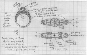
SO - I''m going custom!
* 18k white gold, no rhodium
* base ring of about 3.5 - 4mm, all the way around
* built on top of that, two "wings" that will swoop up toward the stone, cathedral-style, but will widen to about 6mm at the stone (allowing WB to snug up underneath!)
* Four 2.5mm x 4 x 1.25 tapered baguettes, VS1, G color - built onto the tops of the wings, bar-set but flush with the edges of the wings
* Yellow gold "scrolls" between the base ring and the wings, to support the wings and add visual interest from the sides, same width as the base ring
* Filigree "leaves and vines" pattern on 75% of surface of wings and base ring (bottom stays plain)
* "Tulip" four-prong pin head
* Hopefully a 1.25 - 1.5 carat, "H or better" color, AGS0 with medium-strong blue fluorescence!
I''ve seen the baguettes, and, though tiny, they were clear and white, appeared to have good symmetry, and greatly resembled each other.
My drawings have been sent out to the carver. I''m to see a wax in about a week, my custom jeweler says. I''ll get pics once it''s in, and post them.
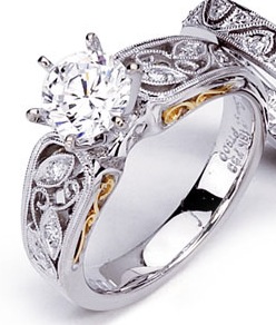
Here''s my inspiration pic for the filigree and "gold scroll" (Simon G).

I''m fortunate to have a BF who wants me to have exactly the E-ring I want, within his budget. He said once I pick it out, he''ll get it for me.
Well - after looking for six months, learning what catches my eye, what I think looks good on my finger, etc., I still do not have a setting! I am clearly too picky.
Early on, I realized I like a sparkly RB, and I like the look of cathedral mountings. I like a four prong head. I like a setting to be around 6mm wide at the center stone, and taper toward the sides of the finger. I find knife-edged rings uncomfortable. That narrowed the field somewhat, but the choices were still overwhelming.
I learned I am attracted to tapered baguettes as accents since they give a little shine but don''t steal the focus from the "star attraction." However, I HATE the clumsy architecture I have seen underneath most baguette rings. That is to say, the side view stinks on nearly all of them. Most have baguettes too narrow for the 1.25 - 1.5 carat stone I hope to get. Proportion between baguettes and center stone is very important, as is the angle of the baguettes relative to it. Also, most baguettes are bar-set, which is fine, but many designs I''ve seen carry the bars out past the edge of the ring, which bothers me because...
I want to use my grandmother''s wedding band, which is 18k white gold without rhodium, and which she wore for so long against a 10k ring that it''s perfectly flat on one side. It''s about 1.5mm thick - I like that it''s "barely there". I also like the natural color of the metal. I was sad when I had it squeezed down to my size and it shined up.

It being a flat band, not curved, I narrowed my search to looking for a tapered baguette setting that would let it snug up flush. This is apparently very rare - most E-ring settings out there right won''t allow this. I can''t imagine why designers can''t consider function whilst dreaming up their works of art. Martin Flyer seems to use this as a selling point - but I can''t pay $4,000 or more for one of his settings! I want a big, beautiful sparkly thing IN the setting, so I''ve capped the setting cost at about half that.
I have also learned that I dislike pave and micropave, and, in general, bling. But I really like filigree! So I looked at a lot of antique settings, but I dislike that most cover the sides of the sparkly thing so you can''t enjoy its beauty from the side. And, of course, the heads stick out so that my WB won''t lay flush.
And if that weren''t enough, this past week I decided I like the ''tiny bit of two-tone'' look that Simon G and others are showing now.
I know for a fact my dream ring does not exist...
SO - I''m going custom!
* 18k white gold, no rhodium
* base ring of about 3.5 - 4mm, all the way around
* built on top of that, two "wings" that will swoop up toward the stone, cathedral-style, but will widen to about 6mm at the stone (allowing WB to snug up underneath!)
* Four 2.5mm x 4 x 1.25 tapered baguettes, VS1, G color - built onto the tops of the wings, bar-set but flush with the edges of the wings
* Yellow gold "scrolls" between the base ring and the wings, to support the wings and add visual interest from the sides, same width as the base ring
* Filigree "leaves and vines" pattern on 75% of surface of wings and base ring (bottom stays plain)
* "Tulip" four-prong pin head
* Hopefully a 1.25 - 1.5 carat, "H or better" color, AGS0 with medium-strong blue fluorescence!
I''ve seen the baguettes, and, though tiny, they were clear and white, appeared to have good symmetry, and greatly resembled each other.
My drawings have been sent out to the carver. I''m to see a wax in about a week, my custom jeweler says. I''ll get pics once it''s in, and post them.
Here''s my inspiration pic for the filigree and "gold scroll" (Simon G).


300x240.png)