shape
carat
color
clarity

Cushion Selection - 2.04 H vs. 1.73 F - What do you think?

Status
Not open for further replies. Please create a new topic or request for this thread to be opened.

Pixie

Rough_Rock
Joined
Jan 20, 2006
Messages
95
Hi Everyone!

I’m getting closer to my new RHR! I’m very excited! Mark T. has sent me two cushion brilliants to compare. Here are the stats:

2.04 ct H VS1
8.06 x 7.29 x 4.92 (L/W 1.11)
D 67.5% T 56%
G Sl Thk F
C Med
P Ex S VG
F None

1.73 ct F VS1
7.91 x 6.73 x 4.58 (L/W 1.18)
D 68.1% T 53%
G Med - Thk F
C Med
P Ex S Ex
F None

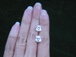
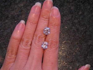
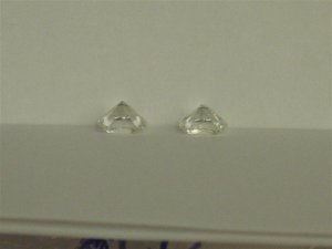
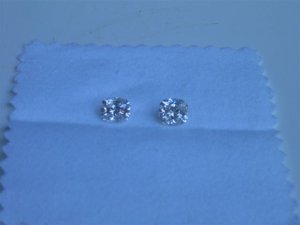
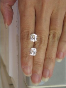
I’ve also attached some pictures although I had a hard time taking good ones and the lighting is not great. I thought this comparison was interesting. I can see a color difference between the two stones on white paper, but I have a hard time seeing the difference face up on my finger or in the temporary setting. When I look at each stone individually, I like the H better because I like the squarer look and also because I like the depth I see in the stone when I look into it (and it doesn’t hurt that it’s visually bigger!). I don’t know how to explain this besides using an analogy of looking into an asscher, which has a lot of depth to the look. The F seems to have sparkles that are a bit more random and doesn’t seem to have that feeling of depth, which I realize now that I prefer. I had a friend that lives in NYC see the diamonds before they were sent to me. She thought the color difference was very noticeable and sort of pushed the 1.73 ct one on me and said the H seemed “yellowish.” (Btw, she’s not a diamond person and has never been engaged.) She was really nice to help be my eyes, but now I’m just more confused! I do think the F looks very nice too. It does look slightly brighter with slightly brighter sparkles, but both are very sparkly and have lots of fire. Anyway, just looking for opinions to help me solidify my decision. I know, I should pick the one that I like better, but I just need a little more than that. Thanks as always!

Cushions 01.jpg
 
Please avoid looking at my unmanicured nails...

Cushions 02.jpg
 
Also, the price is fairly similar for these two diamonds.

Cushions 03.jpg
 
Almost done...

Cushions 04.jpg
 
Not the best application of lighting by the camera, but I thought I would post this anyway.

Cushions 05.jpg
 
The experts will have to chime in on the numbers, but visually I just like the look of the "fatter" stone better. Do you have any idea of the setting that you want?
 
ooooh - la-laaaaa! I''m in heaven! I adore both stones but I must admit that my eye is drawn more to the square-ish cushion. It’s just my personal opinion – it will also depend on your setting…do you have any idea???
 
In EVERY shot I like the fatter "H" better. Maybe I''m an "H" snob. Don''t see much of a color diff in the pix at least, only the "H" seems more "on", not to mention an awesome shape & chunkier. DELISH!

Which jumped out more when you opened the package? Have you tried all lights?

Ooooh exciting! They''re both gorgeous!
 
I prefer the look of the squarer stone, I just find it more visually pleasing. Also, if you can't tell much of a difference, with regards to colour, when comparing them side by side, I doubt you would notice a difference when wearing it. In terms of the setting you are choosing, would it sway you more towards one or the other? Both look like beautiful stones!

I wish you well,

Bridget
 
Date: 4/14/2006 11:34:02 PM
Author: decodelighted
In EVERY shot I like the fatter ''H'' better. Maybe I''m an ''H'' snob. Don''t see much of a color diff in the pix at least, only the ''H'' seems more ''on'', not to mention an awesome shape & chunkier. DELISH!

Which jumped out more when you opened the package? Have you tried all lights?

Ooooh exciting! They''re both gorgeous!
Me too!!! But they are both fabulous!!! How exciting. Good luck deciding.
1.gif
 
I prefer the more rectangular stone, in the pictures the sparkles look denser. However the other one is still very nice to look at. Either would be fantastic!!!!
 
Wow, thanks for all the responses already! I really do like the "fatter" shape as well. I think I''m still going to go with the Reena/Leon masterpiece for the setting. Even with all the talk about the current trend for simpler settings, I really do love that look. Reena''s stone was 1.1 L/W ratio, so very similar to the fatter H above.

I keep going back to, I really can''t see the color difference, especially when face up, and I can get a bigger size for the price, and I do love the look/shape of the H on its own. It''s the whole sacrifice a bit of color for size thing, and I feel a little like I''m getting a better deal, do ya know what I mean? I''m all about getting a deal, on whatever I''m buying, whether it''s a diamond or gas that''s 2 cents cheaper per gallon...
2.gif
 
Reena''s cushion is one of my favorites on PS. I can''t wait to see what you choose. I say, go for the bigger one!
 
Date: 4/15/2006 12:39:32 AM
Author: Pixie

... I really can't see the color difference, especially when face up, ....

Then, it soundslike one win-win sort of thing, right? The F looks a smidgen brighter in these picture, but the long-ish shape suggests sidestones rather then the halo sort of ring you mention.
5.gif
The square cushion would do great in one of those! It looks great on your hand already (the square one). (IMO).


Re. 'trend to simpler settings' - well... dunno about that. There should be loads of shoddy pave jewelry just starting to fall apart after about 1 year of wear
14.gif
as a result of the 'trend'. Finely made pave has never been trendy - just rare, expensive and difficult to come by. It still is all of that, IMO. Even if pave fades out of fashion jewelry as any other style does every couple of years, it would be unthinkable to see it out of fine jewelry where it staid on for a century or so already.
 
I love the squarish one. I''m a bit biased because that''s what I am going with also. It just has more charm and a substance to it. It will look great with a halo.
 
The amazing variety of shapes & appearance of cushions and other fancies made me think of a weird analogy ...

Round Brilliants are like New Construction ... good maker, good product, guaranteed performance.

Fancies are like looking at Old Houses. They could be weird, funky, or transcendent. Ya never know what you''re gonna find. Ya just have to fall in love & hope for the best! (And ideally consult a good independent "inspector")
 
Deco - Love the analogy! And as a realtor I have to point out that a lot of new construction I see lately is frankly just crap -- which adds even more to your line of thinking here!
 
I vote for the H!!!
30.gif


I definitely prefer the shape (and size!) and I seen little to no difference in color. The F *maybe* has a slightly better light return, but not enough that I think the decision should rest on that.

I also agree with Ana that the H will look better in a halo.
 
Thanks everyone! You''ve made my decision easier for me. I really had my heart set on the H when I opened the boxes, primarily because I loved the shape of it, but my friend put some doubts in my head. She asked me which one I picked and just seemed so surprised that I would pick the H among her other comments. Now I feel better to just go with the one that I really like regardless of the "colorless" grade on a certificate because it is so subtle of a difference. Thanks to all of you and your discussions on color. (I loved the Sacrifice Color for Size Thread and am still craving lemon pie, just found out last week that I''m preggers with #2, so the cravings will only get stronger...) I probably would not have considered an H before, but you''re all right about how small the differences are. And with the lack of selection of well cut cushions, you really need to broaden your requirements or the wait is a long one. I''ll send them both back to Mark T. today and start the setting process soon! Yeah!
 
Status
Not open for further replies. Please create a new topic or request for this thread to be opened.
GET 3 FREE HCA RESULTS JOIN THE FORUM. ASK FOR HELP
Top