shape
carat
color
clarity

Critique my invitations

Status
Not open for further replies. Please create a new topic or request for this thread to be opened.

basil

Brilliant_Rock
Joined
Jun 27, 2006
Messages
1,528
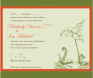
Here are the pdf mock-ups my invitation designer sent...They aren''t quite what I was hoping for but I can''t quite put my finger on it.

A few things I know I want to change - the script font (makes "Ian" look like "Jan"), the text color (should match the dark green of the pocketfold), and something about the layout of the flower design.

The flower design is a trillium that my grandmother drew and was used on my mom''s wedding invitation. So we had asked it to be incorporated, because it is really important to my mom. But it just doesn''t seem to fit in it''s current positioning. Any suggestions?
invitationroughdraft01.jpg
 
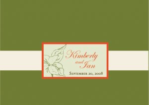
Here is the front of the pocketfold. The colors are very muted in the pdf but the paper samples are more vibrant in real life.

invitationsroughdraft02.jpg
 
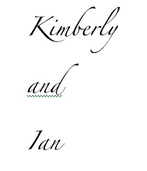
An example of the font I might like to use? Not sure.

zapfino764.jpg
 
Wow! I am really not that good at criticizing, much better at complementing, so I''ll do what I do best! I love them. I love that your grandmother drew the flower and that you are able to incorporate in your invitations. That is so special. The colors are really lovely. Maybe the flower can be made slightly larger to fill in the extra "white space" and then it will seem more cohesive?? It definitely works much better and is more more cohesive on the front of the pocketfold.

Very very beautiful. I would definitely save that invitation if I were to receive it!!
36.gif
 
They really are very pretty... but ( I am sorry) a bit difficult to read

They seem to be choppy... I would try putting the flower to the left and print to the right

Can you fill the flower in more? The art work is beautiful... I hope I didn''t offend you
 
Or maybe the layout could be change so that the text fills in the white space and sort of surrounds the flower?
 
These are my thoughts... I love the invitations as well. I like the orange of the font in that it adds more color to the invite, but I think the names would go better in green because it''s darker and bolder.

Your grandmother is a lovely artist! I see what you mean about the flower, though, it does seem to be "tacked on" a bit. I can''t do any editing of the invite from where I am, but I''m going to use some examples from Wedding Paper Divas.

Your invite currently matches the style of this one, where the art is off to the side...

Style # 1

Would you want it more incorporated like this one?

Style # 2

Or in the background instead?

Style #3

Or in a completely different position?

Style #4

I''m wondering if any of these appeal to you more...
 
Thanks for the replies!

LovesVintage - Thanks! I think the flower design does have to be larger. There is too much empty space.

crystalheart - Not offended at all! They are not my work, so I have no emotional investment...and I asked for feedback! I think part of the problem with the readability is that they are very small and very compressed. I will have to check the font size she used though to make sure it is generally legible (I think the text font is "copperplate").

xiuying - I think I like the style where the text is overlapping the design. Maybe I will ask her to try a sample that way. I wonder if she can blow up just the flower part of the design like she has done for the front, and just use that.
 
I love the idea of them (and what to steal it for my own) but I would absolutely make the font changes and work on the flower placement a little. But they are on their way to be one of my favorite invites on here.

Is it bad that I like them better than mine. LOL?
 
Lovely Invites!!
My only suggestion would be to flip the flower image so it leans to the right instead of the left.

The font is totally a personal choice. I Personally like the flow-y-ness of font, but it''s not for everyone.
 
Date: 4/30/2008 11:47:33 AM
Author: ~*Snow*~
My only suggestion would be to flip the flower image so it leans to the right instead of the left.
That was my first thought, as well.

I love the colors!!!!
 
Date: 4/30/2008 11:26:26 AM
Author: Gypsy
I love the idea of them (and what to steal it for my own) but I would absolutely make the font changes and work on the flower placement a little. But they are on their way to be one of my favorite invites on here.

Ditto!
 
Thanks!

Gypsy, you can totally have my invitations if you want them, but I think your looked fabulous too!

I just emailed her about doing a design with only the flower part of the design instead of the whole stem/grass thing. I think it bothers me that it kind of randomly cuts off halfway across the page. I am looking forward to what she comes up with!
 
Status
Not open for further replies. Please create a new topic or request for this thread to be opened.
GET 3 FREE HCA RESULTS JOIN THE FORUM. ASK FOR HELP
Top