shape
carat
color
clarity

Choices choices...

Which option for three stone setting?

  • Option 1

    Votes: 21 70.0%
  • Option 2

    Votes: 9 30.0%

  • Total voters
    30

Dreamer_D

Super_Ideal_Rock
Joined
Dec 16, 2007
Messages
25,241
So for those of you not bored with me yet ;)) ...

I have narrowed my three stone setting options to two choices. This is for my 1.67ct center and two .35ct side stones. Not a "forever" setting, I don't think I believe in those 8)

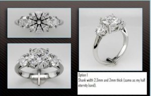
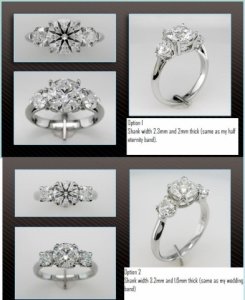
Option 1 (photo is of the same stone proportions as I will get): Cost: ~$1450 in 14k wg. Pros: Love the three prongs on the side stones; shank matches the width and thickness of my half eternity band; thinner shank makes the stones look bigger. Cons: Semi-custom, so 20% restocking fee if I don't like it; 14k gold is what I can afford, and even then it is $200 more than Option 2 (18k is +$800 compared to Option 2!), but my half eternity is 18k; would need a new gold wb to match its profile; too plain?

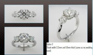
Option 2 (photo is smaller stones -- 1.3ct center, .50cttw sides -- I could not get one with my proportion stones): Cost: ~$1250 in 18k wg. Pros: 18k gold is stock; Love the swoopy but not *too* swoopy baskets; nice low stance; rounded shank is my preference esthetically, matches my gold wb that I love. Cons: 4 prongs on side stones, does it look too boxy?? profile does not match my half eternity, will be *slightly* noticable lower to the hand.

Thoughts?

Also, what do you think about going with rose gold? I would need a new wb and it would not match my half eternity, but it would be unique, which I want...
dreamer_threestoneoptions.jpg
 

Dreamer_D

Super_Ideal_Rock
Joined
Dec 16, 2007
Messages
25,241
That is really small, maybe this will be bigger.

dreamer_threestoneoptions1.jpg
 

Dreamer_D

Super_Ideal_Rock
Joined
Dec 16, 2007
Messages
25,241
And bigger.

dreamer_threestoneoptions2.jpg
 

diamondseeker2006

Super_Ideal_Rock
Premium
Joined
Jan 11, 2006
Messages
58,547
I think you may need to post the profile view of #2. Is it the w-prong?

I am going to say that the profile is better on #1 and it looks better overall to me.
 

Dreamer_D

Super_Ideal_Rock
Joined
Dec 16, 2007
Messages
25,241
diamondseeker2006|1304653481|2913675 said:
I think you may need to post the profile view of #2. Is it the w-prong?

I am going to say that the profile is better on #1 and it looks better overall to me.

It is the w-prong, if you look at Belle's link there are a tonne of profile shots! :))
 

slg47

Ideal_Rock
Joined
Apr 4, 2010
Messages
9,667
which one is the first setting?

also have you tried on settings in the different widths with your wband and eternity band?
 

Dreamer_D

Super_Ideal_Rock
Joined
Dec 16, 2007
Messages
25,241
slg47|1304654234|2913683 said:
which one is the first setting?

also have you tried on settings in the different widths with your wband and eternity band?

It does not have a name, it is custom. A variation on the trois brillent (stock won't fit my size sides, so I liked this semi-custom one better).

My half eternity looks good with a 3mm or a 2.3mm. WB is 3mm so would match Option 2 perfectly. But neither is my original wb, I am not attached to them, just like them, and like the lines of the 3mm comfort fit wb I already own.
 

yssie

Super_Ideal_Rock
Premium
Joined
Aug 14, 2009
Messages
27,242
Ohh I like both!!


Actually... I am loving the idea of #1 in 14k rose gold... a *lot*. It would be pinker than 18k - which I like, the colour would fit perfectly with the bold and modern design. And since the setting is so minimal in actual design - from face-up and from the sides - you wouldn't have to worry about it overwhelming the stones, or making the stones look smaller (not that that's really a concern w/ a 1.6er :cheeky: ) and I think the pink shank would make your diamonds look even bigger, no? Because the colour would blend into your skin more than white metal, so your eyes would see the stones and just stop looking right there, and not continue down to the width of the shank...

I like the Wprong too - it is classic with just a bit of unique, but I would do it in white - it's busier, and I would worry about pink being too much - striking colour + striking design + busier design face-up = overwhelmed sidestones


ETA: are we talking potentially pink prongs too, or just the shank?
 

slg47

Ideal_Rock
Joined
Apr 4, 2010
Messages
9,667
ooh I like both. I really like the three prong on the sides in the 1st one. As far as metals I would stick with WG since it will match your eternity band and wedding band.
 

Gypsy

Super_Ideal_Rock
Joined
Aug 8, 2005
Messages
40,225
I like Slg's three stone the best in terms of design. I know that doesn't help much, but have you inquired about that design?
 

Dreamer_D

Super_Ideal_Rock
Joined
Dec 16, 2007
Messages
25,241
Gypsy|1304655694|2913702 said:
I like Slg's three stone the best in terms of design. I know that doesn't help much, but have you inquired about that design?

I do love that design, and I have not looked into it. It is very similar to my EC three stone setting that I loved a lot. I will ask BGD about it!
 

marcy

Super_Ideal_Rock
Premium
Joined
Feb 27, 2007
Messages
26,275
I voted for #1. I think it would look great in rose gold. I can't wait to see what you get.
 

slg47

Ideal_Rock
Joined
Apr 4, 2010
Messages
9,667
Dreamer_D|1304656563|2913708 said:
Gypsy|1304655694|2913702 said:
I like Slg's three stone the best in terms of design. I know that doesn't help much, but have you inquired about that design?

I do love that design, and I have not looked into it. It is very similar to my EC three stone setting that I loved a lot. I will ask BGD about it!

aww thanks guys!

I think it is a great design myself :)
 

Dreamer_D

Super_Ideal_Rock
Joined
Dec 16, 2007
Messages
25,241
Yssie|1304654609|2913688 said:
Ohh I like both!!


Actually... I am loving the idea of #1 in 14k rose gold... a *lot*. It would be pinker than 18k - which I like, the colour would fit perfectly with the bold and modern design. And since the setting is so minimal in actual design - from face-up and from the sides - you wouldn't have to worry about it overwhelming the stones, or making the stones look smaller (not that that's really a concern w/ a 1.6er :cheeky: ) and I think the pink shank would make your diamonds look even bigger, no? Because the colour would blend into your skin more than white metal, so your eyes would see the stones and just stop looking right there, and not continue down to the width of the shank...

I like the Wprong too - it is classic with just a bit of unique, but I would do it in white - it's busier, and I would worry about pink being too much - striking colour + striking design + busier design face-up = overwhelmed sidestones


ETA: are we talking potentially pink prongs too, or just the shank?

OK, I just showed DH some pics of the rose gold settings on PS -- in particular this one here: https://www.pricescope.com/forum/show-me-the-ring/pretty-in-pink-bgd-5-stone-u-prong-t140376-60.html And he loved it! I do to... and I think you are right about the rg making the stones look bigger, and possible whiter because of the contrast.

My thought would be all rg like the picture in the link... do you think it would make the stones look more tinted?? Lux's ring is J stones and they look delicious to me. But I don't know how pink would affect things? On BGDs site all the rg settings have plat heads. But I sort of think that is a waste because if I got rg I would want to really *see* it, KWIM?

BTW Yssie, how do you think your setting would look with my size center? I love your ring, but think it might look to smooshed with my smaller center stone.
 

slg47

Ideal_Rock
Joined
Apr 4, 2010
Messages
9,667
oh I think yssie's ring would be GORGEOUS, and I think it would work with your size center stone
 

Dreamer_D

Super_Ideal_Rock
Joined
Dec 16, 2007
Messages
25,241
slg47|1304658476|2913728 said:
Dreamer_D|1304656563|2913708 said:
Gypsy|1304655694|2913702 said:
I like Slg's three stone the best in terms of design. I know that doesn't help much, but have you inquired about that design?

I do love that design, and I have not looked into it. It is very similar to my EC three stone setting that I loved a lot. I will ask BGD about it!

aww thanks guys!

I think it is a great design myself :)

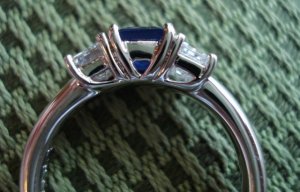
Here is the profile of my old diamond and sapphire three stone. Ignore the fact that it is too chunky, it was not a very good bench, but the lines are a lot like yours slg! I admit, I miss this ring. The shank is sheer perfection in terms of comfort -- it is about 3mm tapering to 2mm and heavy domed comfort fit. I am tempted to go more custom and send this setting along to say -- "Make the shank like this!!" because it is that comfortable to wear.

ddthreestoneoriginal.jpg
 

Gypsy

Super_Ideal_Rock
Joined
Aug 8, 2005
Messages
40,225
I'd look into slg's design Dreamer, it's the one I would get if I were in the market for a three stone. Also BGD makes your Dream band, and if you want to wear them together they will be able to advise you on how to avoid rubbing issues, etc.
 

dani13

Ideal_Rock
Joined
Nov 12, 2004
Messages
6,183
Hi DD!!

I love the first design you posted! I also love RG, but I wonder if you will tire of it easily for your everyday ring? I guess that's a question only you can answer, but no matter what, I know whatever you choose will be amazing! Can't wait to see what you get!!!! :appl:
 

yssie

Super_Ideal_Rock
Premium
Joined
Aug 14, 2009
Messages
27,242
Well - I'm obviously biased, but I don't think a 1.6 would be at all squished in my setting - I wouldn't put anything under say 5.5mm-ish in there. It would definitely be a naturally busier look than something like slg's - hers is all simple clean lines like your old setting (and I'm thinking would look fabulous in pink too ::) )

I'm thinking about whether rose gold head/prongs would make your Js look more tinted... my instinct says no: your stone is well cut, is ultimately only a J, and from what I understand it looks very white face-up even for a J of its size.. I think if it was creamy enough to be called light yellow then a light yellow stone could be tough to distinguish from peachy pink metal, w/ the colours kinda playing off each other, BUT I think there would be a pretty clear delineation between *white* and peachy pink - they'd contrast, like you said. It's another reason I prefer the 14k though, just to be safe - a pinker alloy can only increase the contrast (vs the more orangey 18k)
 

steph72276

Ideal_Rock
Joined
Mar 16, 2005
Messages
4,212
I love the first option. If it were me, I would personally keep saving the additional $800 and get it in 18k wg and wear your same wedding band with it.
 

bright ice

Ideal_Rock
Premium
Joined
May 14, 2010
Messages
4,328
I vote #1. Very clean and classic look plus I like the 3 prongs on the side stones better. That is one of the reasons I am resetting my center stone.
 

yennyfire

Ideal_Rock
Trade
Joined
Jun 6, 2010
Messages
6,872
I think that option 1 in rose gold would be gorgeous! Can't wait to see the finished product!
 

diamondseeker2006

Super_Ideal_Rock
Premium
Joined
Jan 11, 2006
Messages
58,547
I would love a rose gold ring, but I think I would get tired of it if it was my primary e-ring. I think #1 would look best in white metal. If you do go with rose gold, I'd go for a more romantic, swoopy design such as slg's or yssie's. The other reason I'd stick with white is because you already have wedding bands to go with it.
 

Lula

Ideal_Rock
Joined
Apr 5, 2009
Messages
4,624
I voted #1, because the classic three-stone basket setting is one of my favorites. I like the look of platinum or white gold prongs with a yellow gold or rose gold band, but that's just my preference. From your description of your bands, it sounds like white gold would be the better choice - unless you want a change. If so, go for the rose gold! Then you can get a rose gold watch :love: !! But I am a serial-setter, so take my advice with a grain of salt!
 

MissGotRocks

Super_Ideal_Rock
Premium
Joined
Jun 23, 2005
Messages
16,270
diamondseeker2006|1304683943|2913825 said:
I would love a rose gold ring, but I think I would get tired of it if it was my primary e-ring. I think #1 would look best in white metal. If you do go with rose gold, I'd go for a more romantic, swoopy design such as slg's or yssie's. The other reason I'd stick with white is because you already have wedding bands to go with it.

Just this - exactly! Love the clean lines of #1 too!
 

slg47

Ideal_Rock
Joined
Apr 4, 2010
Messages
9,667
Dreamer_D|1304659075|2913734 said:
slg47|1304658476|2913728 said:
Dreamer_D|1304656563|2913708 said:
Gypsy|1304655694|2913702 said:
I like Slg's three stone the best in terms of design. I know that doesn't help much, but have you inquired about that design?

I do love that design, and I have not looked into it. It is very similar to my EC three stone setting that I loved a lot. I will ask BGD about it!

aww thanks guys!

I think it is a great design myself :)

Here is the profile of my old diamond and sapphire three stone. Ignore the fact that it is too chunky, it was not a very good bench, but the lines are a lot like yours slg! I admit, I miss this ring. The shank is sheer perfection in terms of comfort -- it is about 3mm tapering to 2mm and heavy domed comfort fit. I am tempted to go more custom and send this setting along to say -- "Make the shank like this!!" because it is that comfortable to wear.

ok well this gets my vote! a less chunky version :) if you say it is super comfortable then that is what I would go with :)
 

Haven

Super_Ideal_Rock
Joined
Feb 15, 2007
Messages
13,166
I really love slg's three stone in terms of design. ETA: I think your sapphire ring is similarly beautiful, too.

I also love the idea of rose gold for your setting, but of course I just had a rose gold ring made so I suppose I'm still in that goggle-eyed-can't-imagine-anything-else phase of the recently converted.

As for which metal to use for the prongs, I wanted to pop in and share what I've noticed about my ring. The shank is 18K rose gold, the prongs are platinum. I opted for platinum prongs simply because I wanted the extra security of platinum prongs since the design is so delicate, but they have added an unexpected element to my ring: The stone really looks like it's just floating on my hand. The prongs are barely noticeable, in fact I don't see them unless I look for them, so that just highlights the stone even more, and adds to the floating effect.

My 14K RG twist band is more noticeable on my hand than the 18K because the 14K doesn't "match" my skin tone as well, so I'm not sure if this effect would be as strong if my diamond ring had been made in 14K RG. I think the matter of 14K vs 18K really comes down to personal preference. I like the rosier tint to the 18K, whereas the 14K is much more pink. That being said, the difference is really not *that* big. I just have two rings sitting on my hand side-by-side, so it's pretty apparent to me when I look at the two rings together.

As for the business of the profile, I've also noticed that while my ring has a super intricate and busy design, it's not very noticeable unless I really tilt my hand forward to purposely take a peek under her skirt. Otherwise, it looks like a plain solitaire with a small split crown. This is probably because the stone is set so low, so I'm not sure if the effect would be different in your three-stone, but I wanted to throw that in there, as well. The ring does not look busy at all, even from the side. I wonder if the swoopiness of the 2nd setting option would be similarly hidden in your ring.
 

Dreamer_D

Super_Ideal_Rock
Joined
Dec 16, 2007
Messages
25,241
Haven, I think I like the 18k rose gold better than the 14k, as the pink hue is not my preference, but rather something a little more peachy than yelow gold. I like the way yellow gold looks on my hand quite a bit, but it is a little "stark" which is why I am thinking 18k rose gold might be a good fit for me. But I will try and see some in person to see how I feel about it.

And I think you are correct about the undergallery being a little "invisible" most of the time! Especially when you add a wb, which I think I will want to wear.

I have a lot more thinking to do. I am wondering now if I need to go a little more custom to get something that meets all my desires.
 

Haven

Super_Ideal_Rock
Joined
Feb 15, 2007
Messages
13,166
I tried on a lot of rose gold before I decided on the 18K. I originally thought I'd prefer a pinkier hue, but when I saw the 18K on my hand I knew that was what I wanted. Now I look at my platinum wedding band and can't believe how much platinum does not compliment my skin tone.I wear a yellow gold ring from my grandmother, and love the way it looks on my skin, and the rose gold is even better because, as you said, it isn't as stark of a contrast.

Whatever you end up doing, this ring is going to be beautiful! I'm really excited to see what you choose.

After we finalized the design, I spent a lot of time second-guessing my choice to go with rose gold and was actually close to shaking a bit wen we went in to see the ring for the first time. I worried that it would look like costume jewelry, or it would just be too "out there" for an everyday ring. But then I saw it, and I put it on my hand, and it was love. As I said, it really looks like my diamond is floating on my finger, and the rose gold doesn't look nearly as outrageous as I imagined it would be. The words people most often use to describe my new ring are "romantic" and "elegant." I really think that's the rose gold talking!
 

Laila619

Super_Ideal_Rock
Premium
Joined
Apr 28, 2008
Messages
11,676
For a three stone, definitely option one!!! I much prefer 3 prongs around the side stones as opposed to four. I think with the four prongs around the side stones, they almost look like princess cuts.
 
Be a part of the community Get 3 HCA Results
Top