GemView
Shiny_Rock
- Joined
- Jul 25, 2005
- Messages
- 225
Last week a two-year weight dropped off my shoulders. I finally found a wedding/e-ring setting I feel I can live with for the rest of my life!

It's a long story, but I'll try to recap as best I can since I haven't posted much so far this year. I first found Pricescope after my fiancé placed a diamond on layway. I wanted to know if we were getting a fair price and began to search the Internet for info. That's when I found the friendly folks at PS, all these gorgeous rings to drool over, and an invaluable educational resource. (Thank you Pricescope!
 )
)
Fortunately, despite locating PS a bit late into the purchase process, my eyes didn't lead me too far astray. So despite purchasing at a B&M (jewelry mart), and despite the EGL USA cert "ideal plus", I lucked out. Plugging the specs from the cert into the HCA, it came to a ~1.5. Gary said the diamond would make a better pendant than ring, but so far I haven't spent a single day regretting that purchase. It sparkles plenty for me!
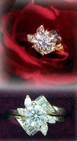
What I did come to regret, and regret BIG, was the setting we originally purchased. I chose it for its floral appearance. It was an interlocking set in yellow gold with what I though was an attractive and unique look. But in our emphasis on selecting a diamond, I made my setting choice in haste. Big mistake. I ended up with an F/SI1 1.04 carat round brilliant for a center stone, and the owner assured me that the stones in the setting she sold us were "GH" in color. Under the store lights the problem wasn't all that apparent. And unlike the diamond, we didn't spend much time outside the store scrutinizing the setting. Yet once the center stone was set and I began to live with the ring on a daily basis, the color difference really began to stand out. I'm not sure if the grade was off — the side stones photographed okay but in real life looked more like K-L color stones next to my J color diamond studs — or if it was just the yellow gold setting reflecting on the side stones. Whatever it was, it really began to nag at me. Finally, I got up the nerve to tell my fiancé that I wished to replace the setting. This time, not wanting to make the same mistake, I spent countless hours browsing PS and over a year looking at the local B&Ms on and off.
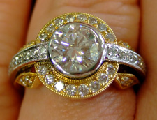
In the process of looking for a replacement setting, I made two false starts. You see, the problem with me is that I've spent years collecting RHR and was having a hard time moving my expectations to something more suitable for a wedding/e-ring. Making matters worse, I love ALL kinds of jewelry — from modern and sleek to antique looking and intricate (filigree, engraving, etc.). Consequently, I ALMOST chose a two-tone bezel set ring with a halo, pictured below, but I hesitated just a enough to stop by PS for an opinion.
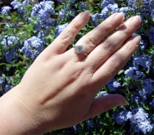
Upon viewing the pictures, most agreed that it would look OK as a RHR, or in single tone, but as an engagement/wedding ring it looked too big (like a "cocktail ring"). Next, I decided on a Tiffany Etoilé reproduction I saw in another jewelry mart. The deposit was made and the order was placed for a slightly modified two-tone look (white bezel, gold band). Needless to say, going custom wasn't for me. I started losing sleep wondering exactly what I would be getting. When, at last, I received the call that the ring was ready, I found that the result didn't look much like a Tiffany Etoilé. The designer had narrowed the band to make it more feminine — probably a good thing since I have very short fingers and the wide Etoilé style, as much as I love it, wouldn't have flattered them. It was a gorgeous band — better in some ways than what I had considered — but as I looked at it on my finger I experienced a familiar sense of hesitation. By now I realized that there would be trouble down the line if I just ignored my initial reaction. So we cut our losses — we'll probably end up using it for a RHR or selling it on Ebay — and resumed the search.
And that's when I found IT.
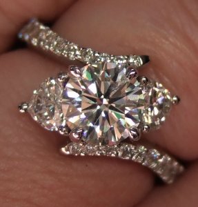
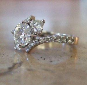
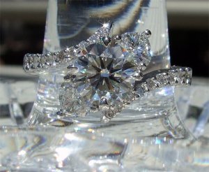
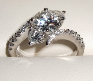
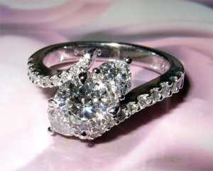
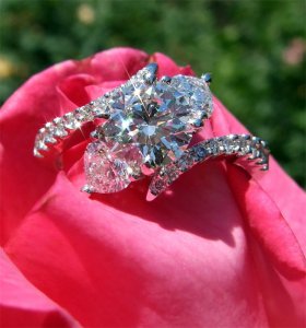
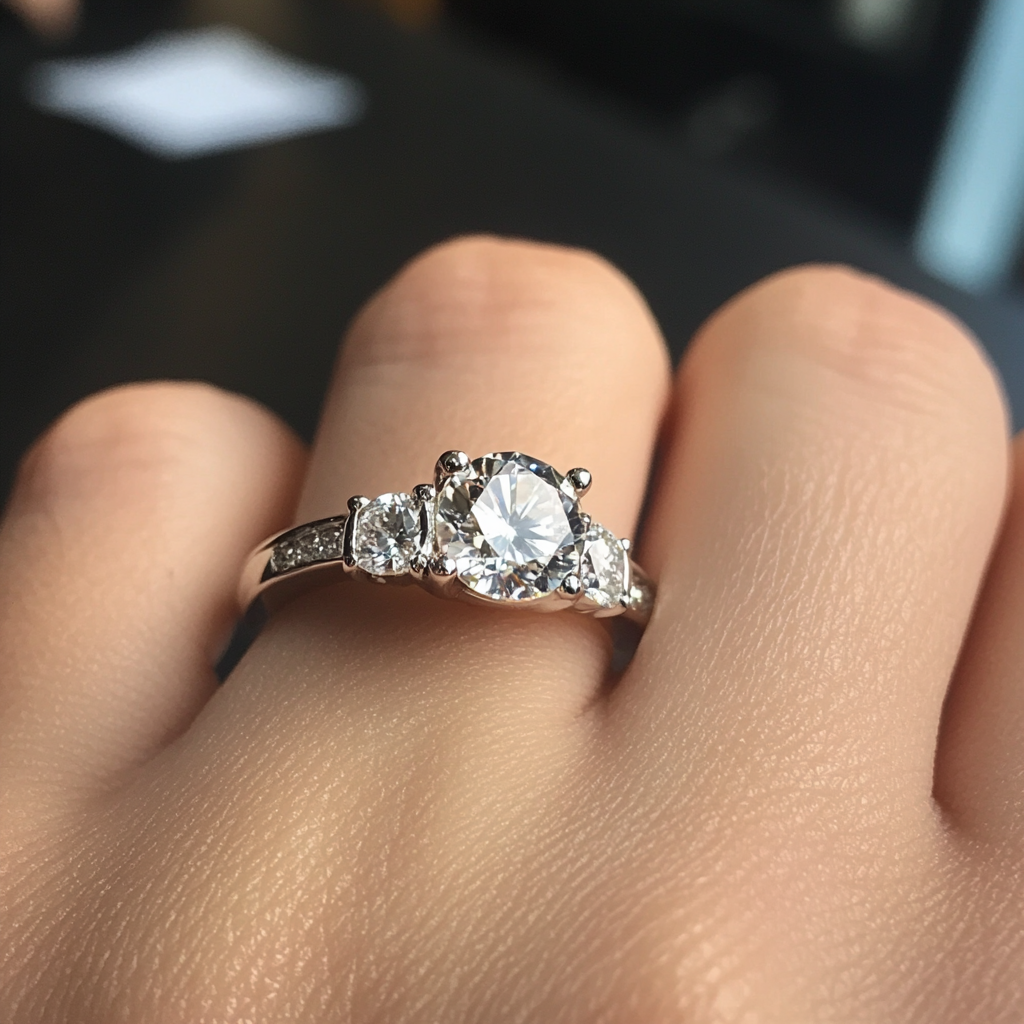
I always liked bypass style rings, three stone rings and heart shapes and my new setting combines all these elements.
So without further ado, here are the before, almost and after photos.
Original Setting (originally posted in Eye Candy folder):

It's a long story, but I'll try to recap as best I can since I haven't posted much so far this year. I first found Pricescope after my fiancé placed a diamond on layway. I wanted to know if we were getting a fair price and began to search the Internet for info. That's when I found the friendly folks at PS, all these gorgeous rings to drool over, and an invaluable educational resource. (Thank you Pricescope!

Fortunately, despite locating PS a bit late into the purchase process, my eyes didn't lead me too far astray. So despite purchasing at a B&M (jewelry mart), and despite the EGL USA cert "ideal plus", I lucked out. Plugging the specs from the cert into the HCA, it came to a ~1.5. Gary said the diamond would make a better pendant than ring, but so far I haven't spent a single day regretting that purchase. It sparkles plenty for me!
What I did come to regret, and regret BIG, was the setting we originally purchased. I chose it for its floral appearance. It was an interlocking set in yellow gold with what I though was an attractive and unique look. But in our emphasis on selecting a diamond, I made my setting choice in haste. Big mistake. I ended up with an F/SI1 1.04 carat round brilliant for a center stone, and the owner assured me that the stones in the setting she sold us were "GH" in color. Under the store lights the problem wasn't all that apparent. And unlike the diamond, we didn't spend much time outside the store scrutinizing the setting. Yet once the center stone was set and I began to live with the ring on a daily basis, the color difference really began to stand out. I'm not sure if the grade was off — the side stones photographed okay but in real life looked more like K-L color stones next to my J color diamond studs — or if it was just the yellow gold setting reflecting on the side stones. Whatever it was, it really began to nag at me. Finally, I got up the nerve to tell my fiancé that I wished to replace the setting. This time, not wanting to make the same mistake, I spent countless hours browsing PS and over a year looking at the local B&Ms on and off.
In the process of looking for a replacement setting, I made two false starts. You see, the problem with me is that I've spent years collecting RHR and was having a hard time moving my expectations to something more suitable for a wedding/e-ring. Making matters worse, I love ALL kinds of jewelry — from modern and sleek to antique looking and intricate (filigree, engraving, etc.). Consequently, I ALMOST chose a two-tone bezel set ring with a halo, pictured below, but I hesitated just a enough to stop by PS for an opinion.
Upon viewing the pictures, most agreed that it would look OK as a RHR, or in single tone, but as an engagement/wedding ring it looked too big (like a "cocktail ring"). Next, I decided on a Tiffany Etoilé reproduction I saw in another jewelry mart. The deposit was made and the order was placed for a slightly modified two-tone look (white bezel, gold band). Needless to say, going custom wasn't for me. I started losing sleep wondering exactly what I would be getting. When, at last, I received the call that the ring was ready, I found that the result didn't look much like a Tiffany Etoilé. The designer had narrowed the band to make it more feminine — probably a good thing since I have very short fingers and the wide Etoilé style, as much as I love it, wouldn't have flattered them. It was a gorgeous band — better in some ways than what I had considered — but as I looked at it on my finger I experienced a familiar sense of hesitation. By now I realized that there would be trouble down the line if I just ignored my initial reaction. So we cut our losses — we'll probably end up using it for a RHR or selling it on Ebay — and resumed the search.
And that's when I found IT.
I always liked bypass style rings, three stone rings and heart shapes and my new setting combines all these elements.
So without further ado, here are the before, almost and after photos.
Original Setting (originally posted in Eye Candy folder):





300x240.png)