Jonathan at GOG has three beautiful Asscher stones to choose from and I''d like to see what people think about them. Thanks!
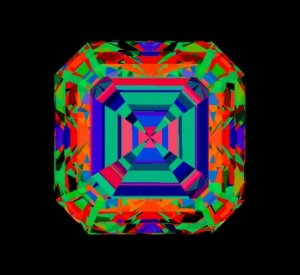
Stone 1 - 0.92ct
Color: G
Clarity: VS1
Polish: Excellent
Symmetry: Very Good
Fluorescence: Negligible
Width: 5.36mm
Length: 5.40mm
Depth: 3.72mm
Table Percentage: 63.64%
Depth Percentage: 69.40%
Crown Depth: 17.52%
Pavilion Depth: 45.98%
Photo
Full Details
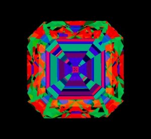
Stone 2 - 1.01ct
Color: H
Clarity: VS1
Polish: Excellent
Symmetry: Very Good
Fluorescence: Negligible
Girdle: 3.54%
Width: 5.51mm
Length: 5.52mm
Depth: 3.87mm
Table Percentage: 63.21%
Depth Percentage: 70.15%
Crown Depth: 19.04%
Pavilion Depth: 45.93%
Photo
Full Details
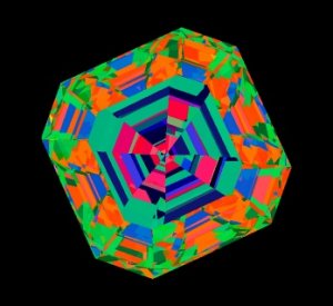
Stone 3 - 0.91ct
Color: D
Clarity: VS2
Polish: Excellent
Symmetry: Very Good
Fluorescence: Faint
Culet: None
Lab Report: GIA
Lab Report #: 13826960
In House: Yes
Width: 5.47mm
Length: 5.46mm
Depth: 3.67mm
Table Percentage: 61.00%
Depth Percentage: 67.20%
Photo
Full Details


300x240.png)