shape
carat
color
clarity

Anyone have a moment for some free graphic design help?

Status
Not open for further replies. Please create a new topic or request for this thread to be opened.

fatafelice

Brilliant_Rock
Joined
Jul 26, 2004
Messages
1,757
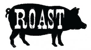
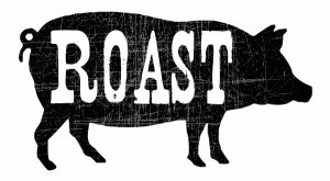
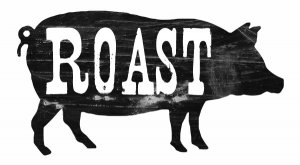
I need this graphic for a BBQ invite to look more "distressed." I have Photoshop, but none of the effects seem to do what I want. I imagine that Illustrator would have something, but I can''t seem to download a trial and I don''t want to pay for the whole thing. Anyone out there have any advice about what I can do or want to give me a hand? I just need the pig to look a bit worn, so it matches the font.

pig roast graphic_merged.jpg
 
I gave it a go fatafelice, but I don''t have anything that worked for the look I think you are going after. Hopefully one of our resident graphic artists can help!!
 
Thank you, anyway, TGal! I have been messing with it for about 2.5 hours, and this is my last resort, so I hope someone can help.
3.gif
 
The only thing I could come up with was something like this.
33.gif


pig%20roast%20graphic_merged1.jpg
 
Hm, it didn''t pop up...let me try again. You can''t see it, can you?
 
.

Trying the pig again.jpg
 
If that works, I can perfect it a bit, as the "distressing" still needs to go in some of the black spots inside the letters.
 
That is better than I have managed!
2.gif
But I''m not sure such fine lines will show up if I print them using my Gocco. What did you use?
 
I can make it look more obnoxious if you want it to show up.

Amusingly, I found a filter called "animal skin" in my Photo Impact program.
 
I am about to head to bed, but an idea might be to go to deviantart.com and download some "texture" brushes. They have thousands so you can pick what you like (use descriptive search words for help) and then just use them over the black background using white. Tada!
1.gif
 
Date: 4/22/2009 11:55:10 PM
Author: MonkeyPie
I am about to head to bed, but an idea might be to go to deviantart.com and download some ''texture'' brushes. They have thousands so you can pick what you like (use descriptive search words for help) and then just use them over the black background using white. Tada!
1.gif
Good idea MP! And good night!
 
LOL, TGal, I thought it looked a bit leathery! I think it is a bit too regular of a pattern for me, though. Thank you for trying!

MonkeyPie, I am heading to bed as well, but I will check that out tomorrow! Thanks for the suggestion!
 
MonkeyPie, thank you so much for that suggestion! I downloaded a ton of brushes and I am going to play around with them and see if I can get the look I want.
 
Does anyone know if there is a way to alter the brushes so that they are solid white? Some of the ones I downloaded are various shades of grey and I am not sure how to change that, if I can.
 
I did a chalk and charcoal filter on Illustrator

ROASTpigcrosshatch.JPG
 
Thank you, Starset! I tried some similar effects, but I think it is just more than I am looking for.

Grrrrr. I can't seem to figure out how to make this look right, even though some of the brushes I downloaded are really cool. Everthing just seems too heavy!

ETA: What do you all think of just leaving it as is? Too weird to have the font distressed and the pig not? We are using it for an invitation, and DH also wants to make t-shirts, so I don't want it to look like crap.
3.gif
 
Hey ff!

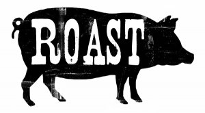
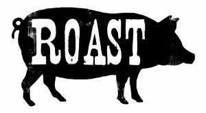
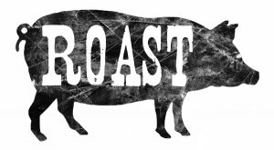
What about one of these? (My husband whipped them up- he''s better with Photoshop than I!)

roastforfata.jpg
 
1.gif


roast2.jpg
 
Ebree, I like that the best yet! Tell your hubby I said thanks!
 
Last one:

roast3.jpg
 
Date: 4/23/2009 8:27:35 PM
Author: fatafelice
Ebree, I like that the best yet! Tell your hubby I said thanks!

I passed the thanks along and he said you''re very welcome!
1.gif
 
Date: 4/23/2009 7:57:01 PM
Author: fatafelice
Thank you, Starset! I tried some similar effects, but I think it is just more than I am looking for.

Grrrrr. I can''t seem to figure out how to make this look right, even though some of the brushes I downloaded are really cool. Everthing just seems too heavy!

ETA: What do you all think of just leaving it as is? Too weird to have the font distressed and the pig not? We are using it for an invitation, and DH also wants to make t-shirts, so I don''t want it to look like crap.
3.gif

I can take a stab at it if you like. You can adjust the opacity of your brushes, but if they are not a solid white to begin with, you will need to click them more than once, being very careful to stay in the exact same spot!

Now I feel all driven. Give me a minute to try something.
 
Attempt one.

roastattempt1-mp.jpg
 
Attempt two.

roastattempt2-mp.jpg
 
Attempt three.

roastattempt3-mp.jpg
 
Attempt four.

I tried to keep in mind that you would be using a gocco, so a lot of these you can tone down if you feel the white is too harsh - just duplicate the original (unscratched) layer in photoshop and adjust opacity.

roastattempt4-mp.jpg
 
LOL, I think I downloaded the same brushes! I like how those look, but I am worried about how they will translate into Gocco prints...

ETA: Ha! We were posting at the same time! I think I like number 2 the best.
 
Date: 4/23/2009 10:06:42 PM
Author: fatafelice
LOL, I think I downloaded the same brushes! I like how those look, but I am worried about how they will translate into Gocco prints...

ETA: Ha! We were posting at the same time! I think I like number 2 the best.

Lol!
I think you may want to actually try one that looks more white than you would want, just because you are using the Gocco. A lot of the detail will get lost in the making.
 
Status
Not open for further replies. Please create a new topic or request for this thread to be opened.
GET 3 FREE HCA RESULTS JOIN THE FORUM. ASK FOR HELP
Top