shape
carat
color
clarity

Second pair of eyes on engraving needed, please!

lissyflo

Brilliant_Rock
Premium
Joined
May 23, 2016
Messages
1,720
Hi,

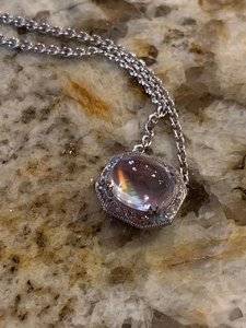
I'd really appreciate some opinions on the engraving on this pendant. I'll preface this by saying that I'm a little emotional as a result of family bereavements, I've been waiting a while for the pendant and I'm emotionally invested in it as moonstone is my children's birthstone (I know for the purists that rainbow moonstone isn't actually the same mineral as moonstone so it's not technically correct, but it's close enough for me!).

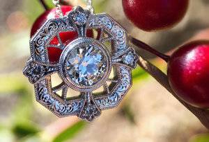
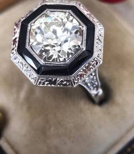
These are the pictures I sent for the engraving style - DS's pendant and I can't remember who the ring belongs to:
pic4.jpg
pic5.jpg

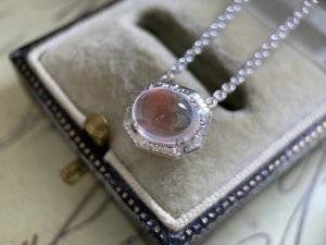
These are the pics I have of my pendant. I've asked Caysie as it doesn't look similar to me, although I'm finding the detail quite hard to see in the pictures. She's said it's the same style but smaller (as there wasn't space on the pendant for the same, but had I known that I would have gone with a different finish), but it looks very different to me, less crisp, more billowy in style, and it sort of peters out in the areas under where the prongs are situated. I appreciate the edges where the prongs are situated are very short so couldn't have the same pattern, but does it seem like a very abrupt change?

Am I tired and emotional and just not seeing the pictures clearly, or does it look way less precise/crisp? I had asked for the millegrained lines radiating out across the metal halo (as in the ring inspo) as I love the way it delineates the individual sections of the halo, but there apparently wasn't room for it.

In general I'm backwards in coming forwards, so a second opinion would be very much appreciated.
pic1.JPG pic2.JPG pic3.JPG
 

missy

Super_Ideal_Rock
Premium
Joined
Jun 8, 2008
Messages
54,132
Hi,

I'd really appreciate some opinions on the engraving on this pendant. I'll preface this by saying that I'm a little emotional as a result of family bereavements, I've been waiting a while for the pendant and I'm emotionally invested in it as moonstone is my children's birthstone (I know for the purists that rainbow moonstone isn't actually the same mineral as moonstone so it's not technically correct, but it's close enough for me!).

These are the pictures I sent for the engraving style - DS's pendant and I can't remember who the ring belongs to:

pic4.jpg
pic5.jpg

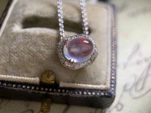
These are the pics I have of my pendant. I've asked Caysie as it doesn't look similar to me, although I'm finding the detail quite hard to see in the pictures. She's said it's the same style but smaller (as there wasn't space on the pendant for the same, but had I known that I would have gone with a different finish), but it looks very different to me, less crisp, more billowy in style, and it sort of peters out in the areas under where the prongs are situated. I appreciate the edges where the prongs are situated are very short so couldn't have the same pattern, but does it seem like a very abrupt change?

Am I tired and emotional and just not seeing the pictures clearly, or does it look way less precise/crisp? I had asked for the millegrained lines radiating out across the metal halo (as in the ring inspo) as I love the way it delineates the individual sections of the halo, but there apparently wasn't room for it.

In general I'm backwards in coming forwards, so a second opinion would be very much appreciated.
pic1.JPG pic2.JPG pic3.JPG


No I don't think you are wrong. The pattern is less crisp and less precise to my eyes too. And I agree Caysie should have let you know from the beginning before proceeding with this project if she couldn't make it work in the smaller space. You could 1. see it in person and see if you feel the same or 2. Just ask for a different design/finish that would work for you. Caysie will make it right. A similar thing happened to Yenny (with Bertie) IIRC and Caysie fixed it for her.

And while I bet in real life it is lovely if it isn't what you want you should get what you want.


@lissyflo I am sorry about your family bereavements. Sending you gentle (((hugs))).
 

tyty333

Super_Ideal_Rock
Premium
Joined
Dec 17, 2008
Messages
27,257
I can make out the pattern and it does look similar to me but due to the smaller size its probably not coming across the same. Hopefully, if you are
not happy with it, CVD will make it right.
 

Arcadian

Ideal_Rock
Premium
Joined
Sep 17, 2008
Messages
9,091
The loss of someone close to us is very hard to endure, and first, I want to give you love of hugs. I'm very sorry you're going through a difficult time right now.

The pendant, its pretty but to me, though the engraving looks "flat" like it was rolled or something. The scrollies appear to be going in the opposite direction than the other pieces.

In particular where the prongs are, I don't see anything like that on the other 2 pieces.

On the overall visual, seems to me that it does not have the same plush and clearly defined look as the other 2 pieces as I mentioned, it looks flatter.

IMO I would say they're totally different.

If it helps, I have a ridiculously big monitor I looked at your images on. Could it be artifact or angle? maybe, but should not be that off visually.
 

cmd2014

Ideal_Rock
Premium
Joined
Aug 6, 2014
Messages
2,541
It almost looks like the pictures are blurry, even though they aren’t. The lines in the engraving don’t seem to be crisp. They almost look like they were gone over a second time with the alignment slightly off. I would ask for it to be addressed, personally.
 

Rfisher

Ideal_Rock
Premium
Joined
Oct 19, 2013
Messages
5,509
Beautiful stone!
I'm sorry for the hard time you are going through. I hope you can hold strong emotionally and have patience with seeing through to the completion of this piece, as it clearly means a lot to you.
I see what you see.
The shape overall is much more soft than your two inspiration pics.
I think the engraving looks 'feathered' for a lack of a better word, to go along with the soft pillowed shape.
It's pretty. But if it's not what you wanted/indicated, it's not what you wanted.
You know you. If you can handle the time taken and effort to get it to see in person, along with possibly sending it back - do so. You might be suprised that you really like it. If not, it gets sent back for reworking. Tell CVB this is the plan.
If you know in your mind and heart this isn't what you want and don't want to deal with it - point out the differences compared to your initial wants, and I'm sure it will be taken care - no issues.
It's a lovely piece otherwise.
I'm partial to your original inspiration of the engraving, for obvious reasons!
Best wishes
 

lovedogs

Super_Ideal_Rock
Premium
Joined
Jul 31, 2014
Messages
18,301
You aren't wrong, the engraving looks very different to me as well. Less crisp, less defined, etc. I would maybe have her send it to you so you can see it in person and decide. But if the pics are accurate then I don't think you'll end up happy with it, and she should (hopefully) make it right. I'm so sorry that you are having a hard time :(

BTW
Your moonstone is the most gorgeous thing Ive ever seen. Can I ask where you got it?
 

lissyflo

Brilliant_Rock
Premium
Joined
May 23, 2016
Messages
1,720
No I don't think you are wrong. The pattern is less crisp and less precise to my eyes too. And I agree Caysie should have let you know from the beginning before proceeding with this project if she couldn't make it work in the smaller space. You could 1. see it in person and see if you feel the same or 2. Just ask for a different design/finish that would work for you. Caysie will make it right. A similar thing happened to Yenny (with Bertie) IIRC and Caysie fixed it for her.

And while I bet in real life it is lovely if it isn't what you want you should get what you want.


@lissyflo I am sorry about your family bereavements. Sending you gentle (((hugs))).

Thanks @missy - I appreciate the second opinion and I'm glad it's not just my eyes that think it looks different. I'm conscious that photos can be hard to judge sometimes, but shipping it to and fro through customs to be able to see it in person is likely to be problematical (if that's a word!). I asked Caysie for some close-up shots of the engraving, especially the parts around the prongs, and I'll wait to see those and then decide, I think.

I remember Yenny having the engraving re-done in the style she wanted and also remember how pleased she was once it was done!

And thank you for the thoughts - much appreciated.
 

lissyflo

Brilliant_Rock
Premium
Joined
May 23, 2016
Messages
1,720
I can make out the pattern and it does look similar to me but due to the smaller size its probably not coming across the same. Hopefully, if you are
not happy with it, CVD will make it right.

Thanks @tyty333 . I'm finding the detail hard to see on the photos so it's good to know that others do see it as similar!
 

lissyflo

Brilliant_Rock
Premium
Joined
May 23, 2016
Messages
1,720
The loss of someone close to us is very hard to endure, and first, I want to give you love of hugs. I'm very sorry you're going through a difficult time right now.

The pendant, its pretty but to me, though the engraving looks "flat" like it was rolled or something. The scrollies appear to be going in the opposite direction than the other pieces.

In particular where the prongs are, I don't see anything like that on the other 2 pieces.

On the overall visual, seems to me that it does not have the same plush and clearly defined look as the other 2 pieces as I mentioned, it looks flatter.

IMO I would say they're totally different.

If it helps, I have a ridiculously big monitor I looked at your images on. Could it be artifact or angle? maybe, but should not be that off visually.

Thanks @Arcadian - I appreciate the thoughts and hugs.

'Flat' in comparison is a very good way to describe how I'm seeing the differences too - flat and lacking the precision that makes the inspo examples so striking. It's good to have another word to help convey the differences I'm seeing!

I was assuming that a side-by-side comparison of the photos should be reasonably accurate in this case as the photos of all three pieces were taken by the same person, even as you say if there's some degree of artefact that throws comparison off a little. I'll see what Caysie says in follow up.
 

lissyflo

Brilliant_Rock
Premium
Joined
May 23, 2016
Messages
1,720
It almost looks like the pictures are blurry, even though they aren’t. The lines in the engraving don’t seem to be crisp. They almost look like they were gone over a second time with the alignment slightly off. I would ask for it to be addressed, personally.

Yes, you're right. I tried to zoom in on the pictures when I first received them, to look in more detail, as usually Caysie's pictures are really sharp and you can see great detail very clearly on zoom in. I couldn't do that with these, which made me even more unsure whether what I was seeing was imprecise engraving or something in the pictures. I should have more confidence in my convictions - being reserved doesn't make life easy at times. Thanks for your input @cmd2014 !
 

lissyflo

Brilliant_Rock
Premium
Joined
May 23, 2016
Messages
1,720
Beautiful stone!
I'm sorry for the hard time you are going through. I hope you can hold strong emotionally and have patience with seeing through to the completion of this piece, as it clearly means a lot to you.
I see what you see.
The shape overall is much more soft than your two inspiration pics.
I think the engraving looks 'feathered' for a lack of a better word, to go along with the soft pillowed shape.
It's pretty. But if it's not what you wanted/indicated, it's not what you wanted.
You know you. If you can handle the time taken and effort to get it to see in person, along with possibly sending it back - do so. You might be suprised that you really like it. If not, it gets sent back for reworking. Tell CVB this is the plan.
If you know in your mind and heart this isn't what you want and don't want to deal with it - point out the differences compared to your initial wants, and I'm sure it will be taken care - no issues.
It's a lovely piece otherwise.
I'm partial to your original inspiration of the engraving, for obvious reasons!
Best wishes

Thanks @Rfisher ! I hadn't appreciated that the engraving on your gorgeous cab ring is the same style or I would have referenced it for inspo too.

I think the joy of engraving is in the preciseness of it. I'd love to see it as is IRL to see whether a more feathered (another good way to describe the differences) engraving might suit the nature of moonstone regardless of my overall preference for crispness, but customs hassles with a 2 way postage pretty much mean it's a one time decision. I think I'm just surprised - I thought this would be an easy win as the inspiration pictures I sent were both from the same designer, so I wasn't expecting any second guessing to be needed.
 

lissyflo

Brilliant_Rock
Premium
Joined
May 23, 2016
Messages
1,720
You aren't wrong, the engraving looks very different to me as well. Less crisp, less defined, etc. I would maybe have her send it to you so you can see it in person and decide. But if the pics are accurate then I don't think you'll end up happy with it, and she should (hopefully) make it right. I'm so sorry that you are having a hard time :(

BTW
Your moonstone is the most gorgeous thing Ive ever seen. Can I ask where you got it?

Thanks @lovedogs ! I bought the moonstone from Elle at the Gemstone Project and I think she had originally sourced it from Meyer and Watt. When I was looking they had a much larger marquise stone in stock but I'd have needed to sell body parts to make it work in budget! It does go a little flat sometimes but the colours it shows when it's on are magical. Have you set your moonstones yet?!
 

Rfisher

Ideal_Rock
Premium
Joined
Oct 19, 2013
Messages
5,509
Thanks @Rfisher ! I hadn't appreciated that the engraving on your gorgeous cab ring is the same style or I would have referenced it for inspo too.
.

Do not give this a second thought.
It is SO not an issue.
I never intended my reply to be taken that way at all.

Being in a different country changes things in shipping back and forth, indeed.
 

yennyfire

Ideal_Rock
Trade
Joined
Jun 6, 2010
Messages
6,873
No I don't think you are wrong. The pattern is less crisp and less precise to my eyes too. And I agree Caysie should have let you know from the beginning before proceeding with this project if she couldn't make it work in the smaller space. You could 1. see it in person and see if you feel the same or 2. Just ask for a different design/finish that would work for you. Caysie will make it right. A similar thing happened to Yenny (with Bertie) IIRC and Caysie fixed it for her.

And while I bet in real life it is lovely if it isn't what you want you should get what you want.


@lissyflo I am sorry about your family bereavements. Sending you gentle (((hugs))).

@lissyflo @missy My situation was a little different in that the engraver went completely rogue and did something totally different from what was discussed/agreed to. There wasn’t a question that it wasn’t what I’d asked for.

That said, discuss your concerns with Caysie. She will want you to be happy. FWIW, I love the pendant...the moonstone is fabulous!

Sending gentle hugs to you and your family.
 
Last edited:

lovedogs

Super_Ideal_Rock
Premium
Joined
Jul 31, 2014
Messages
18,301
Thanks @lovedogs ! I bought the moonstone from Elle at the Gemstone Project and I think she had originally sourced it from Meyer and Watt. When I was looking they had a much larger marquise stone in stock but I'd have needed to sell body parts to make it work in budget! It does go a little flat sometimes but the colours it shows when it's on are magical. Have you set your moonstones yet?!
Not yet, but soon!
 

partgypsy

Ideal_Rock
Premium
Joined
Nov 7, 2004
Messages
6,628
While the engraving on the moonstone pieces is more flowy and less defined, if I did not have your reference pics and your moonstone pieces alone, would say it's a gorgeous piece. The coloring and depth of the moonstone, the claw prongs and silver framing, substantial chain. I would not neccesarily change it, unless the original engraving had meaning for you and you wanted that replicated. Or you don't like how it looks.
 

GliderPoss

Ideal_Rock
Premium
Joined
Sep 25, 2008
Messages
2,936
I agree it looks a little less "pillowy" than your inspiration and obviously it's smaller so hard to discern in the photos. It doesn't look awful by any means but I understand it's perhaps not as crisp as you wish. The stone however - is utterly divine! :love:
 

LinSF

Brilliant_Rock
Joined
Aug 21, 2018
Messages
511
Hmmm, I agree that it doesn't look crisp and defined like the inspiration engraving. My favorite engraving has been done by DK, and he manages to precisely engrave bands that are as small as 1.7mm I believe. So maybe you need her to go over it and define the pattern a little more? I'm sure she'll be able to make it right. :)
 

lissyflo

Brilliant_Rock
Premium
Joined
May 23, 2016
Messages
1,720
While the engraving on the moonstone pieces is more flowy and less defined, if I did not have your reference pics and your moonstone pieces alone, would say it's a gorgeous piece. The coloring and depth of the moonstone, the claw prongs and silver framing, substantial chain. I would not neccesarily change it, unless the original engraving had meaning for you and you wanted that replicated. Or you don't like how it looks.

Thanks @partgypsy . I’m glad you mentioned the chain! I was worried in advance that it might look way too prominent for the style but I have to wear a lanyard for work, so requested a reasonably thick chain as a factor of function trumping aesthetics. I’ve lost a pendant before (thankfully a cheap and cheerful one) after it got tangled in the lanyard and pulled too hard, so wanted something substantial enough that I wouldn’t worry!
 

lissyflo

Brilliant_Rock
Premium
Joined
May 23, 2016
Messages
1,720
I agree it looks a little less "pillowy" than your inspiration and obviously it's smaller so hard to discern in the photos. It doesn't look awful by any means but I understand it's perhaps not as crisp as you wish. The stone however - is utterly divine! :love:

Thanks @GliderPoss . I try hard to be gentle with my jewellery but still didn’t trust myself with something as soft as moonstone in a ring. Great for longevity of the piece to have it in a pendant and so less exposed, less great for being able to appreciate the gorgeous colour show all the time myself!
 

lissyflo

Brilliant_Rock
Premium
Joined
May 23, 2016
Messages
1,720
Hmmm, I agree that it doesn't look crisp and defined like the inspiration engraving. My favorite engraving has been done by DK, and he manages to precisely engrave bands that are as small as 1.7mm I believe. So maybe you need her to go over it and define the pattern a little more? I'm sure she'll be able to make it right. :)

Thanks @LinSF . I’m waiting to hear back, so best case I’ll be reassured by some closer-up pictures. If not, hopefully another finish will be possible in the space available.
 
Be a part of the community Get 3 HCA Results
Top