What do you look for when buying colored gems?
by Wink Jones, GG (GIA), Winfield’s, Boise, ID
It is not nearly so easy as when looking to buy a diamond. There is no universally accepted grading standard for dealers to adhere to and there are the frustrations that come from finding that one dealer’s “nearly flawless” looks like another dealer’s “moderately included”.
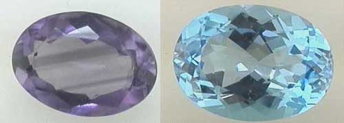
As if what you found in the clarity column were not confusing enough, how do you translate “daffodil yellow” or “sky blue” let alone “rich royal purple with hints of velvety blue”?
Oh, and forget about cut grades! There is no standard for cutting, nor can there be. Each stone has its own refractive index, which determines how the light will play throughout the stone. This means that angles that will create an incredible looking tanzanite might create a lifeless looking amethyst.
The GIA in its efforts to at least give us some guidelines in colored stone grading and classification has gone to great lengths to provide us with a workable system that is at best a good beginning.
Personally, I feel that there will never be a totally accurate system for describing colored gems. Even photography does not provide us with an accurate system to share the beauty of some colored stones, as the chemicals in the stone cause light to react unfavorably, creating an unattractive looking stone where there is great beauty in real life.
I once spent hundreds of dollars with a photographer trying to get a good picture on an incredible chrome tourmaline. Its magnificent rich green color always came out an unattractive brownish yellowish reddish yuck color on film because of the chrome in the stone.
Here are some basic guidelines that you can use in your search, but remember, to paraphrase Mr. Gump, “Beauty is as beauty does!” Look at all the certs you want, but buy the stone because it is beautiful and makes your heart sing. If it does not, don’t buy it!
Clarity Grading
Gems are basically divided into three catagories by the GIA for purposes of clarity grading. Type I, type II and type III.
I will quote from the GIA Colored Stone Grading Workbook.
Type I Colored Stones (Often virtually inclusion-free).
Type II Colored Stones (Usually Included).
Type III Colored Stones (Almost always included).
As you can see, a type I colored stone VVS grade is eye clean with inclusions that are difficult to see under 10x magnification and invisible to the unaided eye, while a type III VVS has inclusions that are easy to see under 10x magnification and may have eye visible inclusions.
What’s a poor rookie to do?
Well one thing to do is to understand the above scales and which stones are in which category. Do NOT be surprised if your local retailer does not know each stone in every category, or even what you are talking about!
Do understand that if your local retailer does not have at least a fair understanding of which stones should normally be eye clean, and which stones are still beautiful even with fair amounts of eye visible inclusions, that you should probably be looking for a different local retailer if you are in the market for a good buy on a colored stone.
COLOR IS A SPECIALIST’S GAME!
Everyone knows diamonds. They are the lifeblood of our industry, but only a few know and really love colored gemstones. Be sure to find one of these people if you want the best value for your money
Now about color.
Again, quoting from the GIA workbook on Colored Gemstones:
“Color is an interplay between a light source, an object, and the human eye and brain. Most light sources emit light that is a combination (or blend) of various wavelengths of visible electromagnetic radiation. The object absorbs some wavelengths and transmits or reflects others to the eye. Receptors in the eye translate these wavelengths into an optical code which the optic nerve transmits to the brain, where they are interpreted as sensations of different colors.”
Translation. Light hits the object that we are looking at and is absorbed or reflected and we see it as different colors.
This is important!
Some stones will look completely different depending on whether they are seen in fluorescent light or incandescent light. ALWAYS look at a stone you are thinking of buying in several light situations. Get your jeweler to walk with you into a room with fluorescent lights, incandescent lights and if possible out of doors in shade and direct sun. Even consider the type of light where you will most be wearing the gem.
Back to “the book”.
“We describe color in terms of three dimensions – hue, tone, and saturation. These create a world of colors or color space. All colors perceived by the human eye can be placed within this world, and their position specified by their hue, tone, and saturation.
The color that is most prominent in a gemstone is called the dominant color. Other evident colors are called additional colors.”
I am going to paraphrase from here, in the
interest of not putting you all to sleep.
Hue is the basic impression of color that we notice immediately. Red, green, blue and the other rainbow colors are the basic hue names. Add in other descriptors and you get a better picture. For example, lets take the color wheel from the short journey between blue and green. Start with Blue, then shift slightly to very slightly greenish blue, and on around the wheel to greenish blue, very strongly greenish blue, green-blue or blue-green, very strongly bluish green, very slightly bluish green, and finally ending at green.
You can take a similar journey around the rainbow, joining the purple red up to the other violet end, which is why we call it a color wheel. The human eye can actually discern about 150 separate hues, but in gemology we use 31 on our hue chart.
Tone is the lightness or darkness of a color sensation, from colorless to black. Tone is divided into eleven steps from “0” being colorless or white through ever increasing shades of gray to “10” being black. In grading colored stones, we use seven of those steps, from “2 very light” through “8 very dark”. The terms describe the lightness or darkness of the color the eye perceives
“Saturation is the strength, purity, or intensity of the hue present in a color sensation.”
What we attempt to describe with saturation is how bright or how dull the color is. For example, with a blue stone here are terms we might use as we go up the scale from colorless to faint to strong, there are actually seven grades of saturation starting with Neutral, but for practical purposes we will use six modifiers for saturation.
Grayish blue, slightly grayish blue, very slightly grayish blue, moderately strong blue, strong blue, vivid blue.
Blue is considered a cool color and cool colors are typically modified in shades of gray. Warm colors such as orange will be typically modified in shades of brown.
When you put it all together, you might get a color description of a really beautiful sapphire such as this…
This sapphire has a medium dark, strong, violetish blue. Or if you are into scientific color notation, vB 6/5. (violetish blue, medium dark, strong)
Wowsers! That is more that I need to know about describing a stone.
Let me tell you why.
If you take the same courses that I have taken and practice for years and years, you and I will most of the time be at least in the same neighborhood when describing a stone to one another, provided we both have the same equipment to recreate the color descriptions that we are giving to one another. Hardly any of the wholesale dealers want buyers to be able to compare their prices.
But, you did not take the same course. And, you do not have the same equipment. And even if you did, my eyes are 55 years old. They don’t see the same as they did when they were 30. (Now there’s the shame, especially if you take your joy from looking at stones all day!)
My eyes will not see the same as yours. So after all that, if you like it buy it!
OH, AND LET’S NOT FORGET CUTTING!
Cut right, the stone will SING! Cut poorly, it is just another window, perhaps with a little sparkle around the edges.
Typical “native cut” stones. Notice the brilliance around the edge of the stones, but also notice the “window” in the middle of the stone where you can see straight through the stone. Also notice the black areas of “extinction”. They are cut to retain weight, not to be beautiful.
What’s a poor rookie to do?
First!
LOOK!
Get out there and look at LOTS of stones, then look some more. You will quickly see that the vast majority of what is being shown to you is garbage. Ask to see some well cut stones of high quality. Be prepared to go to several stores until you find one that can show you the goods! You can probably save yourself a lot of time if you just start at some of your better stores and skip the mall chain stores.
I am proud to feature the artistry of Richard Homer, one of the world’s premier lapidary artists. When you see what he and others like him do with stones, you will never be happy with native cut stones again. (Native cut is how we refer to stones that have been cut in the country of origin with an eye to retaining weight rather than releasing the beauty of the stone.) Here is an example of a typical native cut stone versus what it looked like after recutting. Which would YOU prefer?
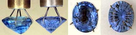
Before 3.22 carat (left) and now 2.88 carat (right). Side (left) and top (right) views.
VOTE WITH YOUR EYES!
For the most part. Take all of the above scientific “stuff” and enjoy reading it and know a little of it, then throw it all out and VOTE WITH YOUR EYES!
Colored gems are about BEAUTY! Buy the stone that makes your heart sing! If you can’t find one that makes your heart sing, spend your money on something else!
Wink Jones
Gemologist and stone lover
discuss
>


 is an easy tool that analyzes the data of round diamonds and calculates a score that grades cut quality.")