MMtwo
Ideal_Rock
- Joined
- Sep 20, 2009
- Messages
- 5,249
I’m working on training materials and I create videos for work (as one of the things I do). For the HMIS Universal Data Element 3.04: Race, it's a HUD thing. My current approach is to give each race definition its own slide. The challenge is that, if I just repeat the same slide format with a new definition each time, it feels like it could turn into a long, monotonous lecture.
To break it up, I’m considering giving each category its own distinctive border design or color theme—something subtle but visually distinct. My hope is that it makes the slides more memorable, and helps the audience stay engaged without me “droning on” over near-identical slides. Even if it means folks are thinking...OMG, whats she going to do for XXX? I work with a diverse group of coworkers.
Before I go too far down that road:
Anyhow, it's a Sunday afternoon, so thought I would post here for thoughts.
Including a few samples. Definitions directly from HUD.
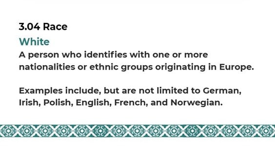
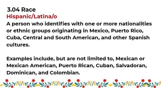
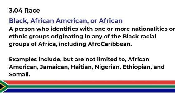
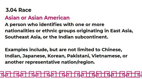
To break it up, I’m considering giving each category its own distinctive border design or color theme—something subtle but visually distinct. My hope is that it makes the slides more memorable, and helps the audience stay engaged without me “droning on” over near-identical slides. Even if it means folks are thinking...OMG, whats she going to do for XXX? I work with a diverse group of coworkers.
Before I go too far down that road:
- Do you think using unique borders/themes for each race category is a good idea (adds clarity and visual interest), or a terrible idea (risks being distracting or even unintentionally inappropriate)? I don't want to make stereotype soup.
- Has anyone tried alternative ways to make this section more engaging while still staying respectful and professional?
Anyhow, it's a Sunday afternoon, so thought I would post here for thoughts.
Including a few samples. Definitions directly from HUD.


300x240.png)