shape
carat
color
clarity

Wedding Please help - opinions on invites needed!

Status
Not open for further replies. Please create a new topic or request for this thread to be opened.

buttercup80

Shiny_Rock
Joined
Aug 12, 2006
Messages
451
I picked up my invites today and I''m really happy with them for the most part - the envelopes are cream and they were supposed to be bright white, but it''s really just not worth the hassle or $$ to have them reprinted. . .

Also, they are a little more DIY than I expected; our invite takes parts from several different invitations and it was my understanding that the stationary lady would be putting them together - apparently not so much. . .

Anyway, they are MUCH prettier in person - my camera stinks and the colors are off in the pics - but the base layer is a gorgeous, rich, dark purple. The layer that the text is on is a metallic lavender - it has a nice sheen in real life. I was expecting the leaf to be bigger, but it''s a nice red suede.

My dilemma is that there are a few different positions that I could glue the leaf in - I need votes to decide!

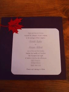
Here''s the basic layout for reference:
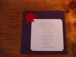
prettypurple.gif
 
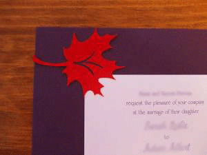
Position 1:

leafy1.gif
 
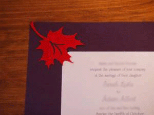
Position2:

leafy2.gif
 
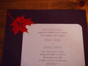
Position 3:

leafy3.gif
 
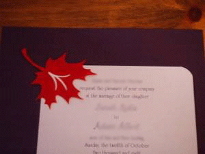
Position 4:

leafy4.gif
 
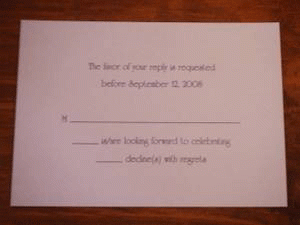
And these don''t need to be glued or anything, but here''s my response card:

celebrateorstayhome.gif
 
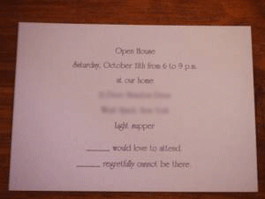
and lastly, the invite to our open house the night before:

openhousecard.gif
 
I like position one the best, with 2 being a close second. I don''t love 3 or 4 for some reason. They sound like they are totally gorgeous!
 
Position one is the best!!! Two is a close second. 3 & 4 are No''s in my book!

Very pretty invites!!!!
 
Thanks, ladies - I think I like Position 2. . . not sure yet.

Sabine, congratulations!
 
I like position 2. 3 is a close second. Position 1 looks too structured or "posed." Position 4 just looks crowded.
 
I like position 2 the best. But I did have to look at them very closely.
 
I like position 2 as well. It looks a little more "accidental," like the leaf fell onto the page and landed cutely, but without the symmetry and careful placement of the others. From what I can tell, the colors are gorgeous, by the way!
 
hhhmm...I say 2. With 3 as my second choice. BTW - I like the invites!
 
I like #2 also. Very nice invites!
 
phic designer's standpoint: go with #3 for sure. It flows best with the invite and draws the eye to the wording while touching just enough of the colored page along with just enough of the white with the leaf points just on the edging of the white.

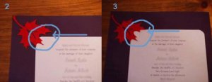
Let me tell you why I don't like #2 as much as #3: Do you see by the right leaf point how there is purple space between the leaf and the white paper vs. #3, the two tips are both touching the white space? This is distracting to me compared to #3. It just seems like #3 is set perfectly.......

#4, the location of the leaf mostly on the white here is distracting from the wording and leaves too much purple space open.....

#1, the location on the leaf here is funky going straight across while on the other options, it looks more like a falling leaf and once again drawing the eye to the wording.

Hope that helps!
 
I quickly pointed out what I meant between #2 and #3 incase what I said didn''t make sense. Lovely cards btw!
35.gif


carddifference.jpg
 
Thanks so much everyone!!!

Although, I'm still a bit up in the air - I was totally ready to go with #2, but I definitely see Dreamgirl's point. . . hmmmmm. . ..

I wish my camera didn't stink b/c they're so much prettier in person!

Dreamgirl, I think most of the reason I'm stuck is b/c I don't want the stem to look like it's just dangling out in space or something. . . With position #2, it's more up in the corner, while #3 it is just hanging out - does that look weird?
 
I'm going to have to say 3 or 1.

#2 is way too symmetrical for me, being right in the corner and all.

#4 just no.

#1 I didn't like at first. Yes, it's very structured, but kind of in a quirky way. Is there any way you can take a picture from further away of this one? Where we can see the whole invitation like in your OP.

#3 This was my initial favorite. It's classic but not stuck in the corner.

Is there anyway you can tilt the leaf so that it gives the appearance of blowing in the wind or falling from a tree? Just an idea!!

BTW, Love you colors!!
9.gif
 
Date: 7/23/2008 8:16:48 PM
Author: buttercup80
Thanks so much everyone!!!

Although, I''m still a bit up in the air - I was totally ready to go with #2, but I definitely see Dreamgirl''s point. . . hmmmmm. . ..

I wish my camera didn''t stink b/c they''re so much prettier in person!

Dreamgirl, I think most of the reason I''m stuck is b/c I don''t want the stem to look like it''s just dangling out in space or something. . . With position #2, it''s more up in the corner, while #3 it is just hanging out - does that look weird?

Not at all. I think it looks natural.
 
Here''s option 1 from farther away. . . Thanks again for everyone''s opinions - I''m sorry for the completely awful picture quality.

leafy1far.gif
 
Date: 7/23/2008 8:16:48 PM
Author: buttercup80
Dreamgirl, I think most of the reason I'm stuck is b/c I don't want the stem to look like it's just dangling out in space or something. . . With position #2, it's more up in the corner, while #3 it is just hanging out - does that look weird?
I can see your point. But actually, #3 looks as if it were more floating/falling down like a real leaf where #2 is situated right at the very top corner looking like it were still on the tree or about to just fall. Plus honestly, #3 is very close to the corner as #2 is anyhow. So to me, I don't see #3 as just being out in space. I don't think either way looks weird at all. Whichever discision you make will be the right one!
28.gif
I love the design!
 
Thanks, dreamgirl! I think you''re right. . .


Meanwhile, I tried doing one with the glue dots that the invite lady provided, but I hate those - they''re too thick, so the leaf doesn''t sit close enough to the base layer for me AND they don''t seem that secure. . .so I went and got a krazy glue pen - I hope that works better!
 
Buttercup, definitley #3 is my vote. Best of luck with the crazy glue pen!!
 
I''m voting for #3 as well.

I like how the corner is evenly covered. In #2 the corner of the white is covered on the left but not on the top. going by this theory #1 is also not bad but for some reason I just like #3 the best.

Beautiful invites!
 
Date: 7/24/2008 10:28:17 PM
Author: buttercup80
Thanks, dreamgirl! I think you''re right. . .

Meanwhile, I tried doing one with the glue dots that the invite lady provided, but I hate those - they''re too thick, so the leaf doesn''t sit close enough to the base layer for me AND they don''t seem that secure. . .so I went and got a krazy glue pen - I hope that works better!
Your welcome! Im glad I could help! Good luck with the glue situation too!
 
Status
Not open for further replies. Please create a new topic or request for this thread to be opened.
GET 3 FREE HCA RESULTS JOIN THE FORUM. ASK FOR HELP
Top