shape
carat
color
clarity

Invite Spacing Help

Status
Not open for further replies. Please create a new topic or request for this thread to be opened.

DMBFiredancer

Brilliant_Rock
Joined
Jan 12, 2008
Messages
595
So i finally found one that I like, but the way that this particular one spaces things is driving me nuts. It has the bride and groom''s names alone and over to the right (which I don''t mind) but then it has the first 2 lines of text over to the left and not centered with the rest. Is there any graphic reason for this that anyone can think of? Is it because the names are off to the right?

Here''s an example of what I mean (Obviously I changed the names)
 

DMBFiredancer

Brilliant_Rock
Joined
Jan 12, 2008
Messages
595
Maybe if I learn how to post a picture....hmmm...I attached the file, but it''s not showing up.
 

DMBFiredancer

Brilliant_Rock
Joined
Jan 12, 2008
Messages
595
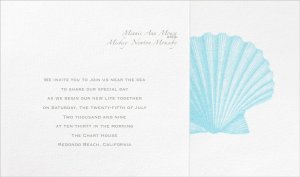
trying again...ok....this was the one i did LAST....it didnt upload the right pic, sorry....

this is the one that i did by leaving space instead of text on those 2 left lines....i'm not sure if this looks TOO spacey in the middle or not, though

mousemouse2.jpg
 

DMBFiredancer

Brilliant_Rock
Joined
Jan 12, 2008
Messages
595
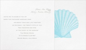
THIS is the one that was supposed to be first....to show how it brings the first 2 lines to the left....any graphic reason for that? does it look as bad as i think?

mouse1mouse.jpg
 

DMBFiredancer

Brilliant_Rock
Joined
Jan 12, 2008
Messages
595
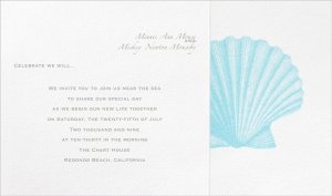
this is one where i added a quote instead of leaving the 2 lines blank....not sure if it is too informal, though.
we are pretty laid back informal people, so maybe it could work, though....just not sure.

it''s crazy to me that i''m stressing over things with these invites that i never thought i''d be bothered with...i seriously thought this was going to be the easy part!

mouse3.jpg
 

D&T

Super_Ideal_Rock
Premium
Joined
Oct 27, 2008
Messages
12,502
Date: 3/8/2009 1:20:18 PM
Author: DMBFiredancer
trying again...ok....this was the one i did LAST....it didnt upload the right pic, sorry....

this is the one that i did by leaving space instead of text on those 2 left lines....i''m not sure if this looks TOO spacey in the middle or not, though
I like the first posting... where everything was in the middle... just from a visiual standpoint and reading it... but it also looks traditional... not sure how you want it to be like?
 

D&T

Super_Ideal_Rock
Premium
Joined
Oct 27, 2008
Messages
12,502
Date: 3/8/2009 1:26:38 PM
Author: DMBFiredancer
this is one where i added a quote instead of leaving the 2 lines blank....not sure if it is too informal, though.
we are pretty laid back informal people, so maybe it could work, though....just not sure.

it''s crazy to me that i''m stressing over things with these invites that i never thought i''d be bothered with...i seriously thought this was going to be the easy part!
umm, maybe I like this one better?? but those are my two choices..
 

ash313

Brilliant_Rock
Joined
Jun 24, 2008
Messages
535
Maybe it''s just because I''m a DMB lover, too, but I love the one with the Two Step quote!

I also think it looks the best, graphically, and I honestly wouldn''t worry about formality. If it works for you, it works!
 

Inanna

Brilliant_Rock
Joined
Sep 14, 2008
Messages
565
I definitely like the 3rd one you posted the best. I like the visual balance between the names on the right and "Celebrate we will..." on the left, with the ceremony/reception information centered. This looks really elegant to me, not informal.

The first one you posted is ok, but I do think it''s a bit too spacey between the names and the centered text.

The second one you posted - eek, I really don''t like the alignment of the first two lines. It looks like some kind of formatting error. You''re right to want to correct this.

Can I ask where you found these invites?
 

DMBFiredancer

Brilliant_Rock
Joined
Jan 12, 2008
Messages
595
Date: 3/8/2009 1:46:58 PM
Author: Inanna
I definitely like the 3rd one you posted the best. I like the visual balance between the names on the right and ''Celebrate we will...'' on the left, with the ceremony/reception information centered. This looks really elegant to me, not informal.


The first one you posted is ok, but I do think it''s a bit too spacey between the names and the centered text.


The second one you posted - eek, I really don''t like the alignment of the first two lines. It looks like some kind of formatting error. You''re right to want to correct this.


Can I ask where you found these invites?

i''m glad others see what i mean about those first 2 lines....that''s just how its formatted with this invite. the sample one that i got in the mail has it that way, too. i dont understand why they have it that way.

basically i can have it say anything i want, but those two lines always get shoved left. our names have to be where they are to have the script font - its pretty much set that way when trying to order online. i thought about trying to have the quote on the right and our names center with the text, but then our names would be in the same font as the rest of the text (if that makes sense)

Inanna, thee are from the ''naturally ever after'' collection - they have them at invitationsbydawn.com (15% off everything until 3/12) - after all the samples i got in the mail, they are the only ones i really liked.

well, except for this darn spacing problem! :)

thank you to everyone for your input so far...i really appreciate it!
 

DMBFiredancer

Brilliant_Rock
Joined
Jan 12, 2008
Messages
595
thanks for your help, guys - i ended up with the 3rd one - FI loved the quote, too...the only thing we added was another line with the address of the venue.

one more thing to check off the list! yay!

what next....hmmm....maybe bridesmaid dresses or rings.

:)
 

galvana

Brilliant_Rock
Joined
May 4, 2008
Messages
884
I LOVE THE 3rd One. any touch of dmb is always great! you go !
i wish i had done that. lol
 

Clairitek

Ideal_Rock
Joined
Jul 21, 2008
Messages
4,881
I''ll have to ask my graphic designer friend about the odd spacing. I can''t come up with any reason besides "different strokes for different folks" to explain why they would do that. Some people might like whimsical spacing. I am one of those people I suppose.

I think you made a great choice with the spacing you ended up with. The personalized quote is nice too! I am a big fan of simple designs like yours.
 

sammyj

Brilliant_Rock
Joined
Aug 28, 2008
Messages
1,247
Date: 3/12/2009 10:02:59 AM
Author: iloveprincesscuts
I LOVE THE 3rd One. any touch of dmb is always great! you go !
i wish i had done that. lol
Ditto! I had to smile when I read "Celebrate we will...."

You DMB fanatics, you!

I love it!!
 

DMBFiredancer

Brilliant_Rock
Joined
Jan 12, 2008
Messages
595
Date: 3/12/2009 1:00:45 PM
Author: sammyj
Date: 3/12/2009 10:02:59 AM

Author: iloveprincesscuts

Ditto! I had to smile when I read ''Celebrate we will....''


You DMB fanatics, you!


I love it!!

we met thanks to the band, so we are incorporating that in subtle ways as much as we can. there''s a bunch of our guestlist that is our group of DMB friends so they will get a good smile out of it, too.

we just had to try very hard not to overkill it with the music selections - we just chose a few key songs and that was it....it was tough!
 

Rock Your Socks

Shiny_Rock
Joined
Apr 18, 2008
Messages
286
i like the 3rd one also...it''s just seems alot more fluid visually and otherwise.
 
Status
Not open for further replies. Please create a new topic or request for this thread to be opened.
Be a part of the community Get 3 HCA Results
Top