shape
carat
color
clarity

Padparadscha lovers and experts needed!

Joined
Jan 20, 2012
Messages
4,252
Hello PSers,

As you can see, I am as new a newbie as can be. But I have been a gem and jewelry collector for some time. So I'm hoping to endear myself to you lovely ladies (and gents) of the PS community. :) Recently, I purchased my first pad. Now, I know this topic has been done to death on this forum (yes, I lurk!), but this post is really about the fact that I'm in need of some serious help with regard to how I should set the gem. So I apologize in advance to any of you who could happily live the rest of your lives without ever seeing another pad thread! :knockout: For those of you even minorly interested, your advice would be welcomed and deeply appreciated! :wavey:

I've never had this much trouble deciding on how I'll set a gem in my life. I'm usually very decisive and have everything planned out before the gem even arrives. While I do have a design in mind (3 or 5 stone), I'm just really having trouble deciding on a metal. I think what's throwing me for a loop is the fact that this gem dramatically changes color with every blink - it's orange, it's pink, it's peach, it's bright, it's pastel - you know what I'm talkin bout. Initially, I was going to stick with 18k white gold, but now I'm thinking the addition of a rose or yellow head would be a nice compliment. So my question is this - Any no-no's with regard to setting this type of gem? It appears (to my eyes anyway) that the rose gold enhances the orange tones in the stone, while the white tends to bring out the pink (I prefer the former). And while I'm not typically a fan of yellow, the vendor did recommend 18k yellow as bringing out the best in a pad, so now I'm considering that as well (two-tone). Is there any one agreed upon metal that most pad lovers feel compliments this stone best? Or is it strictly a matter of taste? I'm so confuuuuuuused! And I'm dying to set this thing. I will add photos to my next posts to avoid messing anything up in this one! I have no idea how to do this of course, but I shall try! Here goes...

Sincerely,
Autumn :wink2:
 
Joined
Jan 20, 2012
Messages
4,252
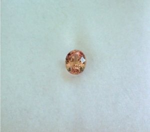
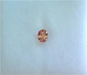
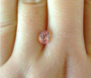
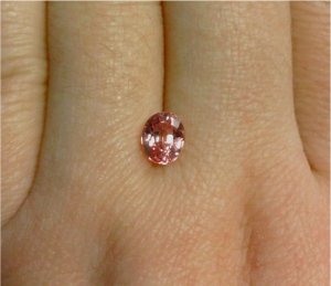
OK, it is a 1.48 ct. oval (certified unheated/Sri Lankan). The color is described on the cert as "light orangy-pink." In daylight, the color definitely veers towards the orange, and in fluorescent, it shows more pink. I also noticed it is quite a bit brighter/more saturated in artificial light than in daylight. It is much more of a delicate pinkish-orange in daylight. Is this dramatic color (and saturation) shift from artificial to natural light the norm? It was quite a surprise to me, but I admit this is the first pad I've ever studied in person. I don't think I've seen it be the same color twice (the cert also lists the stone as "strongly dichroic" with "moderate orange" and "weak red" fluorescence, if that means anything). But regardless of the lighting, the brilliance of this stone is outrageous. I've never seen another CS that sparkles like this in my life and I own quite a few other fine blue and fancy sapphire/ruby pieces. I suspect it's the lighter saturation of color that does it. It's spellbinding… but it only makes photographing it even more difficult. Anyway, here it is indoors with only natural light coming in. Taken with my very antiquated cell phone, yet still quite an accurate representation of what the color looks like in person. The black spots are just a reflection of my office surroundings, phone, etc.; they don't show in person. Please excuse the dry, cracked, suffering hands… my username should be winter in New England. It's a sweltering 28 degrees today!

PadNaturalLight1.jpg

PadNaturalLight2.jpg

PadNaturalLight3.jpg

PadNaturalLight4.jpg
 
Joined
Jan 20, 2012
Messages
4,252
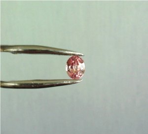
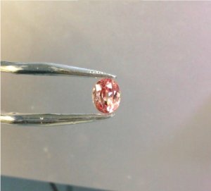
Here are a couple pics of the stone under fluorescent lighting. So, any recommendations or opinions as to how I should set this little fella? I really value and respect your opinions, so please do drop me a quick post if you are so inclined. Thanks again to everyone and anyone who can assist!

PadArtificialLight1.jpg

PadArtificialLight2.jpg
 

TristanC

Brilliant_Rock
Joined
Jun 6, 2011
Messages
995
Congrats on a rare and special stone! I love pads - and this one is lovely. It does have a touch more orange than pink, but that's a personal preference.

I would go ahead and set it in platinum or white gold. For some reason the fallback is yellow or rose gold for pads, and I always feel it mutes the colour more than it enhances it. But then again, I'm a die hard fan of plat so please bear that in mind. I like the contrast, even if the colour is softened a little by the contrast.

I can't love a YG setting, so no point going there for me. Guess you'll need to figure out what you want!
 
Joined
Jan 20, 2012
Messages
4,252
Awww Tristan, thanks for being the first (and hopefully not the last) to respond! And you bring up a good point... I guess I'm having the most difficulty deciding whether I like the contrast of the white metal and the stone's color or the complimentary hue of the rose gold. I've never been a yellow gold fan either, so that was a last choice for me, but I noticed some finer pads that are set in a white metal, be it gold or plat, but have yellow gold prongs (NSC has several on their website, yet I don't see any rose gold). So I'm wondering what the mindset is there and if there's a specific reason for it or, again, it's just personal taste.

Thanks again for the input! Also, yes, sometimes the stone has more orange and sometime it looks almost completely pink, sort of like a pink diamond (I prefer the more orange hues though so I'm happy to hear that!).
 

Aoife

Brilliant_Rock
Joined
Jun 23, 2010
Messages
1,779
Setting a lighter-toned stone is always tricky, because the metal can have such a strong effect on how you perceive the color of the stone. If it were me, I would probably set this in undipped white gold, or in yellow gold. Platinum or dipped white gold will almost certainly make the color look even less saturated, but ultimately it is a matter of personal taste.
 

pregcurious

Ideal_Rock
Joined
Mar 18, 2009
Messages
6,724
Rose would look very nice next to the stone, but because you prefer platinum, I would use that for the rest of the ring. I think that yellow gold really brings out the colors in pads, but if you don't like it, you don't like it.

Here's a thread I started to compile settings for pads:
[URL='https://www.pricescope.com/community/threads/padparadscha-ring-setting-ideas.162394/?hilit=padparadscha']https://www.pricescope.com/community/threads/padparadscha-ring-setting-ideas.162394/?hilit=padparadscha[/URL]

Here's a thread with a simple rose gold halo:
[URL='https://www.pricescope.com/community/threads/peachy-stone-like-morganite-but-with-good-durability.164807/#post-3000250#p3000250']https://www.pricescope.com/community/threads/peachy-stone-like-morganite-but-with-good-durability.164807/#post-3000250#p3000250[/URL]
 
Joined
Jan 20, 2012
Messages
4,252
Hi Aoife - Thanks so much for the advice. My initial feeling, when comparing the metals to the stone, was that the white was definitely washing it out (which was a blow because it's pretty much all I wear). To me, the yellow clashed with it a bit and the rose kind of "matched" it. So that's why I'm so lost. I just can't come to a decision on this! :???: Everyone kind of prefers something else, so I guess the good news is that maybe it means the stone can look nice in any of the metals and that there is no one perfect compliment. I've received votes for the rose, white, and yellow... and each person had a good reason for choosing it. So I guess I have more mulling to do! I just don't want to make a mistake (if a mistake is possible), because it was a significant purchase for me. Thanks again!
 
Joined
Jan 20, 2012
Messages
4,252
Good evening (morning?) pregcurious - I'm glad I got a vote for the rose and white two-tone. I think that's what I'm leaning to right now. I know, the vendor said yellow too, but it's just not my thing. If it's in two-tone though, it would still be pretty subtle. Hmmm.... here we go again! See what I mean? I'm never this indecisive...

Thanks so much for the thread links. I will check them out! I would also love it if other PSers wanted to post their pad stones/rings here (if it hasn't already been done 100 times - or we could always make it 101). :naughty: Actually, I would be happy to see any pieces the PSers thought I should see which could help in my hunt. Thanks again for the assist!
 

Pandora II

Ideal_Rock
Joined
Aug 3, 2006
Messages
9,613
I'm a big fan of 22k gold, pads look great against it.

Lovely stone.
 

kt

Shiny_Rock
Joined
Jan 30, 2003
Messages
286
I have a pad-ish colored spinel that I set recently in a rose gold halo with a white gold split shank and I love it, so my vote would be two-tone.
 

evergreen

Brilliant_Rock
Joined
Jan 18, 2012
Messages
828
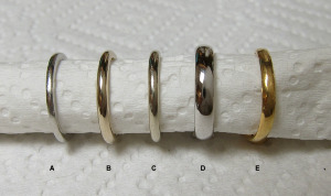
I hope Yssie doesn't mind my quoting her post, but there's lots of discussion about metals over in RockyTalky. Apologies if you already know about this and it's obvious, but -- one thing I didn't know about before PS was that white gold is nearly always rhodium-plated. If you want a white unplated metal, platinum is usually your best bet... but if you don't mind a delicate, creamy yellow color, try unplated 18k white gold! Yssie's a huge fan, as are many PSers, and has a great collection of 18k WG alloys (which range from pinkish-yellowish-white Pd-WG to a yellow halfway to YG with some alloys of Ni-WG). Maybe unplated 18k WG would give you the right half-way point!


Yssie|1326213867|3099404 said:
Too late to edit -

A - plat (950/ru)
B - unplated 18k nickel wg from e-wb, custom piece (different manufacturer, matches my WF custom Ering metal perfectly)
C - unplated 18k nickel wg from e-wb, stock piece
D - plated 18k wg from WF
E - 22k

Metals1.png


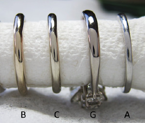
A, B, C from above
G - unplated 18k palladium wg from DBL, custom piece
IMG_1327%20copy_1.png


*WBal is off but it gets the point across re. differences in alloys, mixes.. I do see that kinda-sorta-almost-pinkishness in the Pd-wg IRL as well in some lights (cloudy), in others it looks almost creamy yellow like C - it is a chameleon metal!
 
Joined
Jan 20, 2012
Messages
4,252
This discussion is really helping me! Just what I was hoping for.

Thank you, Pandora. I was lucky in that the first stone I purchased turned out to be "the one." I was also told by another friend that the higher the yellow gold karatage, the better this stone looks. It's making me re-evaluate my feelings towards yellow gold for this piece (not that I don't like it to begin with, but it's just never been my go-to, as I have yellow undertones in my skin and tend to look better in white metals). I don't have any yellow gold over 18k, so I was really excited to see evergreen's post for comparison...

Evergreen! This was very, very helpful. Thank you! (And thank you Yssie, wherever you are). I must confess that I had never heard of pd-wg before reading this forum. It makes sense though as those allergic to nickel would need some alternative to traditional white gold (aside from plat). What a lovely blush-white color it is! Absolutely gorgeous. And from what I can see of the ring, also gorgeous. (It must be brand spanking new because I don't see even one scuff). So congrats to Yssie on that one! P.S. Do you think there are any pics of 14k and 18k rose gold side-by-side comparisons over on RockyTalky? I didn't find much doing a general search on google.

Hi kt - You're ring sounds divine... would you happen to have any pics of it? Spinel is my all-time favorite stone, as it is for a lot of collectors. I have a bright strawberry red 2.08 ct. stone from Namya (set) that is close to my heart. Congrats on yours. :sun:
 
Joined
Jan 20, 2012
Messages
4,252
Pregcurious - I just took a better look at the threads you posted for me. A lot of great information in there... But first of all, cheers on that peach sapphire of yours (I orginally wanted a round pad but couldn't find the right one). I wanted to set it on a diamond band as a solitaire. Anyway, really delicious color. :lickout: Did you eventually set it (I didn't see a set stone post)? If you did, and it's not too much trouble, I'd love to see the finished product. The pic of the sapp set in the rose gold halo gave me a good idea of how the rg prongs would look against my stone if I went that route, so thank you. Hopefully, as I become more acquainted with navigating this forum, I can dig up some of these great older threads as well.

*Honorable mention for TravelingGal's 5 stone bauble. I love how clean, crisp, and to-the-point it is. Great piece! I bet it looks smashing on.
 

Treenbean

Brilliant_Rock
Joined
Feb 25, 2010
Messages
798
Hi Autumn!
I think your pad is beautiful and I love the tone and I think it's a really good size for the design you are thinking of. I am adding a link to my BGD bezel earrings because they are unplated white gold set with my orange zircons. The third pic is most accurate to depict the warmth of the gold. https://www.pricescope.com/communit...m-and-brian-gavin-sooo-happy-together.161035/
Can't wait to see your ring.
 

pregcurious

Ideal_Rock
Joined
Mar 18, 2009
Messages
6,724
I'm glad you enjoyed the threads. I haven't set my sapphire, but will most likely do all rose gold, or a rose gold head with a white metal shank.
 
Joined
Jan 20, 2012
Messages
4,252
Treen - First of all, LOVE your avatar (so sweet). Secondly, those earrings look antique! I think the choice to use unplated wg was brilliant... it couldn't have worked any better and would not have achieved the same look with any other metal. Did you come up with that combo of colors and textures? I mean, they're so simple, but remarkably beautiful! And they look lovely ON you as well. Just the right size and I bet they sparkle like crazy in person. Cheers. :appl:

Thanks so much for the kind words! It took me a reallllllly long time to decide on this stone. And I'm relieved I made a good choice (for me, anyway). Definitely the hardest stone to buy EVER (I thought a good ruby was hard to find)! Lots of beauties 'round these parts though, so I'm sure mine is nothing special. But I am really excited about setting it. Thanks again for the enthusiasm! I will definitely post pics when it's done! :))
 
Joined
Jan 20, 2012
Messages
4,252
pregcurious|1327119582|3108020 said:
I'm glad you enjoyed the threads. I haven't set my sapphire, but will most likely do all rose gold, or a rose gold head with a white metal shank.
Not surprisingly, my vote is for the two-tone. I'm sure it will be fabo whatever you choose because the stone is a winner... and we'll need lots of pics! Btw, I meant to add earlier that the ring in your profile pic is ridiculously beautiful. Love the burnish set stones on the shank... it's as if the diamonds are just kind of scattered and "found." Mmm mmm mmm...
 

fussykiki

Shiny_Rock
Joined
Jun 28, 2011
Messages
452
Wow wow wow!!! It is one very pretty and special stone. Can't wait to see it set. Keep us post!!
 

autumngems

Ideal_Rock
Premium
Joined
Jul 24, 2003
Messages
2,601
Autumn,

Who did you get your Pad from, I have been looking for one as well? Yours is lovely.
 

VapidLapid

Ideal_Rock
Joined
Feb 18, 2010
Messages
4,272
I would like it best in 22 k gold and size 10.5 please
 
Joined
Jan 20, 2012
Messages
4,252
Fussy - How funny... I was just admiring YOUR beautiful tourm ring over in the eye candy thread! What a gorgeous mounting (and big!). Thanks for the thumbs up! =)

Hello Autumn too :wavey: - I actually purchased the stone from a very good friend of mine who sources the rough in Sri Lanka. It's not something he does on a retail basis, so I wouldn't be able to refer you to him. But, I did see some other really beautiful pads online in my (long) search for this one. So keep looking... and if I see anything that looks good (similar to mine?) online or come across anything in my travels, I will definitely give you a heads up. Good luck and please post if you do find one that strikes your fancy. It's well worth the effort, though it may be a tedious process!
 
Joined
Jan 20, 2012
Messages
4,252
haa haa... Vapid, I would be happy to take customer orders! However... we would have to discuss some sort of arrangement as far as that 1.18 Mahenge princess in concerned. Yes, I remember that little sweetheart. :naughty: Gorgeous!
 

LD

Super_Ideal_Rock
Premium
Joined
Jun 29, 2008
Messages
10,261
I suspect that the fluorescence is responsible for the changing colours you see. Probably at times it looks more pink and saturated and at others a baby pink or orange? Mine does that and it's one of the qualities I like about it. Because of it's changing colours I've found that yellow isn't always right but honestly, at the end of the day, pick the colour metal you wear the most. It's important that you feel comfortable and like looking at the finished ring.
 

pregcurious

Ideal_Rock
Joined
Mar 18, 2009
Messages
6,724
LD, my umba sapphire does this also. It shows peach during the day, and at night turns into a very pretty pink. It's why I think it pink gold is a safe choice for pads.
 

chrono

Super_Ideal_Rock
Premium
Joined
Apr 22, 2004
Messages
38,364
If you are unsure about yellow or rose gold, do a 2 tone ring instead to get the best of both worlds. White metal is only going to make the stone look washed out, while yellow and rose will bring out the warm orange/pink hues.
 

T L

Super_Ideal_Rock
Premium
Joined
Sep 20, 2008
Messages
25,218
Personally,
I am not a fan of orangy pink stones in rose gold. The problem is that rose gold contains copper, and it's not really that "rosey," but it can be brownish. It can give the appearance, IMO, of brown in an orangy pink stone (I learned this the hard way). As someone who recently set an orangy pink stone in 18K yellow gold, I can attest that would be my first option, and as Chrono had stated, white gold will wash it out. That being said, there are some rose gold alloys that are more pink than others, so if you want to do rose gold, you should investigate the various alloy options. I prefer cool stones in rose gold because the coppery color of the rose gold will not compete with or inhibit the saturation of something like a blue or violet stone.
 

fussykiki

Shiny_Rock
Joined
Jun 28, 2011
Messages
452
AutumnInNewEngland|1327267395|3109019 said:
Fussy - How funny... I was just admiring YOUR beautiful tourm ring over in the eye candy thread! What a gorgeous mounting (and big!). Thanks for the thumbs up! =)

Hello Autumn too :wavey: - I actually purchased the stone from a very good friend of mine who sources the rough in Sri Lanka. It's not something he does on a retail basis, so I wouldn't be able to refer you to him. But, I did see some other really beautiful pads online in my (long) search for this one. So keep looking... and if I see anything that looks good (similar to mine?) online or come across anything in my travels, I will definitely give you a heads up. Good luck and please post if you do find one that strikes your fancy. It's well worth the effort, though it may be a tedious process!

Thank you, Autumn. So how are you going set the pad?
 

pregcurious

Ideal_Rock
Joined
Mar 18, 2009
Messages
6,724
Thanks, TL. You might have saved me from a mistake there.

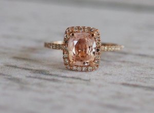
I'm not very experienced with colored stones, but what do you PSers think of the color of this morganite in the rose gold setting? I find it pleasant, but if I really think about it, it has some brown. Is this what we are trying to avoid, or is it okay? This is not a PSers ring, but one from Etsy.

Etsy_EidelPrecious.jpg
 

T L

Super_Ideal_Rock
Premium
Joined
Sep 20, 2008
Messages
25,218
pregcurious|1327333890|3109576 said:
Thanks, TL. You might have saved me from a mistake there.

I'm not very experienced with colored stones, but what do you PSers think of the color of this morganite in the rose gold setting? I find it pleasant, but if I really think about it, it has some brown. Is this what we are trying to avoid, or is it okay? This is not a PSers ring, but one from Etsy.

You're welcome. I think it brings out the brownish color in that stone, but some people might like the look of the morganite (or peachy stones) in a rose gold setting. It's not my thing, even though I'm a rose gold addict. I don't like red, orange, pink or any warm colored stone in rose gold, but someone else might find it attractive. For me, orangy pink stones are the most difficult to set because they do have a tendency of showing some brown in some lighting, and you want to minimize that as much as possible, unless you happen to like brown.
 
Be a part of the community Get 3 HCA Results
Top