You are using an out of date browser. It may not display this or other websites correctly.
You should upgrade or use an alternative browser.
You should upgrade or use an alternative browser.
FCD CAD assistance request
- Thread starter chrono
- Start date
pregcurious
Ideal_Rock
- Joined
- Mar 18, 2009
- Messages
- 6,724
Interesting discussion ladies about gold color and skin tone.  I will have to try on a rose gold piece before commissioning one. My skin has a yellow tone, but in some light (outside) and conditions (coldness), it can look very red.
- Joined
- Apr 14, 2013
- Messages
- 877
Hi Chrono, You (and everyone else!) have been busy with this, and it certainly has matured in many ways! Congrats! Now, I'm going to offer a piece of feedback that struck me when I looked at the CAD. Are you sure you want the smallest Diamond to be in a white setting? It seems to disappear compared to the other CS. I'm wondering if either a YG or RG would help accentuate it a bit? Plus, if you take the floral motif the colored setting could be a connection to the other colored stones. This, of course, is just my perspective........but after all that's been done to accentuate the colors.....it seem's like 'lil white' is kind of lost. At least that's what I see. I do agree that the engraving will help the platinum to come alive.........just wondering about the lil guy on the sidelines. Continued Good Luck!!!
Just looked at the CAD again and the yellow pear would be YG so if that was extended to the little diamond setting as well? If it was my ring I'd definitely want to see how that looks before deciding. It could end up defining (further) all of the 'floral' structure and ring design. IMO..............
Just looked at the CAD again and the yellow pear would be YG so if that was extended to the little diamond setting as well? If it was my ring I'd definitely want to see how that looks before deciding. It could end up defining (further) all of the 'floral' structure and ring design. IMO..............
- Joined
- Aug 14, 2009
- Messages
- 27,265
Chrono,
I've been following your journey from the beginning and I want to add my voice to the excited chorus - I can't wait to see this design come to fruition! I'm still grinning from reading your "It" post three pages prior! You, starzin, and so many others have nurtured it for so long, through so many variants... it's exactly the sort of project I adore: unusual and nuanced.
I'm just adding my 2c to the discussion about gold colour - I, too, think varying metal colour to suit the individual stones and motif elements would give the delivery allure and flourish.
When I look at the "it" CAD I see something that embraces colour. I do agree with PinkJewel re. peachy rose gold and the yellow FCD - it is not a complementary combination to my eyes. I think the little pinks will have to be in rose gold to play up the colour, and PJ's observation about pinks in RG on the exterior of the design getting lost in the skin adjacent is very interesting... I personally prefer pieces wherein each different design element is clearly delineated, and in my experience with mixed metals (which is limited to a small handful of pieces) there are two ways to delineate design elements: by colour or by texture. Your leaves will be engraved, which adds texture, but I don't love the idea of 'textured white metal' + 'plain polished white metal' + 'coloured metal' because I don't like the idea of mixing delineators. I see your concern about delicately coloured stones not being able to "hold their own" against a large amount of boldly coloured metal like rich YG, but there are all sorts of options in-between!!
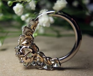
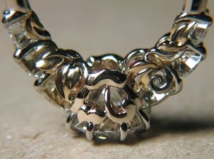
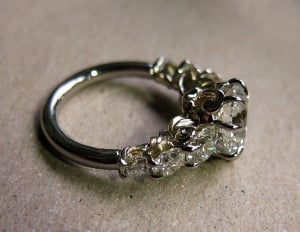
I had the pleasure of seeing (and wearing!) PJ's orchid ring for a few hours a couple of years ago and the center pink really does stand out in the sea of white twinkle - the contrast really does amp up the colour IRL! I think the yellow pear is pleading to be set in a rich 18k YG basket. The pink oval and two peachy rounds look quite differently coloured in the pics on Page2 and I like that she tailored the type of RG to suit. At this point you have two shades of RG, one shade of YG, and two textures of platinum... perhaps you might consider turning that into two shades of RG, two shades of YG, and one texture of platinum, by either changing the plain polished white metal holding the structure together into a very very pale cream/off-white (I'm confident the right alloy of WG is out there), or keeping the plain polished metal white and making the engraved leaves very slightly yellow? I'm thinking a very light ivory that's just barely off-white, so pale that you've got to look closely to even see that it isn't the same white - the sort of difference that YOU will, however, note and appreciate.
As an aside I have to say that the dimensionality of the leaves is IMO one of its biggest draws, and from what I 'know' of you I'm betting it'll wind up being one of your favourite characteristics IRL
My RDG is tri-coloured - it features two shades of plain polished unplated 18k WG (the shank and "curls" are one type of WG and the centerstone basket is another) and brushed 18k YG (leaves). I don't think it's too busy at all - I think the combination of colours is beautiful and elegant. I have thus far avoided posting it on PS for fear of crude copies, but... a year and change post-acquisition and after all sorts of intervening drama I've come 'round to PJ's way of thinking - beauty should be shared! So... here's its quiet and hopefully helpful PS debut. The colour and texture differences are more subtle IRL just by virtue of size - I think we often forget just how tiny these pieces really are!


pinkjewel
Ideal_Rock
- Joined
- Aug 1, 2011
- Messages
- 2,362
Ah, Yssie- I'm so glad you've finally posted your beautiful ring. 

 I also got to wear Yssie's ring for a bit, too.
  The changes of metal color are so beautiful and subtle in your ring. But Mike was (is?) a master goldsmith. I have not seen work from Chrono's jeweler and I don't know if they could pull off all the different colors in quite the same way. What do you think, Chrono? I know you visited them in person at the beginning of your journey.
deskjockey
Brilliant_Rock
- Joined
- May 10, 2013
- Messages
- 544
That is just beautiful.
I don't know if this is the right place for this, but I have to thank all you PSers - I never really was into jewelry or had much appreciation for it but reading and watching here has made me so appreciative of the creativity, beauty, and subtlety involved. I doubt I could ever come up with even the idea for something like that, let alone help guide its execution (all these CADs look the same to me!)
Just, bowing to the collective creative and artistic skills of all involved!
pregcurious
Ideal_Rock
- Joined
- Mar 18, 2009
- Messages
- 6,724
Yssie, your ring looks like someone brought metal together to envelope your stones in a beautiful and natural way.
- Joined
- Aug 14, 2009
- Messages
- 27,265
PJ - I did! I guess... with everything that's happened, with RDG closing, and honestly with so many bigger things to worry about... the thought of a vendor stealing another vendor's work still infuriates me but I've just recently realised what you'd known from beginning - that the pleasure of sharing beauty with like-minded friends outweighs the fear of that possibility!
You're right: adding another colour to the mix definitely adds complexity! I hadn't really considered it when I posted, but in this case since the engraved leaves will be resting on top of the polished portions - since there are multiple "layers" of design that are clearly exposed to view - adding another colour would require meticulous and carefully-planned solder work to ensure the colour change is abrupt from one element to the next...
I do have one other small suggestion: The "S"s winding between the stones look very rounded, but none of the other white design elements share this roundedness. What would you think about requesting a more rounded shank?
Preg, TL, thank you! I'm very lucky to own one of the most beautiful pieces I've ever set eyes on. I haven't posted any pictures of it on PS before and I'm still not terribly comfortable making a new thread for it so I'll have I "man up" first I'm afraid! Chrono, I hope you didn't mind me posting it here - I don't want it to intrude on your thread but I do think it's an excellent example of an uncommon metal combination that achieves a specific aesthetic.
You're right: adding another colour to the mix definitely adds complexity! I hadn't really considered it when I posted, but in this case since the engraved leaves will be resting on top of the polished portions - since there are multiple "layers" of design that are clearly exposed to view - adding another colour would require meticulous and carefully-planned solder work to ensure the colour change is abrupt from one element to the next...
I do have one other small suggestion: The "S"s winding between the stones look very rounded, but none of the other white design elements share this roundedness. What would you think about requesting a more rounded shank?

Preg, TL, thank you! I'm very lucky to own one of the most beautiful pieces I've ever set eyes on. I haven't posted any pictures of it on PS before and I'm still not terribly comfortable making a new thread for it so I'll have I "man up" first I'm afraid! Chrono, I hope you didn't mind me posting it here - I don't want it to intrude on your thread but I do think it's an excellent example of an uncommon metal combination that achieves a specific aesthetic.
- Joined
- Apr 22, 2004
- Messages
- 38,364
digdeep|1408721374|3737534 said:Hi Chrono, You (and everyone else!) have been busy with this, and it certainly has matured in many ways! Congrats! Now, I'm going to offer a piece of feedback that struck me when I looked at the CAD. Are you sure you want the smallest Diamond to be in a white setting? It seems to disappear compared to the other CS. I'm wondering if either a YG or RG would help accentuate it a bit? Plus, if you take the floral motif the colored setting could be a connection to the other colored stones. This, of course, is just my perspective........but after all that's been done to accentuate the colors.....it seem's like 'lil white' is kind of lost. At least that's what I see. I do agree that the engraving will help the platinum to come alive.........just wondering about the lil guy on the sidelines. Continued Good Luck!!!
Just looked at the CAD again and the yellow pear would be YG so if that was extended to the little diamond setting as well? If it was my ring I'd definitely want to see how that looks before deciding. It could end up defining (further) all of the 'floral' structure and ring design. IMO..............
I posed your question to the designer and this is her response:
...I've been looking at it and I think that might be too much rose gold in one spot. The four sections of rose gold all have white metal between to break them up, where if the top diamond is also in rose gold, right against the pear... it makes the whole top of the ring rose gold. I think having the platinum there balances the ring.
So I asked about making the 2 petals in PT, to create that contrast and this is her response:
...Those leaves are so small, if you make them platinum between the rose gold, I think they will get lost. It'll look like a flaw rather than intentional. Keep in mind this is SOO much smaller in real life than it appears, so if you were to make the prongs rose, I would also make the leaves rose. Then, that's just aesthetically speaking.... structurally speaking, you really want the entire piece that any stone is set it, to be made of one cast, so one metal. If you make it two pieces and solder them together it will be much weaker. I do not suggest this for my own personal aesthetics, but mainly for structural concerns.
So after our conversation, I have decided to leave the little diamond in platinum.
- Joined
- Apr 22, 2004
- Messages
- 38,364
Yssie,
That is a gorgeous ring and I thank you for sharing it here first, complete with pictures. Trust me, even if your ring is ever copied, it will be one heck of a challenge due to the complexity and I don't think any copy will ever have the same level of detail and finish. It will be almost impossible.
Now onto the questions about the gold colour and CAD by the designer:
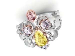
...The colors in the render are all done by eye... my eye :/ There's no way for me to make it 100% accurate. 18K and 14K will render the same. I set all of the values for ROYGBIV making the color what it is. Also, the program isn't able to reflect the metal through the stone as it will in real life. This is a computer generated image and not an actual photograph.... it can only do so much unfortunately.
This is why I have to trust the designer at this point. Any differences in gold colour that you see is an artifact of the CAD software and its limitation. Just as you trusted RDG sans CAD and all, I have to do the same here. The positive out of this trust is a re-do if I am unhappy with the end result.
In the CAD, there is no yellow gold at all. There is only ONE shade of rose gold and platinum. There are only two textures, smooth and carved leaves, both in platinum. I do not like white gold for pieces that are carved because I think they will wear sooner, hence I have tried my best to stay away from it, especially in my special pieces. I agree that the leaves is the biggest draw for me so I am itching to see the end result.
- Joined
- Apr 22, 2004
- Messages
- 38,364
pinkjewel|1408736290|3737679 said:Ah, Yssie- I'm so glad you've finally posted your beautiful ring.

I also got to wear Yssie's ring for a bit, too.
The changes of metal color are so beautiful and subtle in your ring. But Mike was (is?) a master goldsmith. I have not seen work from Chrono's jeweler and I don't know if they could pull off all the different colors in quite the same way. What do you think, Chrono? I know you visited them in person at the beginning of your journey.
To be honest, I have not seen 3 toned work at their store, only 2 toned.
- Joined
- Apr 22, 2004
- Messages
- 38,364
deskjockey|1408736752|3737686 said:That is just beautiful.
I don't know if this is the right place for this, but I have to thank all you PSers - I never really was into jewelry or had much appreciation for it but reading and watching here has made me so appreciative of the creativity, beauty, and subtlety involved. I doubt I could ever come up with even the idea for something like that, let alone help guide its execution (all these CADs look the same to me!)
Just, bowing to the collective creative and artistic skills of all involved!
It was for me too; it takes time to be able to see the differences. Your continued support (and others) is invaluable. Thank you all again and this is truly a PS piece.
- Joined
- Apr 22, 2004
- Messages
- 38,364
Yssie|1408740592|3737735 said:PJ - I did! I guess... with everything that's happened, with RDG closing, and honestly with so many bigger things to worry about... the thought of a vendor stealing another vendor's work still infuriates me but I've just recently realised what you'd known from beginning - that the pleasure of sharing beauty with like-minded friends outweighs the fear of that possibility!
You're right: adding another colour to the mix definitely adds complexity! I hadn't really considered it when I posted, but in this case since the engraved leaves will be resting on top of the polished portions - since there are multiple "layers" of design that are clearly exposed to view - adding another colour would require meticulous and carefully-planned solder work to ensure the colour change is abrupt from one element to the next...
I do have one other small suggestion: The "S"s winding between the stones look very rounded, but none of the other white design elements share this roundedness. What would you think about requesting a more rounded shank?

Preg, TL, thank you! I'm very lucky to own one of the most beautiful pieces I've ever set eyes on. I haven't posted any pictures of it on PS before and I'm still not terribly comfortable making a new thread for it so I'll have I "man up" first I'm afraid! Chrono, I hope you didn't mind me posting it here - I don't want it to intrude on your thread but I do think it's an excellent example of an uncommon metal combination that achieves a specific aesthetic.
I, for one, am glad you changed your opinion about sharing such works of beauty! The two white colours in your ring are so subtle to the point I cannot make it out in your pictures. I am very sure to be able to see it in person though. The S winding is actually a thin line. It has to be thicker in the CAD to allow the finishing because it will be polished out to the correct shape and thinness. I think the S winding is no thicker than 0.5 mm, possibly less.
- Joined
- Apr 22, 2004
- Messages
- 38,364
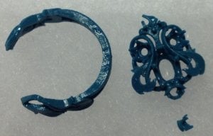
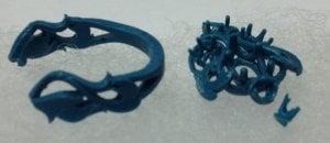
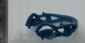
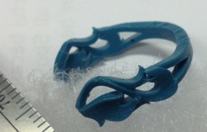
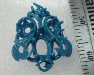
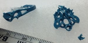
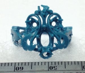
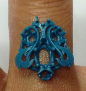
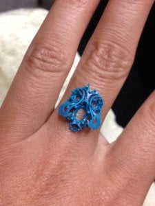
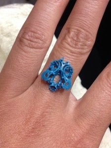
For those curious about the wax mold...
Quote
You can keep it. I will have to make the wax in multiple parts for casting, while I will send you a wax proof that is all one piece. The wax is EXTREMELY fragile!!!! It may not reach you completely in tact :/ but I sure hope it does. It's almost like chalk. We've coated it in an oil that makes it a little more durable, but please be very careful. I'd hate for it to be smashed before you get to see it.
- Joined
- Apr 14, 2013
- Messages
- 877
Thanks Chrono........what a ride! Makes sense about the waxes being fragile if they are constructed for each metal layer. Hopefully you can 'gently' put your stones on/in to get a sense of the finished ring! Congrats on all you've accomplished! You're almost at the finish line............... 
Yssie, that's a gorgeous ring! The flow of the metal looks so smooth. The gallery details are so unique! Love it 
Chrono, seldom do I check into Colored Stones. I checked in today to look for updates on your ring. I didn't realise it's towards the end of the run. Can't wait to see it done!
Chrono, seldom do I check into Colored Stones. I checked in today to look for updates on your ring. I didn't realise it's towards the end of the run. Can't wait to see it done!
Starzin
Brilliant_Rock
- Joined
- Sep 26, 2011
- Messages
- 1,850
PJ - I hadn't seen that lovely cushion! TFS and I see what you mean about the rose gold disappearing somewhat. Nonetheless a lovely ring, not to mention the mind-blowing Orchid!! 
Yssie - thank you soooo much for braving the public with your gorgeous ring. Such a delight to see another RDG masterpiece. I also agree with Chrono that it would be near impossible to to copy it, let alone with any degree of the perfection of yours. Congratulations and wear it in health and happy times
Chrono - on the home stretch!!! Can you believe that this has taken 3 threads (this is the fourth) since 3 Dec 2013???? A marathon indeed and you've done sooo well to stick to what your dream was and yet be able to adjust that to reality when required and eventually come up with something you are excited about. That is a talent in itself! I'm sure you can almost taste it at this stage and I'm on the edge of my seat with you
I think I've missed it somewhere but are you going for YG under the pear even though the CAD cannot show the three colours? And pointed claws rather than "blob" prongs?
Although I was highly resistant to the original roundness and thickness of the "lyre" I think the changes the designer made regarding depth and width have thinned it down remarkably and it now appears to be a more oval shape - top to bottom - if that makes sense, which looks much better and appeases me greatly with regard to the design
- Joined
- Apr 22, 2004
- Messages
- 38,364
digdeep|1409015772|3739276 said:Thanks Chrono........what a ride! Makes sense about the waxes being fragile if they are constructed for each metal layer. Hopefully you can 'gently' put your stones on/in to get a sense of the finished ring! Congrats on all you've accomplished! You're almost at the finish line...............
They are on the West Coast and I am on the East Coast. They also have all my diamonds, so I have to use my imagination to "see" what the end result will be. The purpose of the wax is to get some idea of the proportions and perspective on my finger.
- Joined
- Apr 22, 2004
- Messages
- 38,364
thecat|1409018605|3739297 said:Yssie, that's a gorgeous ring! The flow of the metal looks so smooth. The gallery details are so unique! Love it
Chrono, seldom do I check into Colored Stones. I checked in today to look for updates on your ring. I didn't realise it's towards the end of the run. Can't wait to see it done!
Thank you. The days cannot go by fast enough.
gregchang35
Ideal_Rock
- Joined
- Sep 11, 2012
- Messages
- 3,416
Wow.... what a transformation from the original sketches...
So exciting! cant wait to see the wax model!
So exciting! cant wait to see the wax model!
- Joined
- Apr 22, 2004
- Messages
- 38,364
Starzin|1409019360|3739304 said:Chrono - on the home stretch!!! Can you believe that this has taken 3 threads (this is the fourth) since 3 Dec 2013???? A marathon indeed and you've done sooo well to stick to what your dream was and yet be able to adjust that to reality when required and eventually come up with something you are excited about. That is a talent in itself! I'm sure you can almost taste it at this stage and I'm on the edge of my seat with you
I think I've missed it somewhere but are you going for YG under the pear even though the CAD cannot show the three colours? And pointed claws rather than "blob" prongs?
Although I was highly resistant to the original roundness and thickness of the "lyre" I think the changes the designer made regarding depth and width have thinned it down remarkably and it now appears to be a more oval shape - top to bottom - if that makes sense, which looks much better and appeases me greatly with regard to the design
Yes, this ring has taken quite a long time, from its original brainstorming till today. No, the yellow pear will be set in 18K rose gold. I recall vaguely that I had played with their yellow pear FCD earrings and their 18K RG alloy and found it a good combo when I was last in their store. Good catch about the prongs! I will ask for pointy claw prongs right away.
- Joined
- Apr 22, 2004
- Messages
- 38,364
gregchang35|1409057550|3739440 said:Wow.... what a transformation from the original sketches...
So exciting! cant wait to see the wax model!
Hi Greg! I thought just about everyone has dozed off from being bored with the progress of this ring since we weren't getting anywhere the past week months.
gregchang35
Ideal_Rock
- Joined
- Sep 11, 2012
- Messages
- 3,416
hey chrono,
you are a valued contributor to the PS coloured stones forum and RT. Everyone turns out in droves to help you out.

we have some amazing ppl out there with creative ideas...

you are a valued contributor to the PS coloured stones forum and RT. Everyone turns out in droves to help you out.
we have some amazing ppl out there with creative ideas...
Did You Miss The Throwback Thursdays For April 2024? Did You Miss The Throwback Thursdays For April 2024? - 04/25




300x240.png)