shape
carat
color
clarity

3 stone gem ring help

Status
Not open for further replies. Please create a new topic or request for this thread to be opened.
Date: 9/30/2009 11:11:40 PM
Author: Stone Hunter
Date: 9/28/2009 10:58:40 PM

Author: packrat


Stone Hunter, I talked to Dana and he said whenever I figure out what I want for stones he''d do it for me, and Julia Kay Taylor will be doing the ring!
36.gif


What would you guys recommend for pale blue or yellow? I see zircon and grossular and mali garnets mentioned so far. I''d like sparkly and not over the top expensive.


I''ll do some searches and look at some colors!

So you have a stone vendor and a jeweler nailed down. Way to go!


Garnets are sparkly and so are Spinels! I''d mix the two of them for hardness (well the spinel) and sparkle! HTH

Yep, and that''s about all I''ve got nailed down! Well, oval and rose cut too. I know it will have blue in it..maybe yellow..maybe green too! argh!
 
I just realized I was suggesting side stones of different sizes, and that''s not doable with this design - sorry!

All three in the same shape, but three different colors - hmmm...it they''d be all different sizes, or all the same size, I''d say go for it. But since they''re a center stone with two side stones I''m not so sure. Of course it''s a matter of taste, but all colors have different visual weight so one side stone would look (visually) heavier, potentially seem smaller, or give an impression like it''s not set at the same height. But of course I have an idea - your suggestion could be doable if you''d find one side stone in a lemony (greenish) yellow shade, and the green one in light yellowish green. Think shades of canary diamonds and peridot. That way you could make them seem more similar regardless of them being different colors.
 
No problem. Until I came to PS I didn''t know how to do this either, but I did my stuff in PowerPoint. You just paste in the pictures (you can elongate the shape by using the arrows on the side of the picture, but I just generally searched for ovals). You can add text and whatever else you need to do, and then when you hit save go down to the bottom of the pop-up box, click on the pull-down menu and select save as JPGE (single slide only). Now you''ve got yourself a jpeg! If need be you can then pull up the file in another program if you need to crop it, but the basic work is done.

Anyway, have fun with your stone arrangmenets!
 
Hey pack.
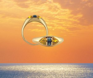
thought you may find this image interesting - sorry about the cheesy sunset bit, I couldn''t get rid of it
40.gif

But it''s tourmalines - blue and yellow. I think it would look equally nice with sterling..
(but really nice in YG
9.gif
)
11.gif


x1878_detail.jpg
 
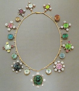
I also thought I'd post this - imho, it's one of the prettiest things I've seen.
They are all tourmalines, a necklace the Hamlin family (who discovered tourms) had made.
I think it just shows you really can mix what you like, as long as you get the right shades and a complementary design.

Before this, I was never a fan of multi - coloured pieces, I saw them as tacky (I guess due largely in part to the icky maul store rainbow sapph bands). But this changed my mind, and shows you can make multi colour classic and pretty!

Hamlin BB.jpg.jpg
 
How about aquamarine, yellow beryl/heliodor, and Prasiolite/green amythest? All come in relatively pale saturations at reasonable prices, and the first two are both beryl and prasiolite has a similar RI (about 1.5) so they would all have about the same sparkle factor?
 
Wow, what a pretty necklace.
30.gif
I want! I want!
30.gif
 
That necklace is gorgeous AJ! Think how fun that would be to have the money to design something spectacular like that!!

Ma Re-you mentioned the visual heaviness..when I was playing last night w/my color pictures, that''s what I was having problems with. I just didn''t know the term for it..it was like my eyes kept going to one part and ignoring the rest. The green on one side (well, the green I picked out anyway) just did not want to work well. I think I''d have to have a super crayon yellow to get it to look right and I don''t want that. Not for this piece anyway. Then the blue would have to be super blue also and meh..It looked better when I put the yellow in the middle-the sides were more balanced out, but then it seemed like the yellow center was put on the back burner and all I really noticed were the sides.

I''m thinking that as lovely as the flowers are in my canvas pictures, they may not be available or work as stone colors.

Anyone ever get the feeling the direction they''re trying to go just isn''t right and scrap part of it to try something else?
 
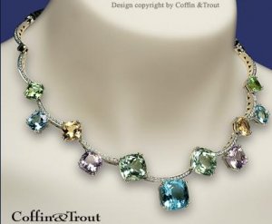
ok- I didn't read all the response, but I saw this necklace, and I actually saw this in person, and it was sooooo stunning with all the colors, however (there were a lot of gems with windows
40.gif
) anyhow thought of you,

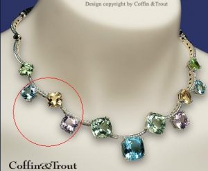
The Blue Yellow and lavender looks more well balanced to me in this photo.

cf dt 09091.JPG
 
like the one circled... but thats just me talking...lol

cf dt 090912.JPG
 
Wow-another gorgeous necklace! What kind of stones are those D&T, do you know?
 
those are beryls just a bunch of different ones.
 
Date: 10/1/2009 3:54:29 PM
Author: packrat

It looked better when I put the yellow in the middle-the sides were more balanced out, but then it seemed like the yellow center was put on the back burner and all I really noticed were the sides.
What about having oval cabs as sides, and a faceted yellow center? That would make it clear who the star is
9.gif
As for cabs, you could go with a moonstone and a prehnite or something like that, or blue and green tourmalines if you''d like them more transparent. Just suggesting
1.gif
 
I actually looked at cabs last night! I like prehnite alot, but think I would do more transparent-tourmalines like you suggested.

I''m thinking of scrapping the 3 color combo and doing something a little more similar to the LM ring-white center and 1 color sides.

As I was looking at places last night, I saw some other pretty colors so now I''m torn about the sides. I could do a white spinel for the center. I saw some pretty raspberry and pad colors I could do for the sides instead..either cab or rose cut like the center. Those colors I figure would be more striking with white center, like how the blue cabs have such a good contrast w/the diamond in the LM ring.

Thoughts on that instead? Sorry I''m so all over the place!!
 
Well since you have a hard time deciding on color(s), how about giving your wardrobe choices some thought - which colors you wear, which look particularly good on you, which color combinations are your favorite, which colors work well with your skin tone... For example, I like a combo of deep blue and high karat gold, but I wear blue so rarely that it would be a waste of money to get jewellery in those colors (and I also don''t like how blue looks on me in general).
 
Oh boy..I wear cheap random colored sweats most of the time. Bwhahaha ok, sorry, I''ll be serious now and have a look.
 
Hmm..I have an abundance of various shades of pink, orange and yellow. Haha it was kinda funny actually, to open my closet and dresser and see those colors..I never paid that much attention to it before. My scrubs I wear to work are bright orange and pink-neonish. The scrubs I have my eye on for an extra pair are bright yellow. My fleece pull overs from my other job are all raspberry. Plus a ton of my regular non work clothes are those colors too.

Do spinels come in those colors, or should I look instead for sapphires and tourmalines? Tourmaline being less spendy than sapphire I''m sure. Tho, since they''d be on the smaller side, would there be much difference in price?
 
Spinels come in both orange and pink/magenta, but those tend to be pricey, especially the purest, brightest shades (neonish). When it comes to sapphires, such colors can be either quite affordable or very expensive, depending on the treatment (BE sapphires come in those colors for like 100$/ct, naturals can go for thousands). Pink tourmaline can be very nice and bright while still being affordable, orange ones are inexpensive too (but generally not really bright of a shade), while yellow ones are rare and more expensive.
 
Thanks Ma Re!

Are raspberry colors more affordable?

Would a white center w/either pad color or raspberry sides be too visually heavy on the sides? I suppose it would depend on the how dark the color is?

I wonder if a lighter/brighter color would show the rose cut better than a darker. I saved pictures of a deeper raspberry color that was really pretty and also one that was lighter. And I saved Tgal''s color collage of her pad.
 
Raspberry - I was talking about pink, but I was thinking about an array of shades, from rose to magenta to raspberry - they''re all kind of pink
9.gif
So yes, there are raspberry (i.e. light pinkish red) spinels and they are pricey, just like untreated sapphires of that shade. Tourmalines would be your best bet when it comes to the color RASPBERRY (<---click).

I think you slightly misunderstood me about visual weight - I was refering to it in terms of using sides of different colors, in which case one stone could end up feeling visually heavier than the other one (so you''d get a feeling of lacking balance in that piece). But if you''ll go with sides of the same color there''s no risk at all. Of course, the ring would look totally different with pad colored sides as opposed to the one with raspberry sides, but if the center is white it''s all down to personal preference. BTW affordable tourmalines can look padish, as well as some not overly expensive spinels.

When it comes to bringing out the reflections on a rose cut gemstone, the darker the color, more contrast there is between it''s color and white reflections of light i.e. reflections will be easier to see. If light shines off a stone (reflects) and it produces a white "sparkle", if that stone''s color is light, there won''t be much contrast between the two because the color of the surface and the color of the sparkle are visually similar so it''s harder to distinguish between the two. It''s the opposite of refraction, where you''ll se a stronger sparkle in a lightly colored stone because less light is absorbed by the material and more is reflected from the pavillion facets, but those are internal reflections, and rose cut stones depend on external (surface) reflections.

Hope I didn''t go to far and confuse you further
9.gif
 
haha yeah, I thought I got it wrong about the visual heaviness. (the heaviness is like when I tried to do yellow and green on the sides, right?) I was reading my post again and thought that it wasn''t so much what I wanted to say. I meant more, if the color is darker on the sides, will that take away from the center and wash it out, make it fizzle?

Sooo now what about the different properties of the stones? Are there stones more suited for certain cuts than others? Would it look "off" if the center stone were spinel, and the sides were tourmalines? Or would it create a nice contrast?

Haha, no I like it when you guys take the time to explain all these different things about stones and their properties, and why certain metals look better with certain gem colors and why this particular color gem doesn''t look well w/this other. It''s interesting. That''s why I like following along with everyone''s projects so much-first, b/c I''m the most indecisive person on the face of the planet when it comes to what I want, so it''s fun watching others actually getting something done, and second b/c I can learn a bit at the same time-why someone went w/a particular setting over another and things like that too.

Dana has a spinel that is sort of paddish, tho seems darker. Hard to tell b/c the pictures aren''t necessarily the same as real life. I can see what kind of rough he has hanging around in some of these different colors.
 
Will darker sides take away from the center? They could, but don''t have to - depends on the color combo and things like lighting conditions. Usually when you look at a photo, or an object that doesen''t move, your eye is always drawn to vibrant, more saturated colors (or darker tones over light ones). But since gems are three dimensional objects that handle light due to the faceting process they went through, you also see them sparkle and scintillate.

Now let''s take your desired stones into consideration. Since you''d like to use rose cuts, the higher the refractive index, the more will the stone reflect light off it''s surface. Also, the darker the tone of color, easier it''ll be for your eye to pick up flashes of light bouncing off the surface. What that means? If you''d take one very light spinel and two (say...) burgundy ones as sides, those two would most probably overpower the center as they''d seem to sparkle more - since all three have the exact same R. I. Now, if you''d take a lightly colored spinel and deeper colored tourmalines, they would probably work better together and show all three stones in a nice way, since tourmalines lower R. I. would make them sparkle less, but it''s darker color would make reflections more obvious at the same time. So eventhough spinel would be lighter and it would be more difficult to see it''s light reflections, tourmaline would not slow down light as much (due to the lower R. I.), and therefore it wouldn''t allow light to bounce as much off the surface. So I think it might (at least in theory) be safer to combine low R. I. darker sides with a high R. I. lighter center if you''re going with all three rose cuts. If you wonder which stones have lower and which have higher R. I.''s just google out something like "refractive index gemstones" and you''ll find some reference.

Oh yeah, rose cuts perform best in stronger direct light obviously, and yes, there are stones which are more suitable for certain cuts. For example (as I tried to explain in my previous post), rose cuts make light reflect off their surface producing external reflections, so high R. I. (which indicates stronger slowing down of light upon entering the material) brings out that cutting style better than it would be brought out by low R. I. materials which would leak more light inside the stone where it doesen''t have anything to bounce (reflect) off - no pavillion.
 
I have nothing useful to say, but thanks for the education Ma re!
 
Date: 10/4/2009 10:41:36 AM
Author: AustenNut
I have nothing useful to say, but thanks for the education Ma re!
No problem
2.gif
At least all those years of reading about gems and watching youtube videos of them (while paying attention that no one sees me watching them, just to be safe) are resulting in something useful
9.gif
 
So interesting Ma Re-thank you!

I did google it and made a little chart. Now, say I were to end up using white spinel as the center and sapphire or rhodolite as the sides-the spinel isn''t *that* much lower than either of those, so having the lower R.I. as the center, would the difference be huge or barely noticeable? I have more choices if I use sapphire as the center than spinel, according to my handy dandy chart, tho I''m leaning towards spinel and tourmaline.

Does anyone have thoughts on the merits of white sapphire v white spinel?
 
All these things we discussed are just written theory and may not prove right in practice. There are aspects like clarity which affect visual characteristics, so you never know, it''s down to each individual stone I guess.

If you were to use white spinel and sapphires or rhodolites for sides (any of them a darker color) I''d say sides would probably be quite sparkly compared to the center (if we''re talking all three in oval rose cuts) and possibly more noticable.

BTW, do you have someone to source you white spinels, cause they''re not exactly abundant and I can''t remember when was the last time I saw them sold anywhere online? White sapphires are more durable and easier to find (but probably a bit more expensive).
 
I really like the idea of keeping the white center with two of the same colored side cabs. Why not shoot for the same paraiba/indocolite sides? I really love Leon''s originial, so if it were me, I think I would try to go for a similar effect- a rose cut center over with glow-y paraiba side stones.
 
Dana had a white spinel on his site that''s sold. I sent him an email to see if he had anything in these colors. White sapphire would be fine by me..I was mainly saying spinel cuz that''s what I have already so that''s the only experience I have w/seeing stones in real life.

It''s ok if the sapphire is a little more expensive..I''d originally planned on having Leon do the ring and using diamonds, so this is going to turn out a lot less expensive, regardless!

I really appreciate all this help Ma Re!
 
Date: 10/4/2009 3:25:20 PM
Author: szh07
I really like the idea of keeping the white center with two of the same colored side cabs. Why not shoot for the same paraiba/indocolite sides? I really love Leon''s originial, so if it were me, I think I would try to go for a similar effect- a rose cut center over with glow-y paraiba side stones.

Thanks for weighing in szh07! The stones are what originally caught my eye in the ring, and I thought to do something similar but not copy it too much..however, that doesn''t mean the thought isn''t still in the back of my mind! I''ve looked at quite a few cabs at various websites the last few days!
 
Hey, I have another question. What kind of measurements should I be thinking of? 7x5 for the center and 5x3 for the sides or something maybe? I don''t know the first thing about ovals.

I''ve decided on either all white or white w/raspberryish cab sides, for what it''s worth!
 
Status
Not open for further replies. Please create a new topic or request for this thread to be opened.
GET 3 FREE HCA RESULTS JOIN THE FORUM. ASK FOR HELP

Featured Topics

Top