shape
carat
color
clarity

Peach engagement ring suggestions

Starzin

Brilliant_Rock
Joined
Sep 26, 2011
Messages
1,850
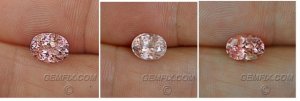
I also like the middle stone best. It fits your gf's desire for a pale stone and looking at the pictures it shows that rare mix of pink/apricot/yellow facets which would indicate a very pretty stone when sparkling in a setting as those colours wink on and off around the stone as it's moved. This is one of the things that set pads apart. The others look as though they may not have this ideal mix in real life.
 

chrono

Super_Ideal_Rock
Premium
Joined
Apr 22, 2004
Messages
38,364
Since the handshots are more accurate, here's what they look like when put next to each other.

one_two_three.jpg
 

GregS

Brilliant_Rock
Joined
Sep 5, 2012
Messages
719
You said no pink, I think the first stone may have too much pink in it for somebody that doesn't want pink. Third stone is out for reasons already mentioned. So you're left with the middle stone, which is a certified Pad, looks to have the best cut of the bunch and will play off of rose gold very nicely.
 

chrono

Super_Ideal_Rock
Premium
Joined
Apr 22, 2004
Messages
38,364
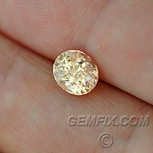
Since you mentioned champagne diamonds, I thought you might be open to considering this colour as well.
Peach yellow untreated 2.6 ct sapphire (8.4 x 7.4 mm) with a prong-able inclusion.
$2875.00 with AGL lab report included.

sapphire_yellow_547_a.jpg
 

itsapeach

Rough_Rock
Joined
Oct 15, 2014
Messages
7
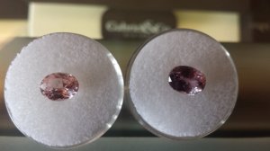
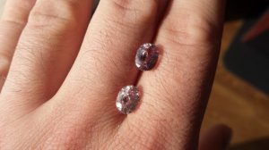
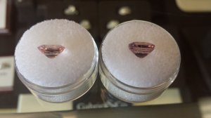
OK all, I'm back with a few stones in hand from Gemfix. I ordered the first but found it to be surprisingly purple, even stating as much on the GIA cert so got the second in order to vet them against each other.

I do like the color of the lighter stone better against the rose gold that she wants, and I know color is paramount. One concern I have is that it is a bit cloudy to the eye with some soft inclusions, while the other is eye clean from what I can tell. What do you all think?

The first/darker stone is described as: "Brilliant and flashy peachy champagne pink color sapphire. Clean and bright, well cut. Certified heat only, GIA lab report included." The GIA report calls it "Purplish pink" and I can tell the purple under the correct light.

The second/lighter stone is described as: "Lightest peach-pink, bright and flashy. Beautifully cut, eye clean with "sprinkles" visible at about 4 inches. Certified Padparadscha, GIA lab report included."

The first is 3.08ct, and second 2.35, though from the profile picture you can see below the additional weight comes from the depth of the stone, they are both nearly the same face-up.

A few pics of both together:

20141107_102418.jpg

20141107_102455.jpg

20141107_102529.jpg
 

GregS

Brilliant_Rock
Joined
Sep 5, 2012
Messages
719
Aside from not having the color you're after, the first stone appears to have a small window, it would probably close up some in a setting but it'd drive me crazy in an engagement ring. The second lighter stone would be my pick between the two. I do see reason for your concern with the inclusions as they could affect the stones overall brilliance and scintillation.
 

Niel

Super_Ideal_Rock
Premium
Joined
Jul 23, 2012
Messages
20,047
Your photos don't really look much like the vendors. Are your photos accurate to what you're seeing.
 

chrono

Super_Ideal_Rock
Premium
Joined
Apr 22, 2004
Messages
38,364
I agree with Niel; are the colours in your photography close to what you see in person, rather than what is on Gemfix's website? Let me see if I understand you correctly:

Oval is a peachy colour more in line what what you want but it looks cloudy to you.
The cushion looks more purplish (not the colour you want) but it is clear and sparkly.

If so, then neither stones are the right one for you.
 

itsapeach

Rough_Rock
Joined
Oct 15, 2014
Messages
7
I feel like the photos I've taken represent fairly what I have in hand. Unfortunately the first is a bit purple and not ideal in the rose gold that she wants. The she economic is a delicate pink that's perfect, but does have some cloudiness and is less carats, despite the desired padparadscha designation.

I'm very inclined to take the lighter second stone, with the only caveat being the inclusions. I understand that in sapphires this is not uncommon, perhaps expected. And the padparadscha designation is well desired, though maybe the pricing matches. In reality this may be the tip end either way so in my mind between the two I'm inclined to rake the second and lighter since the color fits better. Am I going to get myself in trouble with this approach?
 

Niel

Super_Ideal_Rock
Premium
Joined
Jul 23, 2012
Messages
20,047
itsapeach|1415447107|3779656 said:
I feel like the photos I've taken represent fairly what I have in hand. Unfortunately the first is a bit purple and not ideal in the rose gold that she wants. The she economic is a delicate pink that's perfect, but does have some cloudiness and is less carats, despite the desired padparadscha designation.

I'm very inclined to take the lighter second stone, with the only caveat being the inclusions. I understand that in sapphires this is not uncommon, perhaps expected. And the padparadscha designation is well desired, though maybe the pricing matches. In reality this may be the tip end either way so in my mind between the two I'm inclined to rake the second and lighter since the color fits better. Am I going to get myself in trouble with this approach?

Sounds like either the inclusions or color aren't quite what you are looking for. Id return them both if that's the case. I don't think there is any reason to compromise

I still am fond of that concave cut round.
 

LoversKites

Brilliant_Rock
Joined
Nov 16, 2013
Messages
1,733
There are plenty of gems out there. Don't settle for something you aren't perfectly happy with. It'll take some more time to find but it's better than thinking 'Gee I wish it didn't have those inclusions' every time you looked at it.

I like the concave cut as well.
 
Be a part of the community Get 3 HCA Results
Top