shape
carat
color
clarity

Red and green should never been seen ......

dk168

Super_Ideal_Rock
Premium
Joined
Jul 7, 2013
Messages
12,499
Does that hold true when it comes to coloured stones?

I LOVE the combination of red (my "red" is magenta/deep pink/cerise/fuchsia/etc.) and green, so much so that I had a custom-paint job on my car, a MINI Cooper with Chilli Red body with a lime green roof and wing mirrors, and she is called Apple. :))

Peeps thought I was mental at the time back in 2002 when I placed my order, however, she inspired many others to have custom-paint jobs on their MINIs.

I have an emerald green jacket made that is lined with (true) red satin fabric, and often wear it with a red-cheque or solid fuchsia blouse.

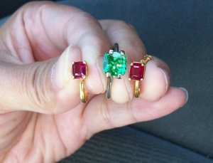
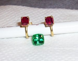
I have seen quite a few examples of CS rings with red and green stones together, and this thread is prompted by Chrono's recent pics of gorgeous deep pink and bright green stones, therefore, I am guessing peeps like the combination of red and green when it comes to CS.

Red and green co-exist naturally in nature in flowers and plants, so why the saying of "red and green should never been seen"??? :confused:

DK :))
 

missy

Super_Ideal_Rock
Premium
Joined
Jun 8, 2008
Messages
54,127
Interesting Dk. I have never heard of that saying and in fact aren't Christmas colors red and green?
 

Enerchi

Super_Ideal_Rock
Joined
Oct 4, 2011
Messages
10,658
I thought the expression was "Blue and Green should never be seen, except for in a magazine..." That's the one I grew up with
 

missy

Super_Ideal_Rock
Premium
Joined
Jun 8, 2008
Messages
54,127
Enerchi|1386625667|3570855 said:
I thought the expression was "Blue and Green should never be seen, except for in a magazine..." That's the one I grew up with

Wow, another one I never heard and I love blue and green together! As long as it is the right shade that is.
 

LD

Super_Ideal_Rock
Premium
Joined
Jun 29, 2008
Messages
10,261
You're absolutely right. The saying is "red and green should never be seen unless there's yellow in between". This is actually a Nautical reference. Red is port and green is starboard in terms of navigation lights so if you're seeing both the red and green lights of a ship coming straight at you ........................... you'd better get out of the way pronto!!
 

T L

Super_Ideal_Rock
Premium
Joined
Sep 20, 2008
Messages
25,218
I think the combination of warm (red) and cool (green) stones are fabulous.

My new favorite combination is bright orange and turquoise blue. I wish I could get a mandarin spess halo around a neon paraiba.
 

sonyachancs

Shiny_Rock
Joined
Aug 6, 2013
Messages
427
I think it's beautiful! I always thought it was purple and red together that was the problem.

but these days, not matching IS matching!
 

endless_summer

Brilliant_Rock
Premium
Joined
Sep 15, 2013
Messages
1,103
TL|1386630521|3570902 said:
I think the combination of warm (red) and cool (green) stones are fabulous.

My new favorite combination is bright orange and turquoise blue. I wish I could get a mandarin spess halo around a neon paraiba.

So funny you say that! I love orange & blue combos - they work as well as they do because they're opposite each other on the color wheel (complementary colors) and make each other look brighter. I've never heard the red and green should never be seen saying, but it's surprising because red & green are opposite each other as well - part of the reason that strawberries and red fruit are in green baskets in the grocery store - makes the red look brighter :)
 

pregcurious

Ideal_Rock
Joined
Mar 18, 2009
Messages
6,724
I like the combo. I think emerald/tsavorite with red spinel or ruby looks fantastic!
 

chrono

Super_Ideal_Rock
Premium
Joined
Apr 22, 2004
Messages
38,364
I think it depends on the hue. I like orange and blue, and pink and green but I'm not so sure about red and green. Perhaps it is because we have been conditioned to associate Christmas with this colour combination?

_12588.jpg

christmas2.jpg
 

OTL

Brilliant_Rock
Joined
Jun 27, 2012
Messages
1,349
Chrono|1386765124|3571874 said:
I think it depends on the hue. I like orange and blue, and pink and green but I'm not so sure about red and green. Perhaps it is because we have been conditioned to associate Christmas with this colour combination?

Chrono I like the color in the second picture better when the green cushion goes darker. The first one is so minty green that I feel the tone does not match as good as the second one.
 

chrono

Super_Ideal_Rock
Premium
Joined
Apr 22, 2004
Messages
38,364
OTL,
Both pictures are with the same stones; the only difference is the lighting condition. Since most gems are shifty creatures, one has to take any darkening or hue shifts into consideration. I agree that most colour combinations look best when the tone and saturation levels are similar.
 
Be a part of the community Get 3 HCA Results
Top