shape
carat
color
clarity

POLL : WHITEFLASH CALENDAR COVER OF 2017

Which Cover do you like best

  • Option 1

    Votes: 55 80.9%
  • Option 2

    Votes: 9 13.2%
  • Option 3

    Votes: 4 5.9%

  • Total voters
    68
  • Poll closed .

psadmin

Brilliant_Rock
Staff member
Premium
Joined
Apr 19, 2008
Messages
1,493
Whiteflash recently approached us a fun idea that we thought the PriceScope community would enjoy.

The PriceScope Community gets to choose which cover gets to be on the Whiteflash Calendar 2017.

The poll will run until Thursday.

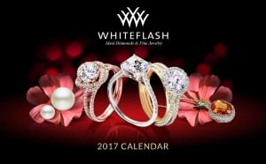
Option 1:
whiteflash_2017_calendar_-_option_1.jpg

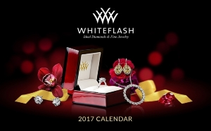
Option 2:
whiteflash_2017_calendar_-_option_2_0.jpg

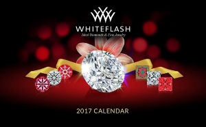
Option 3:
whiteflash_2017_calendar_-_option_3.jpg


It was a difficult choice, but I choose Option 1.
 
I like option 1 - both pretty, elegant and eye catching, the other two lack something in all of those departments visually IMHO.
 
The first design is elegant. The box rather than the jewelry takes center stage in the second design. The third might appeal to us diamond wonks, but its significance would probably be lost on most others.

My only quibble? All three look quite traditionally "Christmassy" to me. As it happens, that's the holiday I celebrate and I do understand why it's the one most merchants play to.... it's just that I'd also like to see someone take a more inclusive - or maybe just less traditional - approach to holiday marketing sometime. (I don't get caught up in the Starbucks cup controversy either. :wink2: )
 
Well, I like no. 2 the best, lots of lovely bling, in fact, it would be nice to see more! :love: :love:
 
I like #1 - it's most aesthetically pleasing to my eyes and the objects in the picture seem balanced. The box in the second picture throws me off, especially because it's tilted, and the third one is too linear IMO.
 
Hands down... no question... #1!
 
Although #1 isn't perfect, I feel that it looks the best.
#2 pulls the eye towards the box
#3 too diamond-centric and WF is more than just rounds and princess cuts.
 
My vote is for option #1--best balance of all 3.
 
Ooh fun! I voted for #1. It's very eye catching and balanced in scale. It shows a nice representation of setting options, stones, etc. A beautiful composition for the cover.
 
I vote for #1
 
I voted #2 for a few reasons. It has more of a variety of jewelry. Also, over the years, people have asked about the box... if it was nice to present the ring. They would be able to see how nice the box is for themselves.
 
I prefer #1 too.

DK :))
 
#1. I go with my first impression. And the first one caught my attention immediately.
 
I really like number one also.
 
#1, though the geek in me also likes #3.
 
I voted #1 as the best overall but I too sort of like #3.
 
#1 gets my vote but #3 is very nice as well!
 
I prefer option 1. I like that it utilizes white, yellow, and rose gold.
 
#1 for sure!

I feel like #1 is missing something. It feels almost like a Christmas add with the balls of light and focus on red than a full year cover. That said, I love the balance and focus on different pieces.

#2 just feels like I am looking at the box first and losing some of the impact. The boxes are beautiful, but not the main point of buying from them.

#3 was my second favorite. I think if they are aiming at those who know stone detail, it is great. For a broader audience, it is a little too focused on the stone and doesn't show the all around beauty of their finished pieces.
 
Wow! What fun for PS to be invited to do this! :appl: :appl: :appl: I voted for #1 since it's for general consumers. However, the PSer in me loves #3 too! :dance:
 
VRBeauty|1478590068|4095065 said:
The first design is elegant. The box rather than the jewelry takes center stage in the second design. The third might appeal to us diamond wonks, but its significance would probably be lost on most others.

My only quibble? All three look quite traditionally "Christmassy" to me. As it happens, that's the holiday I celebrate and I do understand why it's the one most merchants play to.... it's just that I'd also like to see someone take a more inclusive - or maybe just less traditional - approach to holiday marketing sometime. (I don't get caught up in the Starbucks cup controversy either. :wink2: )
VR, I do see what you mean, but I can assure you it is completely coincidental! We were actually going for a cover image that reflects our new branding colors. We have gradually transitioned away from the brown and gold to a black and red with a touch of gold. This is the color combo of our retail store and also our packaging. The new site is designed to unify our branding look and feel.
 
siv1|1478639848|4095377 said:
I voted #2 for a few reasons. It has more of a variety of jewelry. Also, over the years, people have asked about the box... if it was nice to present the ring. They would be able to see how nice the box is for themselves.
This is a good point. It may come as a surprise to some how important the ring box is to many of our customers. In fact, we created a new page for the new site entirely dedicated to our packaging!
 
Thank you all so much for your participation (66 votes in total). We have a clear winner! #1 will be the cover of our 2017 calendar. We are finishing it now and will go to the printers soon. Hopefully they will start hitting the mail in mid December.

We really appreciate everyone's feedback :appl: :appl: :appl:
 
Texas Leaguer|1478793329|4096363 said:
Thank you all so much for your participation (66 votes in total). We have a clear winner! #1 will be the cover of our 2017 calendar. We are finishing it now and will go to the printers soon. Hopefully they will start hitting the mail in mid December.

We really appreciate everyone's feedback :appl: :appl: :appl:


It will be beautiful! Looking forward to seeing EVERY page!
 
How do we get a calendar? I have been a customer for years and never got one?
 
AprilBaby|1478838062|4096780 said:
How do we get a calendar? I have been a customer for years and never got one?
Sorry about that! Not sure why there is a disconnect but if you call, chat or email in we will get that corrected. There may still be a few from years past that they will send you if you want to catch up :twirl:
 
Thanks! They look beautiful!
 
We will be putting up a page soon describing the calendar with a short form to request one, compliments of Whiteflash. I will post back here with that link when it is live.
 
Well, it's finally done and should be hitting the mail this week!

We just put up the page with a form to order your free copy. You will recognize the cover! :appl:

http://www.whiteflash.com/confidence/the-whiteflash-jewelry-calendar

If you are unsure whether you are already on our calendar mailing list, it won't hurt to submit the form. We will check it against the list that is already going out to prevent duplicates.

If your contact info has changed, submitting the form will enable us to update your record.

Thanks to all who participated in our poll. This one's for you!

Happy Holidays from Team Whiteflash :love:
 
Texas Leaguer, congratulations to you and the great team at WhiteFlash for producing this beautiful calendar and all the lovely jewellery! :appl:

Wishing everyone at WF a wonderful Christmas and a terrific 2017!

:wavey:
 
GET 3 FREE HCA RESULTS JOIN THE FORUM. ASK FOR HELP
Top