shape
carat
color
clarity

Mahenge 10K PS Gift

Status
Not open for further replies. Please create a new topic or request for this thread to be opened.
Date: 12/9/2009 2:21:48 PM
Author: Fly Girl
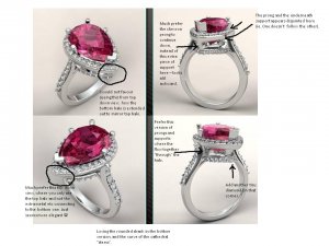
I''m terrible at this, but it looks like there is no tiny diamond at the front of the lower basket on the bottom photo. Also, in the lower right photo some of the side diamonds appear to be floating in mid-air, but I''m sure this is an illusion. Anyhow, either one looks fine to my undiscriminating eyes.


I see what you mean fly girl. I thought maybe that was more for protection than anything. I can see it both ways.

The floating diamonds may be an artifact of CAD. At least thats how I treated them.


-A
 
Chrono - after seeing the two pics, I like the top of the shoulders on the top photo best. On the bottom one, the top diamond (nearest the halo) seems to stick out too far - does that make sense?

May I suggest something else? You can see this in the bottom photo better ...... where the top and bottom halo joins with metal (sort of extended prongs), the metal looks too far forward and too think (I know it''s a CAD) but I''m wondering if they actually need to be there at all? I''m wondering what it would be like with a top and bottom floating halo without the adjoining metal bits. Crikey does that make sense?

You know what though .......... that''s really nit picking because I adore the design, adore the gemstone AND this is going to be a sensational piece.
 
I also prefer the top version. Adding a diamond at the tip of the lower halo looks much better, and I agree with Lauren that the shoulders joining under the halo is an improvement. I also noticed that the metal joining the top and bottom halos at the tip is thinner but not recessed like the bottom version.
 
This is what I mean ...........
 
To All,
Sorry for the confusion. The top picture is the new and improved CAD and the lower picture is the old CAD. They are put as a collage to help make the difference more obvious as to what has been tweaked.

Arcadian, you are too funny.
Lauren, thank you. And I agree with you about the top pictures looking more refined.
Flygirl, the lower 2 pictures are the old ones. I was not happy with it and as such, requested changes which have been implemented in the top 2 pictures.
LD, I’m sorry but I’m confused. Do you mind trying to explain it to me again?
 
Date: 12/9/2009 2:35:19 PM
Author: LovingDiamonds
This is what I mean ...........
Unfortunately, WF thinks they need to be there. They are reluctant to not have them there for support because the stone is large.
 
Date: 12/9/2009 2:40:57 PM
Author: Chrono

Date: 12/9/2009 2:35:19 PM
Author: LovingDiamonds
This is what I mean ...........
Unfortunately, WF thinks they need to be there. They are reluctant to not have them there for support because the stone is large.
Okey dokey! I''m surprised because I would have thought the bottom halo was supported by the shank and the top halo by the shoulders - but hey, what do I know!!!

More importantly, what do you think? Are you pleased with the re-work? Are you set to push the button on it?
 
I like the new cads, specially the flow of the shoulder. However, I do not like the bit of metal between the halos sticking out like that - I prefer the older version on this.

Another issue: the way the prongs are placed, they will hold the spinel over the angle between two facets. I think that having the prongs on the facet is better: I think it will be less risky to finish the prong over a flat surface than angle and safer too (if the prong ever slips a little to the side, it will sitll contact the stone, whereas, if it was adjusted for the angle, it will be ever so slightly loose).
 
The shoulder on the new cads looks great.

I''m with Lady D on the metal supports between the halos and think that they look better recessed as on the old CADs. Would it be possible to just have two supports at the top of the stone and one support at the tip of the stone and not include the two side supports? I think this will open up the side view and the two side supports seem redundant with the shoulder supports.

Regardless of how the supports work out, though, your ring is going to be beautiful!
 
Please excuse me if this is a dumb question and response, but aren''t those "supports" a continuation of the prongs and needed to fully connect/support the stone to the base of the ring?
33.gif
It looks to me as if they need to be there as well. I do think I prefer them to be recessed though. Either way, lovely stone and ring Chrono!
 
I think its gonna be a knockout ring!
 
Chrono, this is going to be such a stunner, siiiiiiiiiiiiiiiigh of contentment (and a tad of envy)...
 
I like the tucked in shanks better too, flows better. Are you set on double halo? How about tucked in curve basket with diamonds? Like the butterfly basket in a recent LM ring?

My final vote is the new cad. Can''t wait to see the completed ring!
 
Hey C sweets!
Love your gorgeous spinel, this is going to be a smashing ring doll!
I have not really waded into this thread yet, so pls excuse if my observations have already been made - I''m just going off the most recent update with the comparison CADS..

oh and lovey, I have made notes on your CAD as I would my own - short and to the point
2.gif

Overall I love the design, I just think it still needs a couple "tweaks", so I hope you get that it is simply constructive nit-picking
1.gif

Hope it helps, if not please feel free to completely ignore
9.gif


chrono mahenge WF aj.jpg
 
LD, thanks for the picture, circles and explanation. I understand your comment better now. I will ask WF again to be sure that they cannot be eliminated. If it is possible, I will certainly have them removed because they also look odd to me.

Lady D, I’ve taken note of the bits of metal sticking out. I too prefer the older version of the prongs. Good point about the placement of the prongs; I will definitely bring this up with WF. Naturally, one would think that WF will place if flat on a facet, rather than at an angle but it’s better to ask and be safe.

Tsavvy, I did ask for a 2 prong and 1 V prongs only but WF is very reluctant to do so. They feel that it isn’t enough support for the large stone. It’s a pity because my original inspiration has only 3 prongs and I love the open look.

SDL, don’t start putting naughty thoughts in my head. LOL!

Brandy, I think the supports are a continuation and also needed to fully support the stone to the base too. But you are correct that the recessed version looks more delicate.

Dreamer and MarriedTiger, thank you for your kind words. I hope I’ll love it as much too when I get the real thing.

LG, yes, I am set on the double halo. I’m sure what you mean by a tucked in curve basket with diamonds. Are you asking for a more enclosed gallery like Art Nouveau’s Mahenge ring?

AJ, good eyes on the “missing” melee at the tip. Your picture is helpful too. Hope you don’t mind if I use it as a communication tool with WF.
 
Date: 12/10/2009 8:22:37 AM
Author: Chrono


AJ, good eyes on the “missing” melee at the tip. Your picture is helpful too. Hope you don’t mind if I use it as a communication tool with WF.

of course matey! As long as that is in line with your wants / aims then please do.

You know what? I know we are all getting a bit caught on the topic of the placements of the supports - imho, once it is executed, if you go with the version more like the bottom ring, than the metal will be off to the sides, close to the edges of the cathedral shoulders etc..
however, if those metal supports are moved in closer to the stone like in the top ring, it starts to look a lil crowded, and you won't be able to admire the culet of your stone.
I'm a big culet lover, so I would much prefer an "airier" gallery where the supports are not obstructing your view of the bottom of the stone.

I hope that all made sense?

I am confident WF will achieve this in their final execution, if you make it clear it's one of your priorities..
 
Yup, I want a more airy and open gallery so I can admire the pavilion.
2.gif
 
Date: 12/10/2009 8:51:35 AM
Author: Chrono
Yup, I want a more airy and open gallery so I can admire the pavilion.
2.gif

sounds good!
 
Chrono, I think it''s going to be a stunning piece!

Arjuna, good eye! I think your tweaks really help pull it all together.
 

Another update after a telephone call to WF: we will be using the new CAD but the prongs will be like the old CAD where they are recessed. The V prong will also go back to the original version because it looks less bulky BUT this time, it will taper to achieve a more open look. Unfortunately, due to the size of the halo, the supports between the 2 halos cannot be removed or trimmed any further. A single melee will also be added to the very pointy tip of the lower halo so it will be an endless diamond look instead of having that bit of metal sticking out. Pointy claw prongs are also noted once they are ready to do the prong work. A great big thank you to all who have shared their ideas and opinions. WF hopes to have this version 4 to me tomorrow incorporating all the above changes and will try to work their magic so I can have this in time before Xmas!

 
I''m so excited for you Chrono!!
36.gif
36.gif
36.gif


I''m also excited for me because I can''t wait to see your photos!!
 
I’d almost forgotten a little funny tit bit from my conversation with WF this morning, which addresses Lady D’s question. I mentioned having the prong place flat against a facet surface during the setting process and the designer assured me he will do that. The reason it’s not shown as such in the CAD is because that’s not really my stone in the CAD. He informed me that my Mahenge is too large for their scanner!
23.gif
He had do draw it in the CAD himself and approximate the facet pattern. Therefore, for all those ladies who are doing CAD custom work for their stones, note that if you have a very large stone, you might experience the same issue.
 
I have sad news to announce: Santa will not be bringing the Mahenge ring to me in time for Xmas.
39.gif
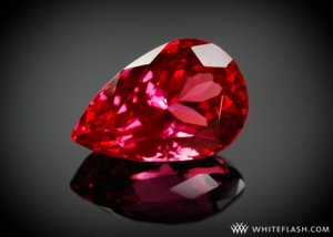
However, WF was kind enough to take a picture of the stone for me but looking at it makes me miss it even more.

5ctPearMahengeSpinel.jpg
 
Better to have it right, than have it sooner Chrono. It''s going to be stunning when it is done. The photo Whiteflash sent is gorgeous.
 
Beautiful Chrono. I can''t wait to see your finished ring. Will you have it in time for New Years?? What a lovely way to ring in the New Year!!
36.gif
36.gif
36.gif
36.gif
36.gif
36.gif
36.gif
 
I can''t be of any help with the CAD stuff...my mind is not equipped to handle that kind of creativity, but gotta say, hubba hubba on that last pic of your baby!!
 
Date: 12/10/2009 2:40:43 PM
Author: Gailey
Better to have it right, than have it sooner Chrono. It''s going to be stunning when it is done. The photo Whiteflash sent is gorgeous.
Ditto. A very very beautiful stone.
9.gif
 
Awwwwwwwwww what a shame BUT sometimes masterpieces take a bit longer. It'll be worth the wait Chrono. WF are taking their time making sure you get what you want so I'm pretty sure that you'll be starting the New Year in style! What a fabulous photo of your stone. Breathtaking.
 
Okay, that's got to be one of the most gorgeous photos I've ever seen on PS.
wowzer.gif
That should be part of their calendar.

Better late than never, and done correctly.
 
Date: 12/10/2009 2:34:39 PM
Author: Chrono
I have sad news to announce: Santa will not be bringing the Mahenge ring to me in time for Xmas.
39.gif
However, WF was kind enough to take a picture of the stone for me but looking at it makes me miss it even more.
Holy mackeral that''s a gorgeous stone!
30.gif
I agree with everyone else. Although it''s disappointing that you won''t have the ring for Christmas I''d rather have it done right than done quickly when both isn''t an option.
 
Status
Not open for further replies. Please create a new topic or request for this thread to be opened.
GET 3 FREE HCA RESULTS JOIN THE FORUM. ASK FOR HELP

Featured Topics

Top