shape
carat
color
clarity

Mahenge 10K PS Gift

Status
Not open for further replies. Please create a new topic or request for this thread to be opened.
Date: 11/20/2009 2:36:01 PM
Author: Lady_Disdain
Stone loving engineers of the world, unite!
Computer engineer, at your service
2.gif

with so many CADs running around, it would be nice to run some FEA on the designs and see how they hold up to everyday stresses and knock arounds =)
 
Beautiful!!
 
OH how STUNNING CHRONO! You really have yourself a beautiful spinel and it looks like Royalty in that setting!!!
30.gif
30.gif
30.gif
36.gif
 
Date: 11/20/2009 3:27:39 PM
Author: haagen_dazs

Date: 11/20/2009 2:36:01 PM
Author: Lady_Disdain
Stone loving engineers of the world, unite!
Computer engineer, at your service
2.gif

with so many CADs running around, it would be nice to run some FEA on the designs and see how they hold up to everyday stresses and knock arounds =)
My husband is an electrical engineer, but he hates my hobby and all jewelry and gems!!
14.gif


Hey at least there''s some engineers with great taste!!

Beautiful, beautiful gem Chrono. Fit for a queen, and I really mean that.
 
Okay, ladies and gentleman, a new CAD was out yesterday and I called WF this morning for some minor modifications.
7.gif
It''ll be another week before I receive version 3 for review.
 
Date: 12/1/2009 12:28:52 PM
Author: Chrono
Okay, ladies and gentleman, a new CAD was out yesterday and I called WF this morning for some minor modifications.
7.gif
It''ll be another week before I receive version 3 for review.

Aww, that''s a bummer. Still, it''s better to fix the CAD now than the finished ring later!
 
Date: 12/1/2009 12:47:18 PM
Author: Kismet

Date: 12/1/2009 12:28:52 PM
Author: Chrono
Okay, ladies and gentleman, a new CAD was out yesterday and I called WF this morning for some minor modifications.
7.gif
It''ll be another week before I receive version 3 for review.

Aww, that''s a bummer. Still, it''s better to fix the CAD now than the finished ring later!
Chrono,
With your attention to detail, I''m sure it will be worth the wait, and drop dead gorgeous when it''s done.
 
Chrono can I ask (if you don''t mind sharing) what design you''re choosing? Please ignore this if you don''t want to share!

BTW I agree with some of the other comments that, although it''s a pain, it''s far better to mess around with the CADs than to get the ring and have that "oh no" feeling.
 
My poor ring that was supposed to be in my hot little hands by today is further delayed with my not being satisfied with what I see. Thank goodness for the CAD though because I can see it and talk to the designer at WF before they spend the time and $$$ to make it. Less of a surprise and heartache for me, less of a shock to WF when I call/email to complain why it doesn’t look anything like what I expected.

LD,
I’m debating whether to share the new design or not. Should I be nice or mean?
27.gif

 
Date: 12/1/2009 3:12:17 PM
Author: Chrono

My poor ring that was supposed to be in my hot little hands by today is further delayed with my not being satisfied with what I see. Thank goodness for the CAD though because I can see it and talk to the designer at WF before they spend the time and $$$ to make it. Less of a surprise and heartache for me, less of a shock to WF when I call/email to complain why it doesn’t look anything like what I expected.

LD,
I’m debating whether to share the new design or not. Should I be nice or mean?
27.gif

I would share it simply because others can offer their comments, ideas and suggestions, and because WE ALL WANT TO SEE!!
 
Santa says you should be nice.
 
Definitely be nice!
 
WOW chrono!

just WOW!!!

i''m in love with your ring already

30.gif
30.gif
30.gif
 
I love that TL thinks rationally and the rest of us resort to begging and guilt. Nice nice nice!
 
Santa only bring pressies to kiddies who play NICE!
 
Oh man...you ladies are plying the guilt trip on me.
25.gif
Okay then, I’ll post the second version of the CAD. Note that there are a couple changes that you’ll have to imagine until I get version 3.0

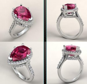
1. WF is going to change the V-prong support between the 2 halos into a round wire support. This should minimize the “heavy metal” look of the setting. From the top halo upwards, the chevron prong still remains to protect the Mahenge. In addition, all the other round wire (prong) support will be flush in between the 2 halos as well, rather than on the inside of the halo. This hopefully will make the entire setting more fluid rather than looking disjointed.

2. We are changing the connection of where the shank joins the halo. I don’t like the metal gap where they join and even though WF suggested thinning down the metal there for a more seamless look, it looks like a melee is missing to me. Instead, now the shank will join UNDER the halo.

3. I’ve requested that the shank be squared rather than rounded.

4. I’ve also verified that the lower halo will be visible when the ring is worn on the finger. Thanks to LD for this suggestion!

Chrono1ver2.jpg
 
Date: 12/1/2009 3:38:01 PM
Author: Chrono


Oh man...you ladies are plying the guilt trip on me.
25.gif
Okay then, I’ll post the second version of the CAD. Note that there are a couple changes that you’ll have to imagine until I get version 3.0

1. WF is going to change the V-prong support between the 2 halos into a round wire support. This should minimize the “heavy metal” look of the setting. From the top halo upwards, the chevron prong still remains to protect the Mahenge. In addition, all the other round wire (prong) support will be flush in between the 2 halos as well, rather than on the inside of the halo. This hopefully will make the entire setting more fluid rather than looking disjointed.

2. We are changing the connection of where the shank joins the halo. I don’t like the metal gap where they join and even though WF suggested thinning down the metal there for a more seamless look, it looks like a melee is missing to me. Instead, now the shank will join UNDER the halo.

3. I’ve requested that the shank be squared rather than rounded.

4. I’ve also verified that the lower halo will be visible when the ring is worn on the finger. Thanks to LD for this suggestion!
1. Think that's a great idea - the V prong does look a bit chunky at the moment (understanding that the CADs will put on weight). Interesting idea about having the prongs flush between the 2 halos instead of on the inside - just a thought but will that make the prongs more noticeable? Seeing the new design (which I LURVE by the way!), it did occur to me that I would be tempted to do a Leon with the prongs and make them into eagle claw tips. Have you considered that?

2. Totally and utterly agree. The missing melee look would drive me bonkers too. Well spotted.

3. That's interesting. I wouldn't have thought of that one. I'll be really interested to see how it looks as I can't imagine that because the rest of the ring is all rounded (in one way or another). It might make a nice contrast.

4. Great news!!!! It looks very pretty!

Not sure of any of that helps and I hope you don't mind my input? Thanks so much for sharing
2.gif
 
To LD and others,
I’m open to any and all comments. Sometimes, having a different opinion helps open the mind to things that I don’t/can’t see at the moment.

1. I did ask WF if it’ll be more noticeable if we made it flush versus having it on the inside. Joe’s suggestion is that it won’t because it’ll be more fluid that way. As it is, with the prong support on the inside, the ring looks “bumpy”. He’d better be right on this one. You can bet that I made sure my work order states that the prong tips are to be as small and pointy as possible.

3. I think the effect of the “squaring” will be very minor, but it’s just a look that I’m more used to.
 
I think the prongs being flush might look a bit weird since the top part of the prong is obviously on the inside. Or will that change too and the tip of prongs will arch over the halo?
 
Date: 12/1/2009 4:18:05 PM
Author: Kismet
I think the prongs being flush might look a bit weird since the top part of the prong is obviously on the inside. Or will that change too and the tip of prongs will arch over the halo?
Good point, Kismet. I''ll have to ask Joe at WF.
 
Date: 12/1/2009 4:00:47 PM
Author: Chrono

To LD and others,
I’m open to any and all comments. Sometimes, having a different opinion helps open the mind to things that I don’t/can’t see at the moment.

1. I did ask WF if it’ll be more noticeable if we made it flush versus having it on the inside. Joe’s suggestion is that it won’t because it’ll be more fluid that way. As it is, with the prong support on the inside, the ring looks “bumpy”. He’d better be right on this one. You can bet that I made sure my work order states that the prong tips are to be as small and pointy as possible.

3. I think the effect of the “squaring” will be very minor, but it’s just a look that I’m more used to.
Well, to be honest, since you want all comments, that is the ugliest ring I ever saw, so you should send it to me so I can properly dispose of it for you.
27.gif
11.gif
31.gif
 
Kismet,
You made me call Joe at WF right away. The poor man probably can''t wait to get rid of me now.
9.gif
He said he understood what I (you) meant but assured me that the way he plans to do it will be very fluid. It will not look like 2 separate posts. I guess at this point, I''ll just have to wait for CAD version 3 to see what he has in mind.
 
Date: 12/1/2009 4:32:01 PM
Author: tourmaline_lover
Well, to be honest, since you want all comments, that is the ugliest ring I ever saw, so you should send it to me so I can properly dispose of it for you.
27.gif
11.gif
31.gif
Hey, I didn''t say that I''m shipping my ring anywhere.
26.gif
You can attempt to pry it off my cold stiff fingers too.
 
Date: 12/1/2009 4:36:33 PM
Author: Chrono
Kismet,

You made me call Joe at WF right away. The poor man probably can''t wait to get rid of me now.
9.gif
He said he understood what I (you) meant but assured me that the way he plans to do it will be very fluid. It will not look like 2 separate posts. I guess at this point, I''ll just have to wait for CAD version 3 to see what he has in mind.

I''ll be interested to see how they handle that one. At the moment I can''t really envision it but I guess that''s why I''m an accountant and not a jewelry designer.
 
Looks like it will be a stunning ring.
9.gif


Oh I do like the changes that you''re having made. Except the prongs. I just don''t understand what you''re saying so I''m waiting for the CADS to explain it to me.

But fluid is good!
 
To All,
Apologies for the delay but the updated CAD version 3 is here! I'm going to withhold my opinion for now, but please comment.
12.gif
Harsh or kind is fine but please be quick as I need to get back to WF if I don't want this delayed any further.
1. Can you spot the difference of the old versus new?
2. Do you prefer the top or bottom picture?

chronoscads.JPG
 
Harsh? Ok well you asked....

Chrono, I hate it. I hate it so much I want one LOL

Its gorgeous
30.gif
of course! I do love the design.

-A
 
Chrono - I like the top version better with the shoulders tucked up under the halo.

That is just going to be a smashing ring!
30.gif
 
I'm terrible at this, but it looks like there is no tiny diamond at the front of the lower basket on the bottom photo. Also, in the lower right photo some of the side diamonds appear to be floating in mid-air, but I'm sure this is an illusion. Anyhow, either one looks fine to my undiscriminating eyes.
 
Status
Not open for further replies. Please create a new topic or request for this thread to be opened.
GET 3 FREE HCA RESULTS JOIN THE FORUM. ASK FOR HELP

Featured Topics

Top