You are using an out of date browser. It may not display this or other websites correctly.
You should upgrade or use an alternative browser.
You should upgrade or use an alternative browser.
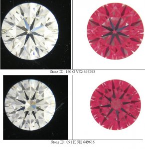
Opinion''s of these photo''s please?
- Thread starter Garry H (Cut Nut)
- Start date
- Status
- Not open for further replies. Please create a new topic or request for this thread to be opened.
- Joined
- Aug 15, 2000
- Messages
- 18,459
Maxine there are NO Tricks.Date: 4/18/2005 9:52:58 PM
Author: Maxine
Were the images ''flipped'' from row one to row two????
The photo''s were taken at successively greater distances - thats all.
MissAva
Ideal_Rock
- Joined
- Mar 6, 2005
- Messages
- 8,230
I have to say I did wonder about that...they looked a little fake to me but I am not a diamond expert by any means. I liked the top row becuase they had less yellow, which to me means a better stone and worth more. I also liked #1 beucase it seemed crisper somehow. Good Luck!Date: 4/18/2005 9:19:17 PM
Author: Garry H (Cut Nut)
Thanks, keep them coming folks.
We are making a tally.
Are the images too flat? to ''computer generated''?
Maxine
Brilliant_Rock
- Joined
- Dec 6, 2004
- Messages
- 1,400
Garry, I wasn''t suggesting it was a trick...but the darkish spot between 12 and 1 o''clock looks like its in a different position(on the bottom) in row two.....what does the IS image look like?????Date: 4/19/2005 12:13:34 AM
Author: Garry H (Cut Nut)
Maxine there are NO Tricks.Date: 4/18/2005 9:52:58 PM
Author: Maxine
Were the images ''flipped'' from row one to row two????
The photo''s were taken at successively greater distances - thats all.
- Joined
- Aug 15, 2000
- Messages
- 18,459
lost on 5th
Shiny_Rock
- Joined
- Mar 16, 2005
- Messages
- 240
garry-
looking at color and visual depth alone.... i think 4 and 5 show the best. they show enough contrast in color to give interest and charactor to the stone. i think the ends (1 and 9) simply show too much of a good thing.
1. is very bright white and makes the cut very visable (probably a draw to people here who start to read the stone) but looks flat for the same reason.
9. shows a LOT of life and color and depth, but makes it hard to appreciate the shape..
4/5. show the cut and subtle contrast to give dpeth to the image. i think it makes it more eye catching.
just wondering.. what are the ethics involved in retouching color??? not the stone''s detail, but pushing and pulling on levels?
**note: im viewing on a LCD screen and that does change saturation vs. most CRT''s.
- Status
- Not open for further replies. Please create a new topic or request for this thread to be opened.


300x240.png)