recordaras
Shiny_Rock
- Joined
- Mar 19, 2013
- Messages
- 376
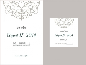
I decided to go with a non-photo save the date, and my printer has a really nice "semi-letterpress" option: only the top detail is letterpressed, while the rest is printed with regular ink on 100% cotton paper. Since the layout and the top design element is predetermined, I figured it would be easy to DIY the fonts and put together the layout... Boy was I wrong! I've finally been able to put together an option that I am happy with, however I'd love to hear any feedback - at this point I've been staring at it for so long, and have tweaked things so many times that I don't quite trust myself anymore.
The 5x7 save the date is on the left, and on the right is a 3x3 magnet (next step will be figuring out how to attach the two to each other, but that's a whole different brainstorming session...). In all honesty I wasn't initially going to do the magnet, but I couldn't find a way to add our website link to the main card that would look decent, so I figured it would be easier to have it on a separate item.
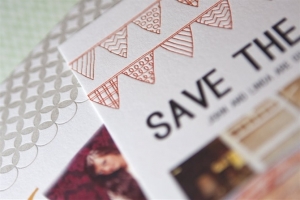
And this is the color of the letterpress ink on the left. I was initially planning on going with the orange pennant layout, but printed out a mockup and didn't really like it as much as I thought I would.
In any case, I'd be grateful for any critique I can get!
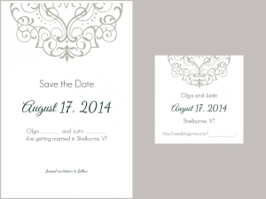
The 5x7 save the date is on the left, and on the right is a 3x3 magnet (next step will be figuring out how to attach the two to each other, but that's a whole different brainstorming session...). In all honesty I wasn't initially going to do the magnet, but I couldn't find a way to add our website link to the main card that would look decent, so I figured it would be easier to have it on a separate item.

And this is the color of the letterpress ink on the left. I was initially planning on going with the orange pennant layout, but printed out a mockup and didn't really like it as much as I thought I would.

In any case, I'd be grateful for any critique I can get!



300x240.png)