shape
carat
color
clarity

Pricescope's new look

Jambalaya

Ideal_Rock
Premium
Joined
Oct 2, 2014
Messages
4,784
Made the request shortly after I started beta testing it. Andrey said nope. Hoping after things smooth out I can re-approach him about it.

Even if there were a dark mode, there's still nothing to break up all the text. The old look had various shades of blue that marked off different replies, different threads, etc. This new look is like looking at a bunch of twigs on snow.
 

Jambalaya

Ideal_Rock
Premium
Joined
Oct 2, 2014
Messages
4,784
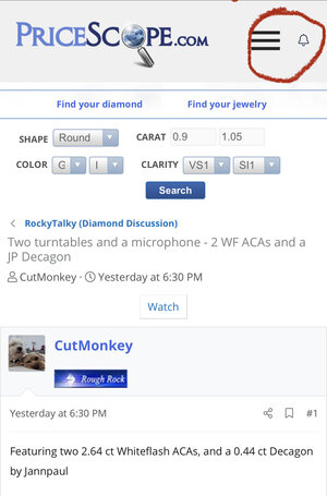
on the phone, it is hidden in your name/ log in section... it was hard to find, too.

i made a comment about that to admin.

also the lack of contrast between the threads makes reading/ seeing things a little more difficult

This. So much this.
 

TooPatient

Super_Ideal_Rock
Premium
Joined
Sep 1, 2009
Messages
10,295
It is starting to grow on me. I am almost always on my phone when I am on PS and usually have my screen brightness way down . No glare issue because of how I set that and the text feels easier to read
 

chrono

Super_Ideal_Rock
Premium
Joined
Apr 22, 2004
Messages
38,364
I couldn't find the log in on mobile. I could only get the "register" page. It's so hard to navigate that I only come to PS when I can use my laptop and even then, it's so hard to read that I only visit once or twice a week instead of daily.
 

icy_jade

Ideal_Rock
Joined
May 1, 2009
Messages
6,131
I mainly use my iPhone to read and thought to give this a few days before commenting to see if it will grow on me but…

1. Alerts need an extra step to find when previously you would see it immediately when you enter PS.
2. The “new” posts is no longer at the top of the page. I know it’s there at the bottom but sometimes I change my mind and want to go see something else immediately when I realize the topic isn’t what I thought it will be.
3. Preloved is so hard to find now
4. So white! I feel rather blinded. Many forums offer a dark view that you can toggle between for easier on the eye reading.
5. Link to the sub-forum of the thread is right at the very bottom after the new posts. Would prefer it maybe below the reply box so that there is less scrolling.

Ok these are the stuff that continues to bug me.
 

sledge

Ideal_Rock
Premium
Joined
Apr 23, 2018
Messages
5,791
I couldn't find the log in on mobile. I could only get the "register" page. It's so hard to navigate that I only come to PS when I can use my laptop and even then, it's so hard to read that I only visit once or twice a week instead of daily.

Another user reported this on the main thread. I took some time to troubleshoot and provide a temp solution. I also alerted Andrey about the matter and it’s being worked on.

Read posts #61-64 for all the details.

Alternatively, use this link on mobile: https://www.pricescope.com/login


Daisys and Diamonds

Super_Ideal_Rock
Joined
Apr 30, 2019
Messages
22,510
is there anyway to eaiserly see all the recent posts without having to go into every sub forum ?
i think i am missing a lot of pretty things
 

stracci2000

Ideal_Rock
Premium
Joined
Jun 26, 2007
Messages
8,345

icy_jade

Ideal_Rock
Joined
May 1, 2009
Messages
6,131
One more - when you want to create a new thread, there is now a pop up that asks in which forum. But I thought that’s a bit redundant since people will usually want to create a thread in the forum that you are in right? Ie if I’m in SMTB and I want to create a new thread, I now have to select SMTB in the pop up instead of automatically creating it in the SMTB forum.
 

Slickk

Ideal_Rock
Premium
Joined
Jan 3, 2013
Messages
4,926
@Daisys and Diamonds I have the New posts, preloved and other sub forums bookmarked, which makes it easy to get to. Maybe others could do that until they’re easier to find.
I’m also finding the alerts not as easily seen.
 

Daisys and Diamonds

Super_Ideal_Rock
Joined
Apr 30, 2019
Messages
22,510
@Daisys and Diamonds I have the New posts, preloved and other sub forums bookmarked, which makes it easy to get to. Maybe others could do that until they’re easier to find.
I’m also finding the alerts not as easily seen.

Hmmmmm
Sounds good


....What's a book mark ?
 

chrono

Super_Ideal_Rock
Premium
Joined
Apr 22, 2004
Messages
38,364
I noticed Pre-Loved can now be accessed from the Forum drop-down at the top right. :appl:
 

diamondringlover

Ideal_Rock
Premium
Joined
Dec 12, 2006
Messages
4,400
Yeah I am struggling as well...not sure it hurts my eyes or something I cant quite put my finger on it...I find I am not on here as much...I am sure I will adjust soonish...
 

nala

Ideal_Rock
Premium
Joined
Oct 23, 2011
Messages
7,045
Tbh. I hated it at first. But I already forgot what the previous format looked like. Sadly. I’m not even joking.
 

Daisys and Diamonds

Super_Ideal_Rock
Joined
Apr 30, 2019
Messages
22,510
Im very slowly getting the hang of it after some help
 

goldnsilver

Shiny_Rock
Joined
Oct 31, 2020
Messages
250
I find I can tolerate the desktop version better if I scroll down quickly to avoid looking at the header, which remains too shiny with the gradient for me and (now I realise) reminds me of some religious mission websites.

Having the notification bell reinstated on both versions is good, I noticed that yesterday(?).
 

bright&shiny

Brilliant_Rock
Joined
May 11, 2009
Messages
1,259
So something I just noticed - I often take screen shots of data or charts that I’d like to reference agai. (Then I add them to an album I use for reference). The old screenshots are easily identified in my photo stream because of the distinctive colors/fonts. The new pegs are impossible to tell from other text screenshots. I recognize this might be a me-only problem, but boy, I miss the visual cues that I’m in PS and not some other site. That’s true of safari pages left open etc….

with all that said, I recognize the difficulty of web design. Just thought I’d add an example of a practical use that has gone away.
 
Be a part of the community Get 3 HCA Results
Top