shape
carat
color
clarity

Please show me your backsplash...

missy

Super_Ideal_Rock
Premium
Joined
Jun 8, 2008
Messages
54,123
Could you please share your kitchen or bathroom backsplash or both. We are doing a total renovation of our kitchen and would appreciate the sharing of your backsplash.

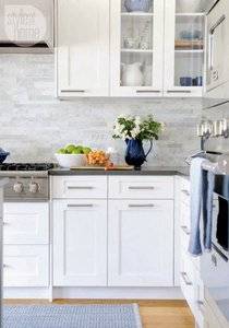
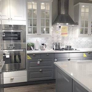
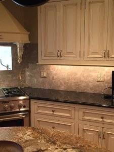
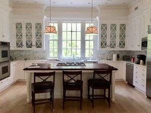
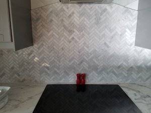
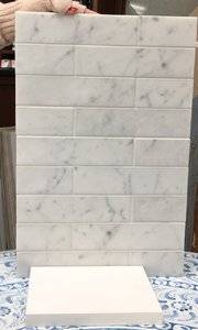
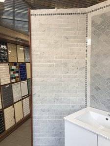
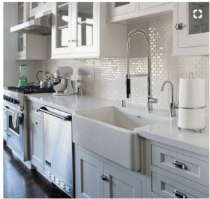
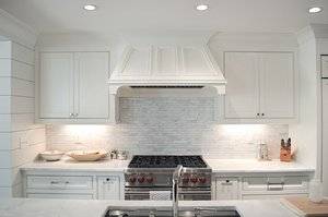
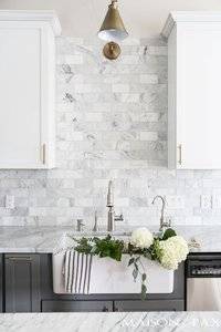
It’s for our beach house kitchen. We are doing white shaker cabinets and European Thassos (white) quartz and leaning towards a marble grey and white tile backsplash. Just not sure if we should do a 3” by 6”subway tile pattern marble backsplash or a mosaic tile linear marble backsplash. Examples below.

I’m going for a fresh airy and elegant aesthetic.

Mosaic linear marble tile
C61FCFCC-ACF2-44DF-BBF0-0D92277CDED9.jpeg

A2A00E15-D24F-4C57-9752-0CF06960A09F.jpeg

And examples of a marble 3 by 6” subway tile pattern
EBE89A02-A3BB-488C-9727-322C262906FE.jpeg

F90C87D9-40C1-4B9C-89F6-033BAB468864.jpeg


Which would you prefer and if you could verbalize why I would appreciate it. Thanks.


99291D4E-9D7F-4C11-AE08-980911FD64E5.jpeg
 

Austina

Ideal_Rock
Premium
Joined
Feb 24, 2017
Messages
7,580
I like the mosaic linear tile, just looks more modern IMVHO
 

ksinger

Ideal_Rock
Premium
Joined
Jan 30, 2008
Messages
5,083
One is just meh. I like the second pic the best. The tile has variation, but the gout lines aren't so evident and it all leans to an overall impression of lightness. Three has too much variation and is visually distracting, and four is just too dark - it says gray overall rather than white.

That's my take.
 

missy

Super_Ideal_Rock
Premium
Joined
Jun 8, 2008
Messages
54,123
Thanks Austina. Thanks Karen. You both make good points. Appreciate your thoughts.
 

msop04

Super_Ideal_Rock
Premium
Joined
Dec 3, 2011
Messages
10,051
I love 1 and 2...
 

december-fire

Ideal_Rock
Premium
Joined
Sep 3, 2013
Messages
2,385
Oh, I love interior design! So exciting to be renovating your kitchen! :dance:

You asked about two styles of tile layout, but these particular four photos touch on some other considerations; tile colour, including variation and contrast.

I agree with @ksinger , and my favorite tile is in photo two because it is lighter in colour and has less variation in the contrast. These factors allow the tile to be less of a feature, and the backsplash has some interest while still blending in with the cabinets and adding to an overall quiet, elegant feel. White grout, that blends with the tile, doesn't draw the eye to the grout.

By the way, I think one reason photo two's tile colours appear lighter, with less contrast, is due to a light source coming from the left-hand side. The tiles above the stove (whose appearance I prefer) appear lighter than the tiles in the corner; just due to lighting. So your kitchen's lighting (natural and artificial) will affect how your colour choice appears in your own kitchen.

I hope you'll share photos of the completed renovation!
Have fun!
 

lyra

Ideal_Rock
Premium
Joined
Jul 13, 2007
Messages
5,249
I like 1 the best, and would definitely choose 1 or 2 for my own house when we update. Everything else I see has the possibility of ending up dated, which I'd like to actually avoid this time.
 

Bonfire

Ideal_Rock
Premium
Joined
Feb 22, 2014
Messages
4,242
They are all beautiful! I would choose the second picture over a mosaic. I prefer a softer more subtle look. Any of these choices will be beautiful!

Our marble tiles are 3x10.
99E38100-EE4A-4649-A433-78599E8B989B.jpeg
 

junebug17

Super_Ideal_Rock
Premium
Joined
Jun 17, 2009
Messages
14,142
I like the second and third pics. I think they’re all nice and any one of them will look good. the last one does seem more gray than white. Here’s a pic of what we have in our kitchen, not a great pic but the only one I have, excuse the mess
34BF8103-A904-42DB-99A8-61F178B7E9B5.jpeg
 

tyty333

Super_Ideal_Rock
Premium
Joined
Dec 17, 2008
Messages
27,254
#2 is my favorite!

#1 seems a little too busy for me but if you are only doing a small area vs a large area it might be fine

I also like #3 and #4 just not as much as #2. #3 and #4 seem to have more symmetry built into the equal size blocks and placements. I usually
thrive on symmetry but in this case I find the slight variations of #2 interesting.
 

MarionC

Ideal_Rock
Premium
Joined
Dec 9, 2013
Messages
6,246
Had to smile when I saw this thread. You are in the thick of it right now. Yeh these decisions are a pain!
I love the #1 photo. I think the linear look goes well with the white expanses of cupboard...the scale of the narrow tiles is more pleasing to me...
My two cents : )
xx
 

Tekate

Ideal_Rock
Premium
Joined
May 11, 2013
Messages
7,570
Hi Missy, I'm going to be doing a redo of my kitchen, not total, I am keeping the cherry stain cabinets (some wood I can't remember) my decorator lady did not recommend painting them and I was fine with that. I am going to use granite instead of quartz, for me personally the shine from quartz is not what I am looking for. I am supposed to receiving a detailed sketchup of colors and materials she suggests. We are painting the kitchen, dining room and family room from brown to grey, this house was set up with brown everywhere, and I like it but it's too dark so I'm moving it up a notch.. All the pix look great Missy.. I like the mosaic style tile because that is what my eye and mind likes.. my nephew who lives in Brooklyn btw has the 4th tile in one of his bathrooms and I found it distracting in the sense that I wasn't sure if it was defected or dirty.. so I vote for the first pix. I am going to bet getting a new stove and microwave and new granite and painting etc. I'm going to TRY to do a b4 and after shots! we can compare!
 

Efe

Brilliant_Rock
Joined
Aug 8, 2006
Messages
774
20171204_142443.jpg

We did marble herringbone. I don't like the look of outlets on the backsplash, so I had them put under the cabinets. I don't keep any appliances out and plugged in so it works for us.
 
P

PierreBear

Guest
Missy you are definitely on the right track for a beautiful kitchen and I don't think you can go wrong with any of your inspiration photos. It's all in a similar vein but there are only small subtleties in my mind with the tile size, shape, veining, matte or not, etc... I personally like the elongated tile look but one of our friends did the 3 by 6 subway tile style and it looked great as well. I agree with @Austina that the elongated look appears more modern to my eyes so consider the rest of the style of your home perhaps when taking the next step and perhaps the decision will be crystal clear?!

If I really really had to pick my favorite picture, I think it's #2, however, I'm not sure if it's solely because of the tiles. I like how the counter tops are gray and it creates interest with the backdrop. In the other photos you shared, the counter top is whiter so it blends in beautifully. I believe you are leaning towards a white counter top so it's just personal preference. Hope this helps instead of confuse more. Just trying to figure out the differences to my eye. Good luck and can't wait for the end result!
 

lambskin

Ideal_Rock
Premium
Joined
Aug 22, 2012
Messages
3,054
I hate grout lines-especially in a kitchen. Why not do a whole marble slab custom thin cut to fit in the space? You can control the look of the veins and there is no weird tiles and ugly grout. Any piecing or seams can be tucked away in a corner or between cabinets. I have seen this and it looks unbelievable!
 

whitewave

Super_Ideal_Rock
Premium
Joined
Feb 29, 2012
Messages
12,331
Mine is black ubatuba granite which matches my counter. It looks a bit dated at this point, imo
 

ksinger

Ideal_Rock
Premium
Joined
Jan 30, 2008
Messages
5,083
Missy you are definitely on the right track for a beautiful kitchen and I don't think you can go wrong with any of your inspiration photos. It's all in a similar vein but there are only small subtleties in my mind with the tile size, shape, veining, matte or not, etc... I personally like the elongated tile look but one of our friends did the 3 by 6 subway tile style and it looked great as well. I agree with @Austina that the elongated look appears more modern to my eyes so consider the rest of the style of your home perhaps when taking the next step and perhaps the decision will be crystal clear?!

If I really really had to pick my favorite picture, I think it's #2, however, I'm not sure if it's solely because of the tiles. I like how the counter tops are gray and it creates interest with the backdrop. In the other photos you shared, the counter top is whiter so it blends in beautifully. I believe you are leaning towards a white counter top so it's just personal preference. Hope this helps instead of confuse more. Just trying to figure out the differences to my eye. Good luck and can't wait for the end result!

I didn't put that on mine, but I was thinking it. Thanks for saying it. Yes, I like the contrast too. Too much white is too white, you know?

I have lots of warm color in my kitchen, so all the white is very beautiful, but also very impractical because our kitchen it both small and sees such heavy use. (Husband cooks a bunch and for him there are 2 settings on the burners: OFF and HELL. :rolleyes: Makes cleaning the stove top an...adventure.) Not to make it sound like I never clean - I clean that puppy a lot - but that means I'm kind of like a vampire with grains of rice: if I see it I must clean it. With my energy level that's not always an option. So not being able to see every crumb can be a blessing for my peace of mind when I'm totally exhausted. Sometimes the real cleaning (husband simply will NOT clean to my level) just has to wait until the morning.
 

missy

Super_Ideal_Rock
Premium
Joined
Jun 8, 2008
Messages
54,123
Thank you all for your replies. I really appreciate all the info and generous sharing and wow on the kitchen photos. Gorgeous kitchens bonfire, Junie and Efe. BEAUTIFUL! And PierreBear your kitchen tile is beautiful too as I have already had to opportunity to admire it and appreciate you chiming in here. PSers have great taste.:appl:

Efe I love your herringbone backsplash so much. Beautiful. My dh wanted the more linear backsplash but I was gravitating to your exact style of backsplash. I think if we were just doing the backsplash over the oven/stove it would work but we are backsplashing the whole over sink and windows area so east and west walls....so it might have been too much for such a large area.

Junie you have my dream kitchen as you know. Give it to me!:lol: Thank you Junie for your never-ending support and help.

PierreBear my friend thank you for all your thoughts and advice in the past month(s). You are so helpful and I appreciate it.

December-Fire yes I agree with all your points. Thanks for joining in my excitement and I appreciate the support and advice along the way. I will probably have more questions than answers knowing me. I have a lot of trouble making up my mind these days.

Thank you msop04. Appreciate your input.

Lyra, thank you and appreciate your thoughts.

Lambskin I hate grout too LOL. I prefer the look of tiles however to one smooth slab as a backsplash. We did consider it but I think the way we are doing it works best as tiles since it is over 2 walls. Sort of breaks up all the white too and adds some visual interest. But honestly it might have worked beautifully that way too. Again visualizing stuff is not my forte.

Whitewave I love black granite counters and we have that in Brooklyn. Never dated IMO and you can change your backsplash if you want to freshen it up...just a thought. Come to the dark side of kitchen reno....we would love the company.:cheeky:

Tekate yay... We can be reno sisters. Keep me posted OK? And when you are visiting your nephew here let me know girl and we can GTG.

Jimmianne yes the narrow tiles are more pleasing to my eye too and hopefully the 2 by 8 will be just the right size. Fingers crossed.

tyty33 I am a symmetry girl too and I also for some reason was drawn to the mosaic but all the tile places we went too IRL I just preferred the symmetrical backsplash. But yes in the pics I am drawn more to the mosaic. Weird.

Karen yes I definitely want contrast and don't want an all white kitchen and I am hoping the gray white Carrara will add enough visual interest without being busy. We went with a quartz countertop though I was planning on marble originally because we cook and bake and make a mess and wanted a livable kitchen without worrying about etching and staining. Plus the 4 kitties make a huge mess too with their oily food (and yes we feed them on the countertops yuk I know but we love them and it doesn't gross us out) and we feed them on the opposite countertop but still it would have been marble if we went with that so we are going with the quartz and instead doing the marble backsplash. A compromise but a practical one.

So we just came back from the tile store in Brooklyn and they had a Carrara 2 by 8 tile available and I loved it. I also love the contrast as I don't want an all white kitchen so I agree with all of you there for sure. It is a white gray and hopefully the 2 by 8 tile size will be elegant. My eye prefers the shape to a 3 by 6 subway tile shape but again I am not a good visualizer and I really won't be sure till it is in my backsplash. And too late then LOL.

A few photos.
They say a photo is worth a thousand words however not when I take them. LOL

Against our sample of quartz Thassos for the island

carrarabacksplashwithquartz.jpg

an entire wall with it in a bathroom model

carrara2by8tilebacksplash.jpg

OK that's all for now.

Thanks again everyone for your input!
 

DAF

Brilliant_Rock
Premium
Joined
Jan 7, 2012
Messages
778
Missy, we just gutted our kitchen and have ordered all the new stuff for it. I'm thinking subway tiles for ours, but tiny ones like this:
upload_2017-12-4_17-0-31.png .

If your home is indeed a cottage, the small tiles give an air of largeness to this space.
 

missy

Super_Ideal_Rock
Premium
Joined
Jun 8, 2008
Messages
54,123
Gorgeous @DAF! Good luck and please keep us posted. I would love it if everyone doing a reno would share with us.:appl:
 

DAF

Brilliant_Rock
Premium
Joined
Jan 7, 2012
Messages
778
You should have seen my kitchen. It was the original from when the house was built in the 1980's: country wallpaper, which I did take off and paint the wall; cabinets with the pulls in the middle of the doors (!?!?! - what were they thinking!); cabinets were stained an orangy-brown; and a brick veneer backsplash - absolutely uncleanable; and the piece de resistance: stick on tile floor where the only stick was anything that landed on it. This update has been long overdue. My new cabinets coincidentally look just like the ones in the pic. I needed something with a little more design than shaker. Haven't found the perfect countertop yet.

Too ugly to show pics.
 

PintoBean

Ideal_Rock
Premium
Joined
Jul 27, 2011
Messages
6,589
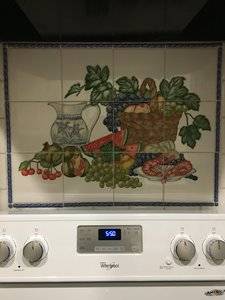
Mahhh stove!
image.jpg
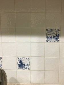
Mahhh sink!
image.jpg
 

mrs-b

Super_Ideal_Rock
Premium
Joined
Aug 18, 2013
Messages
11,660
I like color - so I went in the other direction - tho the overall look is still very light and airy.

All my tiles were bought in small color batches from Italy, and I laid out the 'random' pattern myself which, with all those colors (more than it looks in the photos) was a nightmare and took hours. The overall effect, tho, is smashing when you see it in the kitchen. IMG_2354.JPG

IMG_2355 copy.JPG

IMG_2358 copy 2.JPG

IMG_2361.JPG
 

december-fire

Ideal_Rock
Premium
Joined
Sep 3, 2013
Messages
2,385
@mrs-b , your kitchen looks so cheerful! I love it!
Creating a random pattern is definitely hard to do!
Your effort paid off - the result is wonderful! :appl:
 

december-fire

Ideal_Rock
Premium
Joined
Sep 3, 2013
Messages
2,385
@rainwood , where is your beautiful kitchen photo?

I saw a photo of it in a thread one time and fell completely in love! :love:

Sorry, I don't recall the specifics of your backsplash, but the overall effect, the wonderfully-spacious island, and the incredible view were stunning! :love: :love: :love:
 

ksinger

Ideal_Rock
Premium
Joined
Jan 30, 2008
Messages
5,083
You should have seen my kitchen. It was the original from when the house was built in the 1980's: country wallpaper, which I did take off and paint the wall; cabinets with the pulls in the middle of the doors (!?!?! - what were they thinking!); cabinets were stained an orangy-brown; and a brick veneer backsplash - absolutely uncleanable; and the piece de resistance: stick on tile floor where the only stick was anything that landed on it. This update has been long overdue. My new cabinets coincidentally look just like the ones in the pic. I needed something with a little more design than shaker. Haven't found the perfect countertop yet.

Too ugly to show pics.

Aww, come on. ;-) Show us!

When I bought my house, the previous owners had redone the kitchen. It was NOT a well-thought-out or even slightly posh re-do. It was a (rather obvious) hard plastic-ed particle-ish cabinet fronts put on the original 1950s cabinets. The counters were this ghastly purple-y-taupe-y big-box formica special. And the washer and dryer were in the kitchen with a cheap builder's special cabinet above the set, that had not really been properly painted - was only primed. But for this area, it was a actually a good sized kitchen

However, the owners had left a photo album of the original kitchen and O.M.G. The re-do was so far above the old kitchen, it was a study in bad versus truly awful. Tiled counter tops in a muddy brown, wonky muddy brown cabinet doors on white cabinets, pale yellow tiled backsplash, and yellow and brown PLAID wallpaper. Oh, and a muddy brown corner BOOTH with a fixed round table with an orange top. :eek-2: Yeeeahhhhh.....

So here's before, which is bad but not truly awful ala the previous incarnation. As a single I lived with it for quite a few years. It got the job done.
BEFORE_IMG_0371.JPG

Here's my re-do. It may be dated by the white/gray standard of right now, but I still love the colors.
AFTER_IMG_0542.JPG
 

december-fire

Ideal_Rock
Premium
Joined
Sep 3, 2013
Messages
2,385
@ksinger , you did a beautiful job! :appl:

The previous version that you described (browns, yellows and orange) was probably quite trendy when it was done. Perhaps the 'yellow' was actually the classic 'Harvest Gold'. Not to be confused with the other lovely options at the time, which were 'Avocado Green' and brown (sorry, I don't recall its trendy name).
 

ksinger

Ideal_Rock
Premium
Joined
Jan 30, 2008
Messages
5,083
@ksinger , you did a beautiful job! :appl:

The previous version that you described (browns, yellows and orange) was probably quite trendy when it was done. Perhaps the 'yellow' was actually the classic 'Harvest Gold'. Not to be confused with the other lovely options at the time, which were 'Avocado Green' and brown (sorry, I don't recall its trendy name).

Since I grew up with those colors, I can assure you, no, none of those previously on-trend colors. The brown of the cabinet doors was a low quality milk chocolate color, the yellow was pale, the same pale yellow was mixed with some muted brownish-yellow in the plaid, and the orange bolted-down table was a shade too dark to be vibrant. I don't currently have the old photos scanned in, though I might. So much ghastliness is truly hard to believe. Alas, it was a theme. The bathroom originally had horrible pinky-tan tile with a Pepto-Bismol pink border and similarly toned small floral print wallpaper. Above the tile in the bath surround. :eek-2: Truly eye-watering. The previous owners had done another better-than-before-yet-still-tasteless re-do of that space too. It too has since been re-done by us in lovely shades of blue. Another space that now makes me happy. :)
 

missy

Super_Ideal_Rock
Premium
Joined
Jun 8, 2008
Messages
54,123
Pinto very pretty! Thank you for chiming in!

Karen I love your redo! Nice job!

mrs-b love your backsplash choice and kitchen design. And wow on doing it yourself. I am impressed.:appl:
We did color here in Brooklyn and at our Sea Girt beach house and I was ready for my white kitchen. I wanted a white kitchen for 2 decades but Greg loves color and I like it too so went along with it but now since we are redoing our 3rd kitchen together it is now my turn. But I do enjoy color.


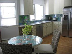
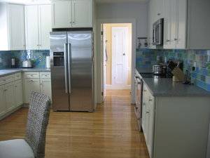
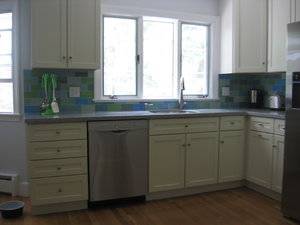
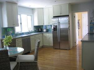
Quick pic of the Brooklyn blue glass backsplash...custom design from Ann Sacks. We did a gut reno in 2003/2004 and almost 14 years later and I still love it.

kitchenbrooklyn.jpeg

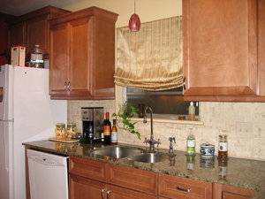
Photo of our past beach house kitchen backsplash. Reno done 2004. This was as the reno was still happening as you can see the kitchen is not yet finished. The color is off in this photo sorry but the backsplash is green, blue yellow and light tan.

seagirtkitchen.jpeg

Haha found this 2009 pic where you can see some of our beach backsplash but more importantly a gratuitous photo of HRH and Bobby as babies. Awww aren't they so sweet and so little. Color is still a bit off sorry.

gregholdingfrankieandbobbyinseagirt.jpg

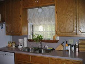
and here is our "before" kitchen at the beach house now. See it now because in a few months it will hopefully be history replaced with a (fingers crossed) beautiful and fresh kitchen. :pray:
beachhousekitchen.jpg


December-Fire I hope Rainwood is good with sharing her kitchen with you. It is TDF gorgeous. :love:

Please share more pics. It is so much fun seeing everyone's beautiful spaces. :appl:
 
Be a part of the community Get 3 HCA Results
Top