shape
carat
color
clarity

Need advice on David Klass' CAD (flower design)

spardaknight

Rough_Rock
Joined
Nov 7, 2019
Messages
4
Hi guys,

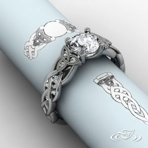
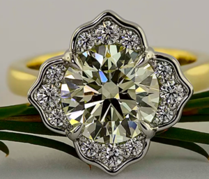
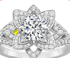
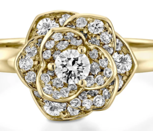
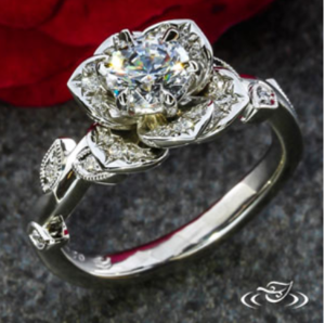
This is THE ring, that I want to be very special to ask my SO to marry me, so I want it to be perfect.

I'm having some minor issues with the design, I don't really know how to improve it, or at least how to formulate it to David so that he can modify it efficiently.

So far we're there :
What I want to keep :

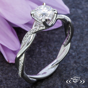
- The helix type, celtic shank

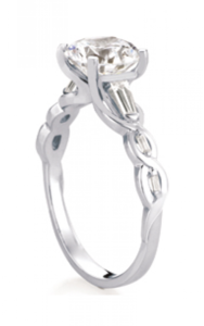
- Some sort of petals on top, so that the stone is revealed in a center of a blossomed flower

- A prong setting for maximum brilliance

What I want to change :

- Put the prongs in between the petals, but in this current state, David said that he can only put 2 prongs in between petals, so I guess the petal arrangement needs to be changed

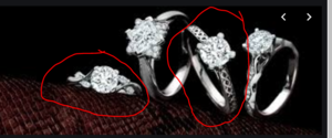
- The diamonds placement. It's kind of awkward right now I feel, I don't know how to make it better, more elegant and flow more with the design

- The hexagonal shape of the ring from the top, I want to avoid what looks like a purely geometrical shape from afar, I would like to have it more "flow" and be more natural

- Maybe too many leafs on the shank, which result in a more massive, clustered effect which I'm trying to avoid

I don't know what you guys think about all this. Thanks for your help
 

Rfisher

Ideal_Rock
Premium
Joined
Oct 19, 2013
Messages
5,504
Maybe six prongs instead of 4?
Do you have the inspiration photos of the rings that you pulled these elements from, that can be used as a real life “likes and dislikes” of what you are trying to achieve?
That may help the folk here to give CAD suggestions that are more fruitful.

Congrats on the upcoming engagement!
 

Rfisher

Ideal_Rock
Premium
Joined
Oct 19, 2013
Messages
5,504
BE187737-C991-4ACA-8675-DEE500DB672B.jpeg
Here’s something to think about, possible symmetrical location of six prongs.
I removed the melee to visualize melee size, qty, and placement possibilities on the petals.
 
Last edited:

Rfisher

Ideal_Rock
Premium
Joined
Oct 19, 2013
Messages
5,504
If this were mine - I would prefer more undulation/ tilt in the petals themselves ( not as in relation to each other) than what is currently shown.
Not to try and change your design, but take a look at this thread. It will show you cad before and after revision related to the petal tilt and you’ll see the gorgeous finished product too!


And I’ve never tried on a shank like that to know what kind of comfort concern - if any- would be due to the leaves over the helix.
 
Last edited:

rockysalamander

Ideal_Rock
Premium
Joined
May 20, 2016
Messages
5,105
I love the floral head on the ring posted by @Rfisher. I think it achieves much of the points you wanted to change.

The shank is not well balanced with the head. Here are a few that provide some elements that would add interest to the shank a feel more celtic and provide more balance. You need a wider shank to balance a head like this -- both in design but also to increase friction on the finger to avoid it tipping over all the time. I also think the leaves within the twist will be lost in the design. Here are a few to ponder.


(vines and celtic elements. I'd like to see them wrap to the sides, but its a lovely design and would balance with the floral head)

(even without the added diamonds, these feels like celtic knotwork)

If you want the shank to have leaves and twist, this is a great inspiration.

If you want a simple twist in the shank, something like this -- more of a flat braid will balance the design.

Another version showing more flowing design that will lead better into the floral head.

Maevona

1573174749359.png

What about this halo/flower?
 

Attachments

  • 1573174623464.png
    1573174623464.png
    248.1 KB · Views: 33
  • 1573174710664.png
    1573174710664.png
    207 KB · Views: 31

spardaknight

Rough_Rock
Joined
Nov 7, 2019
Messages
4
Thank you guys very much for your suggestions. I have decided to change the design completely to incorporate a new idea into it, to better fit with the theme of the stone I chose, and taking into considerations your ideas.

I will show you soon how it turns out.
 

rockysalamander

Ideal_Rock
Premium
Joined
May 20, 2016
Messages
5,105
Thank you guys very much for your suggestions. I have decided to change the design completely to incorporate a new idea into it, to better fit with the theme of the stone I chose, and taking into considerations your ideas.

I will show you soon how it turns out.

We are pretty good at helping with CAD, so feel free to continue to post up your sketches, ideas and CAD. It is an artform to get your idea to work out from CAD. We help folks with DK quite a bit.
 

ringo865

Ideal_Rock
Premium
Joined
Feb 14, 2014
Messages
2,897
This is a very unique design. Is it something your intended has hinted at or helped you with? Or are you designing it for her?

And yes, please do post CADs here. Many PSers have done custom rings-many with David-and can help you tweak design elements.
 

tyty333

Super_Ideal_Rock
Premium
Joined
Dec 17, 2008
Messages
27,234
I dont have any suggestions as far as design goes but I do suggest you have DK send you a wax of the setting because it is so intricate. You'll be able
to try it on and make any necessary adjustments before it goes into production.

Following to see how this one turns out!

Oh wait, I do have a suggestion. This is for your SO correct? This ring will not be able to be resized (easily) due to the helix band. I suggest (and you
might not like it but down the road you'll probably be glad you did it) you put a sizing bar at the bottom of the shank. Women's fingers fluctuate over
the years. Babies can also change finger sizes. Since this is an engagement ring and she'll be wearing it for a long time, I suggest a sizing bar.

This is what a sizing bar looks like. You can ask DK whats the smallest (functional) sizing bar you can get away with.
Capture.PNG
 

rockysalamander

Ideal_Rock
Premium
Joined
May 20, 2016
Messages
5,105
I dont have any suggestions as far as design goes but I do suggest you have DK send you a wax of the setting because it is so intricate. You'll be able
to try it on and make any necessary adjustments before it goes into production.

Following to see how this one turns out!

Oh wait, I do have a suggestion. This is for your SO correct? This ring will not be able to be resized (easily) due to the helix band. I suggest (and you
might not like it but down the road you'll probably be glad you did it) you put a sizing bar at the bottom of the shank. Women's fingers fluctuate over
the years. Babies can also change finger sizes. Since this is an engagement ring and she'll be wearing it for a long time, I suggest a sizing bar.

This is what a sizing bar looks like. You can ask DK whats the smallest (functional) sizing bar you can get away with.
Capture.PNG

Great poInt!
 

spardaknight

Rough_Rock
Joined
Nov 7, 2019
Messages
4
Hi guys, I have worked with David the past few weeks, trying to redesign the ring.

So far we're here :
And we were just there before :
As you can see the petal shapes are different, the shank is different, and the colors as well. I tried to take inspiration from your posts and advices.

Also, the stone I'm using is this particular bi-color sapphire :
So the idea is to accentuate the contrast between the symetrical blue and yellow aspect of the stone by merging the shank incrusted with small sapphire directly into the blue part of the sapphire, and the yellow gold part incrusted with diamonds (not sure if diamonds are a good idea or not) into the yellow part of the sapphire center stone.

What could I improve in your opinion ? What mistakes have I possibly made ?

Thank you guys for your help
 

AV_

Ideal_Rock
Joined
Aug 5, 2018
Messages
3,889
I love the stone.

There is a particularly successful flower design around here - search for 'Queen Pari' & there is a smaller version slightly modified. I'd care about how the petals are filled entirely with diamonds of different sizes.

caveat - my style tends to this sort of thing
www & may not fit...
 

rockysalamander

Ideal_Rock
Premium
Joined
May 20, 2016
Messages
5,105
Here is the Queen Pari thread.
 

rockysalamander

Ideal_Rock
Premium
Joined
May 20, 2016
Messages
5,105
The overall all design will feel is solid and with a lot of metal. That is not good or bad, its a design choice and inquiry. What do you want? What is your vision? Alternatively, you could achieve a very floral look, but with much more open space and the ring will feel lighter and more airy. I have other revisions to this particular inspiration to align with your aesthetic, but wanted to get your goal.

1574507024796.png 1574507083690.png

This ring you designed will look more like this in terms of visual weight and design.

1574507192361.png


Looking at your design, I have a few areas that .

1) I think the area I colored red needs some detail added. You have this intricate and detailed design from the top, but not here.

1574506676393.png

2) The prong placement for the center stone seems to be blurring the petal outlines. I would move the prongs to the inside the NEWS petals (red circle). Then, on those outer petals, I'd leave it open so it adds some lightness to the design. Or, like the not very great example below, you should pull the petals outward so that the prong is well to the bottom of the "V" between the petals. Leaving the spot that the prong used to reside would also solve #1 above.

1574507470869.png


Example of shifted prong and adding and open-spot (yellow). If you don't want this open spot, just use graduated larger diamonds to fill it like Queen Pari's.

1574508415523.png

If you want to keep the prongs in their position, I'd pull the petals outward to allow that prong to be fully in the deeper "V" of the petal. I personally don't prefer this as it would make the head larger and less wearable IMHO.

1574509334077.png

3) On the outer petals, there should be a single stone at the "tip" and the the stones travel off to the sides just like the inner petals. On both the outer and inner petals, I would make that tip stone bigger than graduate the stones. Its a trick of the eye, but this graduation provides movement and design interest. Even if you don't graduate them, I'd make the outer petals like the inner petals with a single stone at the tip.


1574508660556.png

4) On the shank, the diamonds just end abruptly mid-wrap. It would make more sense for them to travel down to the end of the wrap. Or if there was a design endpoint. Something to ponder.

5) Sapphires, especially melee, tend to have low refractive index. They won't sparkle much. You might ask DK if he can acquire enhanced/irradiated diamonds in that deeper blue that are well-cut and how that would change the price. You'll get a lot more life and sparkle out of those than sapphires (natural or not). Its just a function of the refractive index.

Give us some feedback and keep posting and CAD your request. I think you'll be benefited by getting additional design guidance as you finalize this ring as thinking in 3-D like this can be hard.
 

Attachments

  • 1574507645997.png
    1574507645997.png
    1,007.9 KB · Views: 27
  • 1574508289619.png
    1574508289619.png
    561.8 KB · Views: 15
  • 1574509237744.png
    1574509237744.png
    489.4 KB · Views: 22
  • 1574509309883.png
    1574509309883.png
    489.4 KB · Views: 26

molecule

Brilliant_Rock
Joined
Apr 2, 2018
Messages
650
IMHO, there's a lot going on with this design currently because you're combining so many design elements.

Personally, I would stick it in a solitaire. Alternatively David had a beautiful twisted shank ring with petaled prongs (no halo) earlier this year which fits most of your list - Instagram currently blocks non-users from looking past a couple posts, so I'd ask Amy if they have it on file to show you.
 

rockysalamander

Ideal_Rock
Premium
Joined
May 20, 2016
Messages
5,105
IMHO, there's a lot going on with this design currently because you're combining so many design elements.

Personally, I would stick it in a solitaire. Alternatively David had a beautiful twisted shank ring with petaled prongs (no halo) earlier this year which fits most of your list - Instagram currently blocks non-users from looking past a couple posts, so I'd ask Amy if they have it on file to show you.

I would recommend that you read this thread from the beginning. This poster has been clear on the design inspiration and goals - the important of several elements of the design. A solitaire is very far from the poster's design brief.

I looked through to last year and there were the only two DK settings that fit your description.
 

yssie

Super_Ideal_Rock
Premium
Joined
Aug 14, 2009
Messages
27,259
You really, really need to get a designer involved. Ask for Amy’s help. Trust me - you will not be happy with the result of going on the direction you’re headed: your current direction will yield a bulky, blocky, pokey, overly-geometric mockery of floral delicacy and femininity.

The issue is that there is SO much that needs to change to fix it. From literally every angle. Even if you take @rockysalamander’s every suggestion, the result will be disjointed and two-dimensional and will lack the grace you are obviously going for. Why? Because although these suggestions are IMO excellent and valid, what makes a piece is how elements flow into each other and work together, and you can’t create fluidity by gluing ideas together.

Look at Leon Mege’s floral work. He is a master of his craft. Also look through Green Lake’s portfolio - they own their look and feel. This is the sort of aesthetic your vision could achieve in the hands of a professional designer... but David Klass is not a designer, and you yourself are nowhere close to achieving this, and we cannot help you achieve this. Your vision need an expert’s translation and execution.

You will pay for this expert help. In cases like this... PS is free and you get what you pay for.

44C8636F-A1FF-4B8E-A07E-014E2C4A8544.jpeg

3091E6A7-AB76-4805-826F-486870E65995.jpeg

DD476E07-55BC-4D51-ACCC-9F7AC7AEF314.jpeg
 
Last edited:

spardaknight

Rough_Rock
Joined
Nov 7, 2019
Messages
4
Thank you for your advices rockysalamander, and also yssie.

I agree with you that I'd prefer actually working with someone that can design and show me what 'works' in his experience, and from my correspondance with DK he seems like he executes requests but doesn't give his opinion.

So I completely agree with you, but who do I contact for that ?

I indeed very much want to have a very nice flowery but delicate look for my design.

I have general ideas of several things I want incorporated, but I myself don't know how to implement them elegantly, as you pointed out yourself.

So should I contact another jeweler that's also a designer, and in that case, who is qualified for this job ?

Thank you very much
 

molecule

Brilliant_Rock
Joined
Apr 2, 2018
Messages
650
twist.jpg twist2.jpg

This is the design I was thinking of, which I incorrectly thought was DK's. This is Greenlake's design. The reason why I think this design works so well is that it allows the stone to be the focus while still being very floral.
I would encourage you to think of one or two of your design elements that you most like and concentrate on those. Browse more designers work and some of the prior suggestions before committing to what elements you want.
 

yssie

Super_Ideal_Rock
Premium
Joined
Aug 14, 2009
Messages
27,259
Thank you for your advices rockysalamander, and also yssie.

I agree with you that I'd prefer actually working with someone that can design and show me what 'works' in his experience, and from my correspondance with DK he seems like he executes requests but doesn't give his opinion.

So I completely agree with you, but who do I contact for that ?

I indeed very much want to have a very nice flowery but delicate look for my design.

I have general ideas of several things I want incorporated, but I myself don't know how to implement them elegantly, as you pointed out yourself.

So should I contact another jeweler that's also a designer, and in that case, who is qualified for this job ?

Thank you very much

I think Green Lake would be a wonderful fit for your project, however, you don’t need to start fresh - I believe David Klass has a designer on staff. Her name is Amy. Ask him about utilizing her services. I have worked with Green Lake but have not worked with Klass, so I don’t know how that works...
 

elle_71125

Ideal_Rock
Premium
Joined
Jan 29, 2012
Messages
6,202
Just played around a little...

E5E3037D-C829-4341-9C76-F8F0BE319E82.jpeg

Oops, I didn’t finish reading the thread before I posted. :shifty:
 
Last edited:

elle_71125

Ideal_Rock
Premium
Joined
Jan 29, 2012
Messages
6,202
Hi guys, I have worked with David the past few weeks, trying to redesign the ring.

So far we're here :
And we were just there before :
As you can see the petal shapes are different, the shank is different, and the colors as well. I tried to take inspiration from your posts and advices.

Also, the stone I'm using is this particular bi-color sapphire :
So the idea is to accentuate the contrast between the symetrical blue and yellow aspect of the stone by merging the shank incrusted with small sapphire directly into the blue part of the sapphire, and the yellow gold part incrusted with diamonds (not sure if diamonds are a good idea or not) into the yellow part of the sapphire center stone.

What could I improve in your opinion ? What mistakes have I possibly made ?

Thank you guys for your help

If you’re going for a floral look, I don’t think this is it. It’s very pointy and more geometric than fluid. Also, the color play you’re experimenting with is really unique and I like how it plays with the colors of the center sapphire. But, are you sure your SO will like that for her e-ring? If she does, great. However, if you’re not sure, you might want to keep it more classic.

I actually really liked your original design. It had elements I would change (like making the petals connected vs separate entities) but it was very feminine and elegant. Just my two cents.
 

rockysalamander

Ideal_Rock
Premium
Joined
May 20, 2016
Messages
5,105
Another vote for Greenlake Jewelry Design for this particular aesthetic.

1574559244933.png


Attachments

  • 1574559311818.png
    1574559311818.png
    289.7 KB · Views: 28
Be a part of the community Get 3 HCA Results
Top