shape
carat
color
clarity

Chrysoprase CAD help

Hivona

Brilliant_Rock
Premium
Joined
Jul 10, 2014
Messages
541
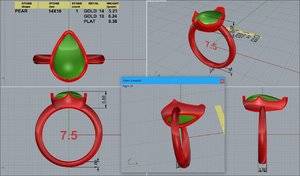
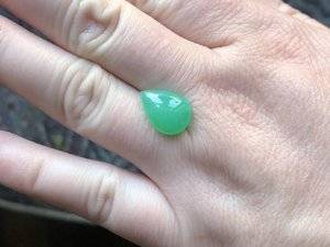
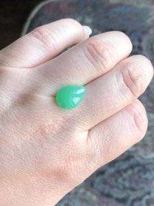
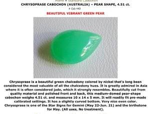
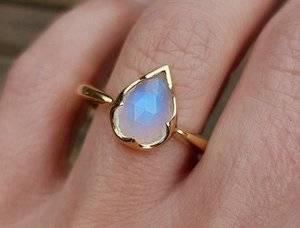
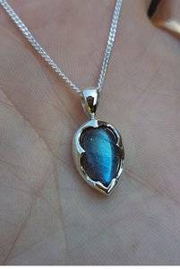
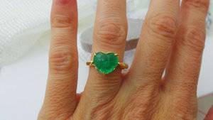
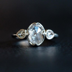
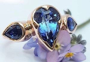
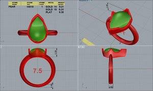
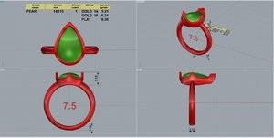
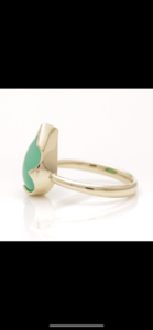
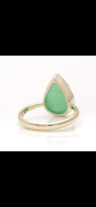
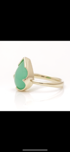
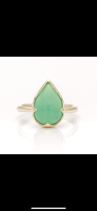
D139CA15-F3A5-4D4E-B128-C9810C461D98.jpeg 938B7798-0E5F-407C-83E1-10AB3BBFA274.jpeg 6ED2BEF9-4740-43A9-A805-86F86386D955.jpeg 3C0518A1-3711-405B-8325-76D466919985.jpeg 23B78A22-6062-4451-9EF0-5E1DFA21BFEA.jpeg 8CCFAF8C-F0B9-43AF-B8C6-AB32858844ED.jpeg Hello everyone! This is my next ring project. I have this chrysoprase that will be an occasional wear ring. The moonstone & labradorite are inspiration photos. It’s kind of a big stone for my fingers and so I’m not interested in any side stones or melee. But it looks kind of bland. Is it just because CAD can have that effect or is it in fact bland? Also, I haven’t decided on yellow or white gold... I’d love to hear any ideas or opinions.
 

Bluegemz

Ideal_Rock
Premium
Joined
Apr 22, 2017
Messages
4,171
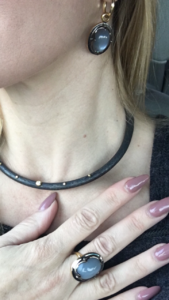
I think it will look great once the prongs are against the stone with that scalloped edge! I have a similar setting style with a grey moonstone set which I have. Elements which add interest are mixed metals, gold, silver and 4 side diamonds placed on the metal which overlaps the stone. These are simple details which one might consider.

I would go with YG because it’s just my opinion that green and gold is gorgeous together. I do think your ring will be amazing and I love love love that scalloped bezel/prong look.


0EDE146A-77D8-4D25-A570-97FB213DFB5D.png
 

Rfisher

Ideal_Rock
Premium
Joined
Oct 19, 2013
Messages
5,506
Pretty pear!
I don't think it's bland at all. It's very much like your inspiration pics.
I vote yellow gold, wish I'd used it for my chrysoprase.
IMG_0592.jpg

The thickness of the bezel can quite change the "feel" of the bezel.
Your inspirations pics ( and Bluegemz's lovely ones!) are bolder than some - TGP, for example, has on her gem silica - lovely as well, but just a different 'feel'.
I can't copy a pic from TGP's Instagram - but she's got a couple pictures of it on there.
 

mochiko42

Ideal_Rock
Premium
Joined
Sep 28, 2013
Messages
2,663
Another vote for yellow gold! I love the beautiful curvy pear shape. The scalloped setting is so pretty, too. Look forward to seeing the end result! If you think the setting is a bit bland face-up, you could ask DK to make the prongs higher up (ie make the swoops/scalloped sides more curved and dramatic). Right now the face up view looks like a normal bezel but that might be a limitation of the CAD because prongs are finished by hand. You could ask DK about it if you wish.
 

natasha-cupcake

Brilliant_Rock
Premium
Joined
Nov 16, 2017
Messages
1,217
I like it a lot. I don't think it's bland. I think it has beautiful clean lines that really showcase the stone.
 

mochiko42

Ideal_Rock
Premium
Joined
Sep 28, 2013
Messages
2,663
Pretty pear!
I don't think it's bland at all. It's very much like your inspiration pics.
I vote yellow gold, wish I'd used it for my chrysoprase.
IMG_0592.jpg

The thickness of the bezel can quite change the "feel" of the bezel.
Your inspirations pics ( and Bluegemz's lovely ones!) are bolder than some - TGP, for example, has on her gem silica - lovely as well, but just a different 'feel'.
I can't copy a pic from TGP's Instagram - but she's got a couple pictures of it on there.

@Rfisher I haven't been on PS much recently, did you get a lotus ring from Sally? Do you have more info/photos, it's gorgeous! (Apologies to OP for the threadjack :lol:)
 

Rfisher

Ideal_Rock
Premium
Joined
Oct 19, 2013
Messages
5,506

elle_71125

Ideal_Rock
Premium
Joined
Jan 29, 2012
Messages
6,202
I love the designs in your inspiration pics and if it turns out anything like that, it’s going to be great. Doesn’t look bland to me. :mrgreen2:

I’m going to agree with everyone else and say yellow gold all the way!
 

elliefire99

Brilliant_Rock
Joined
Oct 12, 2018
Messages
584
Another vote for yellow gold! So warm and delicious with the green.

I think that the ring will be beautiful and simple as is it. I LOVE the scalloped bezel look, and am currently trying something along those likes for my e-ring.

If you really do feel like you want a little more interest in the ring, one of my inspiration photos puts milgrain around the edges of the scallops, and I think it looks really nice :) I may be a bit biased though....
upload_2018-11-14_16-55-32.png
 

Hivona

Brilliant_Rock
Premium
Joined
Jul 10, 2014
Messages
541
Thank you so much everyone for the input. I am not a fan of prongs on pears and ovals. It ruins the flow of those shapes for me. I feel this scalloped type setting hides the prongs in plain sight! It seems right now my taste is for more simple designs so I really liked the style as soon as I stumbled across it & thought it would be great for my pear! Yellow gold it is and I asked DK to clarify how high up the sides of the stone the metal rises. I want to look down & see the scallops. Not look down and see prongs with scallops hidden away & only viewable from a side angle. If that makes sense!
 

Stone Hunter

Ideal_Rock
Premium
Joined
May 12, 2006
Messages
6,487
Love the color of your stone. It will be lovely in the yellow gold setting. The s allows are a great idea.
 

Hivona

Brilliant_Rock
Premium
Joined
Jul 10, 2014
Messages
541
1BFC3A03-4F4F-489F-B4CA-AB9A68426993.jpeg 5121FFA6-45CB-409C-990F-1239E6D12E7A.jpeg 803BD063-0B62-4F73-B693-E76519E03043.jpeg


Here are the last two cads with another inspiration picture I sent to DK. The top CAD is actually the most recent. The prongs are clipped, the swoops are a little deeper, and the V-tip is larger. The bottom has more pointed prongs, less swoopy, and a smaller V-tip.

I think I like the top CAD best but I’d rather pointed prongs. Do you think the V-tip is too big? In the inspiration pic I like how the gem looks somewhat encased. I don’t want to look down and just see prongs.

What do you think? Thanks for taking the time to look and comment!
 

Stone Hunter

Ideal_Rock
Premium
Joined
May 12, 2006
Messages
6,487
Love the color of your stone. It will be lovely in the yellow gold setting. The s allows are a great idea.

Sorry Auto Correct strikes again! The SCALLOPS are a great idea.
 

Stone Hunter

Ideal_Rock
Premium
Joined
May 12, 2006
Messages
6,487
1BFC3A03-4F4F-489F-B4CA-AB9A68426993.jpeg 5121FFA6-45CB-409C-990F-1239E6D12E7A.jpeg 803BD063-0B62-4F73-B693-E76519E03043.jpeg


Here are the last two cads with another inspiration picture I sent to DK. The top CAD is actually the most recent. The prongs are clipped, the swoops are a little deeper, and the V-tip is larger. The bottom has more pointed prongs, less swoopy, and a smaller V-tip.

I think I like the top CAD best but I’d rather pointed prongs. Do you think the V-tip is too big? In the inspiration pic I like how the gem looks somewhat encased. I don’t want to look down and just see prongs.

What do you think? Thanks for taking the time to look and comment!

The larger V tip doesn't stand out as super large. If you think it stands out too much, make it just a tad smaller? I like it a bit bigger than in the bottom CAD. Just my novice opinion.
 

Hivona

Brilliant_Rock
Premium
Joined
Jul 10, 2014
Messages
541
Sorry, should have cropped out the black bars
 

lovedogs

Super_Ideal_Rock
Premium
Joined
Jul 31, 2014
Messages
18,243
lovely!
 

elliefire99

Brilliant_Rock
Joined
Oct 12, 2018
Messages
584
Ahh!! Stunning stunning stunning! That slight taper on the shank is everything.

So simple, yet so custom. Can't wait until it arrives!
 

Rfisher

Ideal_Rock
Premium
Joined
Oct 19, 2013
Messages
5,506
Very pretty!
 
Be a part of the community Get 3 HCA Results
Top