shape
carat
color
clarity

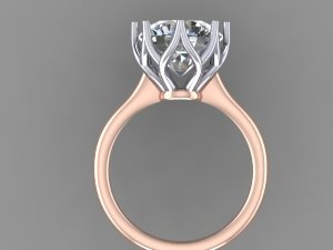
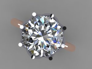
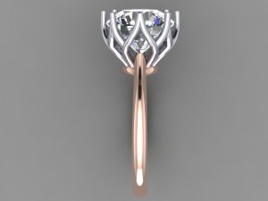
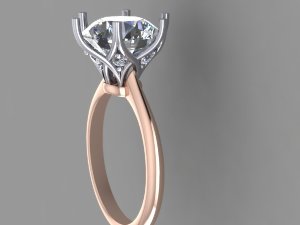
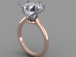
CADs are in for Tiffany Lotus inspired setting - opinions?

Re: CADs are in for Tiffany Lotus inspired setting - opinion

*double
 
Re: CADs are in for Tiffany Lotus inspired setting - opinion

Oh... my goodness.
I have exactly twenty minutes before my next meeting and I thought I'd browse PS for the first time in a couple of days and I'm so glad I landed on this thread because just seeing that design brightened my morning ::)

It's absolutely gorgeous Val!! A beautiful rendition of that Tiffany design :love: I know I completely bailed on another thread in which I promised input and photos, so I'm coming into this one with tail between my legs and the knowledge that frankly, our input is completely unnecessary - you and Adam obviously have this whole design thing covered! :bigsmile:

Okay, first I gotta say that I LOVE LOVE LOVE the two metal colours you've chosen. I imagine the 20k RG will be peachy and the UPWG will be more creamy than in the CAD so they'll go well together in terms of "warmth". The rose gold emphasises the floral aspect and the simple curvy shank is boldly stylised, and the off-white head is just the opposite - an elaborate, flowing ode to Long Ago... the contrast is unexpected and striking.

I actually like the shank shoulders 'reaching up to nowhere' - it looks deliberate, like you purposely left out any attachment joint. My one concern is that IMO it works because the edges of the tops of the shoulders are so sharp and follow the angles of the stone pavilion exactly, and look to hug the stone so closely... and I'm not sure if the edges will be softened or there will be more space between the shoulders and the stone after polishing...

Everything will be thinner after the cast is polished. The shank, the wire details in the head... I wouldn't worry about it looking "bulky" or any more "cage-like" than the design necessitates. Of course, it's the sort of design that does enclose the stone in a sort of cage, so if you don't like that effect it's definitely something to re-work! I like it. But I always like designs like this. The point of that though - if set at exactly that height the stone will look like it's set higher after polishing, because the space between the culet and top of the doughnut will be a tiny bit larger thanks to having polished a very thin layer of metal off the doughnut. I agree with Charmy - I'd consider lowering the stone a bit and making the flower head a bit smaller all around so it 'hugs' the stone more, for a couple of reasons -
- your stone is very large, and setting it high puts it at more risk of bumps and dings,
- I actually think if the head hugs the stone it'll look *less* cage-like - more "cradling in a cozy cocoon" and less "shadow-box cage, keep away from what's inside", and
- from a practical perspective it's impossible to polish the interior of the head to a pristine shiny finish like the exterior, and the higher the stone and more "open" the head the easier it will be to see the less-polished interior as you turn the ring. Having owned both a high-set, open design and a low-set cozy design I can say with surety that with the former the owner *will* see the interior of the wire head sometimes when the ring is worn, so it's a question of if/how much that would bother you, and whether it's worth adjusting the aesthetic of the exterior to minimize...

Speaking of bias - I'm biased, but no pave. Pretty please?! I think a lot of people - end-consumers like us and hotshot designers - feel that pave always "upscales" a piece - generally the simple "lower-end" designs are plain metal and the more "luxurious" pieces have a ton of pave. And I can't count the number of times I've preferred the "lower-end" version! The clean lines absolutely make this design - it's sleek elegance and I have never seen a pave setting that evokes the sort of sensual, silky romance that a well-done plain-metal setting can. I think it's partly because all those little diamonds take up space, and the space required limits the minimum sizes of the details ( and the delimiters between details)... and then there's the fact that they glisten and twinkle and IMHO most always wind up just distracting you from any clean smoothness that might be hiding underneath... I also personally prefer when each design element has one "characteristic" across the whole thing, so with this design a pave doughnut would bug me because to me the doughnut is part of the rose gold shank, and my eyes want the entire rose gold shank to be either paved or plain. I could see covering the whole lotus head in pave though, or covering the whole shank in pave - three-sided band, melee on the doughnut... or, if you must have pave, go the whole hog and encrust the whole thing all over! I just really dislike the idea of a "bit of pave" for this design (unless it's literally just a couple of accent stones where shank meets head like DS suggested) - sorta seems like it'd be the worst of both worlds, you lose the smoothness and you also don't get the show-stopping glitter :sick:
ETA: the apparent colour difference between melee and centerstone will be stark - how d'you feel about this?

Oh - another thing - will you wear a band? If so you might want to have it made at the same time so you're sure the shape, size, and colour(s) will match. Matching colours is a total PITA with "non-traditional" metals!!


Hmm... just thinking out loud... what do you think of a brushed-finish UPWG head and polished RG shank? It's a texture change like adding pave would provide, but much less - what's the word - invasive? More subtle and less distracting? Or engraving the shank + doughnut to add a hint of sparkle and keeping the head plain and polished, if there's enough space to engrave? I haven't seen examples of OWD's engraving though and I wouldn't want anything but the best.
 
Re: CADs are in for Tiffany Lotus inspired setting - opinion

Yssie|1386181196|3567469 said:
Oh... my goodness.
I have exactly twenty minutes before my next meeting and I thought I'd browse PS for the first time in a couple of days and I'm so glad I landed on this thread because just seeing that design brightened my morning ::)

It's absolutely gorgeous Val!! A beautiful rendition of that Tiffany design :love: I know I completely bailed on another thread in which I promised input and photos, so I'm coming into this one with tail between my legs and the knowledge that frankly, our input is completely unnecessary - you and Adam obviously have this whole design thing covered! :bigsmile:

Okay, first I gotta say that I LOVE LOVE LOVE the two metal colours you've chosen. I imagine the 20k RG will be peachy and the UPWG will be more creamy than in the CAD so they'll go well together in terms of "warmth". The rose gold emphasises the floral aspect and the simple curvy shank is boldly stylised, and the off-white head is just the opposite - an elaborate, flowing ode to Long Ago... the contrast is unexpected and striking.

I actually like the shank shoulders 'reaching up to nowhere' - it looks deliberate, like you purposely left out any attachment joint. My one concern is that IMO it works because the edges of the tops of the shoulders are so sharp and follow the angles of the stone pavilion exactly, and look to hug the stone so closely... and I'm not sure if the edges will be softened or there will be more space between the shoulders and the stone after polishing...

Everything will be thinner after the cast is polished. The shank, the wire details in the head... I wouldn't worry about it looking "bulky" or any more "cage-like" than the design necessitates. Of course, it's the sort of design that does enclose the stone in a sort of cage, so if you don't like that effect it's definitely something to re-work! I like it. But I always like designs like this. The point of that though - if set at exactly that height the stone will look like it's set higher after polishing, because the space between the culet and top of the doughnut will be a tiny bit larger thanks to having polished a very thin layer of metal off the doughnut. I agree with Charmy - I'd consider lowering the stone a bit and making the flower head a bit smaller all around so it 'hugs' the stone more, for a couple of reasons -
- your stone is very large, and setting it high puts it at more risk of bumps and dings,
- I actually think if the head hugs the stone it'll look *less* cage-like - more "cradling in a cozy cocoon" and less "shadow-box cage, keep away from what's inside", and
- from a practical perspective it's impossible to polish the interior of the head to a pristine shiny finish like the exterior, and the higher the stone and more "open" the head the easier it will be to see the less-polished interior as you turn the ring. Having owned both a high-set, open design and a low-set cozy design I can say with surety that with the former the owner *will* see the interior of the wire head sometimes when the ring is worn, so it's a question of if/how much that would bother you, and whether it's worth adjusting the aesthetic of the exterior to minimize...

Speaking of bias - I'm biased, but no pave. Pretty please?! I think a lot of people - end-consumers like us and hotshot designers - feel that pave always "upscales" a piece - generally the simple "lower-end" designs are plain metal and the more "luxurious" pieces have a ton of pave. And I can't count the number of times I've preferred the "lower-end" version! The clean lines absolutely make this design - it's sleek elegance and I have never seen a pave setting that evokes the sort of sensual, silky romance that a well-done plain-metal setting can. I think it's partly because all those little diamonds take up space, and the space required limits the minimum sizes of the details ( and the delimiters between details)... and then there's the fact that they glisten and twinkle and IMHO most always wind up just distracting you from any clean smoothness that might be hiding underneath... I also personally prefer when each design element has one "characteristic" across the whole thing, so with this design a pave doughnut would bug me because to me the doughnut is part of the rose gold shank, and my eyes want the entire rose gold shank to be either paved or plain. I could see covering the whole lotus head in pave though, or covering the whole shank in pave - three-sided band, melee on the doughnut... or, if you must have pave, go the whole hog and encrust the whole thing all over! I just really dislike the idea of a "bit of pave" for this design (unless it's literally just a couple of accent stones where shank meets head like DS suggested) - sorta seems like it'd be the worst of both worlds, you lose the smoothness and you also don't get the show-stopping glitter :sick:
ETA: the apparent colour difference between melee and centerstone will be stark - how d'you feel about this?

Oh - another thing - will you wear a band? If so you might want to have it made at the same time so you're sure the shape, size, and colour(s) will match. Matching colours is a total PITA with "non-traditional" metals!!


Hmm... just thinking out loud... what do you think of a brushed-finish UPWG head and polished RG shank? It's a texture change like adding pave would provide, but much less - what's the word - invasive? More subtle and less distracting? Or engraving the shank + doughnut to add a hint of sparkle and keeping the head plain and polished, if there's enough space to engrave? I haven't seen examples of OWD's engraving though and I wouldn't want anything but the best.

Yssie, honestly, thank you so much. To quote Shakespeare...you have "comforted me marvelous much." I want to love this design. I do love it. I really needed someone who knows their stuff to love it too. I have pretty good instincts when it comes to other people's things...jewelry, clothes etc., but somehow when I have to lay down the cash and love the ring, I become paralyzed. This is complicated by the fact that I tend to like things that are a bit...different...so I can't just go buy the stock piece or even a tried and true custom piece.

The CAD kind of scared me. But, your comments about lowering it, and especially having the head hug the stone more make total sense. I will talk to Chris about that today. It was feeling a little bowl-ish to me as well. I think a snugger fit is in order.

Your take on pave/no pave is spot on. I really didn't want it originally which is why the CAD has none. I want the curves of the metal to be showcased so GOOD that is settled. No pave. The only melee I am still considering would be where the shank meets the head. But, I have to say I like your take on the modern design of it. Funny because my husband LOVED the architectural element of the "shank that lands no where" as well. I was concerned it would look like a mistake.

I am excited about the two metals we picked. We were deliberating over 14k and 18k RG and Chris said he though 20k RG would be gorgeous. Not as pinky pink as 14k, but not as coppery as 18k. His exact description is "creamier". Sounds good to me! He said it is closest to the Cartier 18k RG which I love. The UPWG was actually his suggestion. He thought it would be less contrast to the stone and a bit softer overall. He did say it has nickel AND palladium though which confused me.

I am not really a fan of engraving. Don't know why...just don't love it. But, I do find your idea of a brushed finish on the head really interesting. My only concern is that it would look more like trendy costume jewelry. Do you have an opinion on that?

BTW, no worries whatsoever on the other thread! ;) :lol: We do have lives around here!!! I can't be posting all the time either or my poor kids... :nono: Plus, it reminds me of how I only pick up the phone to talk to my sister when I have the TIME to really talk...we need at least an hour. Our conversations are always very long and very fulfilling, but sometimes I just can't do it! Your posts are incredibly detailed and thoughtful. Thank you for this one!
 
Re: CADs are in for Tiffany Lotus inspired setting - opinion

I laughed out loud. I'm another who always wants something a bit different and just can't be happy with stock pieces no matter how beautiful they are! Well, I don't have the analysis paralysis issue - if anything I go the other way: I jump into action without taking time to carefully consider and a few years later I'm swimming in empty settings :eek: I'm flattered that you think I 'know my stuff' though, goodness knows I'd bl**dy well better at least know what *I* like by now :bigsmile:

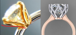
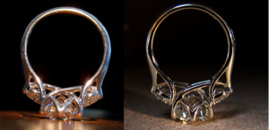
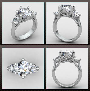
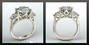
I really, really do think having the head a bit more enclosed and snug (that's a good description!) - stone set a bit lower, petals reaching up to hug the stone a bit more closely - would make you happier, especially if you're concerned about the birdcage-ness of the CAD (because that openness is going to be more pronounced in the final product)! Here are some old pics of my two WF Butterflies settings. The first was (deliberately) very cozy and the second was (deliberately) very open, and you can see how the CADs translated - of course there will be small differences between benches, and even the same bench might be a bit more or less vigorous with the polishing on any given day...

cozyvsopen.png

file.jpg file.jpg


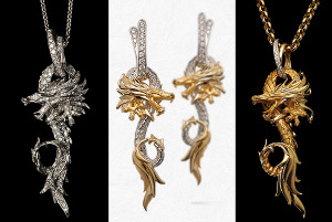
Pave. Yeah. Um. I'm re-reading my post and I was... a bit vociferous... but I honestly do just dislike gratuitous pave! It's inescapable. I was actually thinking of a specific example - these are by Carrera y Carrera. I'm lusting over the plain YG - all that detail, even in the scales :love: the fact that the eyes are diamonds and the bail is paved is basically irrelevant - exactly the sorts of accents I love. The one on the left - OMG, can you say "gratuitous pave"? I'm pretty sure if I saw it IRL I'd want to take some sandpaper to it... and Carrera y Carrrera is usually so good about not running designs through the Coat With Diamond cycle just because they can!
I'm not sure how I feel about the one in the middle. One one hand it satisfies the "one characteristic per design element" requirement - the plain polished YG detail vs. the paved white areas, but on the other I look at it and I think about how much smoother and more fluid and delicate and graceful it would've been had they left the diamonds off (ie. the one on the right)...
I know that your ring isn't supposed to be so realistically detailed but for me it's the same argument! It's perfect the way it is, refined in an understated sort of way, and pave would disrupt the balance.

carrera_y_carrera__circulos_de_fuego.png


I can't wait to see how the colours turn out IRL! Cartier's RG and UPWG are beautiful together in the Trinity pieces - if your combo is anything like that it'll be a stunning combo!! I love engraving but I don't know how that would've worked on a rounded shank anyway... and I wouldn't want to change the rounded shank!
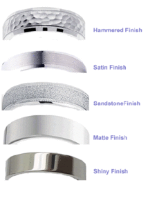
The brush finish was a last-minute comment... My DH's original wedding band was brush-finished and it looked great, no costume jewellery vibes, but it was a plain rounded band - not exactly a lot going on. My RDG is a floral piece with 18k YG leaves that Mike very lightly brush-finished with the brush strokes following the direction the leaf veins would've taken and it's lovely but the leaves are very small and subtle.. Your lotus is the focus of the ring!! I think you're right - the idea of seeing brushstrokes going up the petals does feel very 'trendy' and 'etsy-esque'. A *matte* finish though, without any obvious directionality of brushstroke... that could be spectacular! Dramatic, but IMO in a classy way, rather than sensational, if you know what I mean? The matte finish would bring out the metal colour more than high polish so it'd look a bit softer and creamier, and Mike observed that scratches tend to show up more (they look "shiny" against the matte finish which draws more attention than matte scratches against a shiny surface) - so that's a downside. On the upside if you decide to try it and you hate it it's super duper easy to fix, or if you don't like the idea right now you can always change your mind and try it sometime down the road ::) This pic calls it "satin" instead of "brushed" - I think it's the same thing? That vs. the "matte".
mattevsbrushed.gif

Sorry about the other thread though ;( Life just got in the way I'm afraid!

ETA: Re. the way the petals originate from the doughnut base - I can't really tell from the CADs but will they be concave like the DBL Uber Flower? Convex? Straight out?
concavestraightconvex_0.png
 
Re: CADs are in for Tiffany Lotus inspired setting - opinion

Yssie, it may have taken you a few tries, but you perfected the multi-stone setting with your DBL version! It is just liquid metal and so delicious! Those pictures are very helpful in illustrating how tight in the head is to the stone. Although, I'm not sure if my CAD is because Chris wasn't sure the diamond in the CAD was to spec. My stone is pretty deep.

I love the all YG version of the pendant. I think that puts me in the no pave league. Thanks for the visual. I do like a really thin pave stacker though.

I am intrigued by the brushed/matte look. If we continue with this setting I will definitely bring it up. Again, thanks for the picture.

Interesting developments today. I talked to Chris after he met with the CAD team to discuss revisions. Incidentally, I get the feeling they are very good at what they do. They seem to be amiable to changes that will serve the overall look of the piece, but protective of the elements that make it special. For someone like me who is full of ideas (sometimes too many), I am happy to have the checks and balances system in place. So, here is a rundown:

1. The shape of the head and how close it is to the stone - we talked about snugging it up a bit closer to the diamond, but this isn't going well for a number of reasons. I wish I completely understood why, but I had my 3 kids in the car and music on in the background. I just wasn't completely understanding what Chris was saying...it was pretty technical. I did surmise that the tighter in they bring the basket (shrink it basically), the closer all the metal gets and it would begin to feel very enclosed. They are still working on it and I will see if any progress has been made with the next iteration.

Pic for reference:

brand3.jpg

2. The top-down view of the setting - Gem Fever pointed out that it looks almost like a buttercup setting from the top. I think she said an "accidental buttercup". :lol: Chris discussed this with the CAD team and you will in fact be able to see metal from the top. It is intentional. But, it is also necessary given the space needed to put the pattern in the gallery. Not sure what I think of that. I had always intended to have a solitaire look from the top down. On one hand I kind of think seeing the metal would be sort of cool in a nod to antique settings. On the other hand, I like solitaires. No idea on this one, but it could be a deal breaker for this setting.

Pic for reference:

brand5.jpg

3. The mystery of the floating shank and where will it land? - The little diamond idea (thanks diamondseeker) unfortunately won't work. They said it disrupts the flow of the ring and doesn't look right. Bummer. So, they are now playing around with raising it a bit. Not sure what that will accomplish, but I guess we shall see in the next round.

Pic for reference:

brand4.jpg
 
Re: CADs are in for Tiffany Lotus inspired setting - opinion

valmanin|1386165559|3567302 said:
arkieb1|1386124498|3567075 said:
valmanin|1386076989|3566604 said:
arkieb1|1386074628|3566589 said:
I have that exact setting saved on my computer and drew a simplified version and then changed my mind for my own OEC, can't wait to see how it turns out!!!!

That is so funny! What made you change your mind? Problems like I am having?

I wanted Victor to make a version of it but with a thin row of diamonds going up each prong rather than a thick piece like the picture two thin pieces joined to make one prong much like your pic. He couldn't do it because of where the shank joined the side - that and the fact I don't want to send the diamond to the US and my setting guy here flipped out and didn't want to set something with diamonds in the head at all.... So I gave up and asked for a "Mara" style deco 8 prong for Lola instead..... no idea when he will get around to making it for me whenever he has the time to do a new design.

Well, Lola is :love: :love: :love:!!! I love Mara's setting...have it saved on my computer in fact. But, decided I'm not an antique style girl. Do I need to call this guy? You need that baby on your finger!!!


Victor deserves a medal at times for putting up with me and my ideas. I think I am like you, way too many ideas - except your drawings are a hell of a lot better than mine :D We all scrapped the 8 prong jewelled head idea in favour of a more deco Mara looking ring. I had one attempt at setting Lola already in a preloved setting and it didn't fit and I hated it, so I have figured out the simpler the design the better.

Anyway, I can give you my ideas just to confuse the issue. I was looking at the head of this ring in particular, forget or blank out the shank part I changed it entirely;


http://www.stevenkirsch.com/engagement/solitaire/r0217.html

I then had the idea of that combined with the lotus picture that we both love. So instead of what you currently have if you look at the picture of the head of Steven's ring, remove the diamonds and the split prongs it has 4 static prongs that come up from the base and join the shank. Then I extended the swoopy crossover parts all the way to the top and added a prong to the end of them, you get a more fluid look like Yssie's ring, and top down you end up with 8 prongs. I hope that isn't too complicated to follow.
 
Re: CADs are in for Tiffany Lotus inspired setting - opinion

arkieb1|1386211865|3567882 said:
valmanin|1386165559|3567302 said:
arkieb1|1386124498|3567075 said:
valmanin|1386076989|3566604 said:
arkieb1|1386074628|3566589 said:
I have that exact setting saved on my computer and drew a simplified version and then changed my mind for my own OEC, can't wait to see how it turns out!!!!

That is so funny! What made you change your mind? Problems like I am having?

I wanted Victor to make a version of it but with a thin row of diamonds going up each prong rather than a thick piece like the picture two thin pieces joined to make one prong much like your pic. He couldn't do it because of where the shank joined the side - that and the fact I don't want to send the diamond to the US and my setting guy here flipped out and didn't want to set something with diamonds in the head at all.... So I gave up and asked for a "Mara" style deco 8 prong for Lola instead..... no idea when he will get around to making it for me whenever he has the time to do a new design.

Well, Lola is :love: :love: :love:!!! I love Mara's setting...have it saved on my computer in fact. But, decided I'm not an antique style girl. Do I need to call this guy? You need that baby on your finger!!!


Victor deserves a medal at times for putting up with me and my ideas. I think I am like you, way too many ideas - except your drawings are a hell of a lot better than mine :D We all scrapped the 8 prong jewelled head idea in favour of a more deco Mara looking ring. I had one attempt at setting Lola already in a preloved setting and it didn't fit and I hated it, so I have figured out the simpler the design the better.

Anyway, I can give you my ideas just to confuse the issue. I was looking at the head of this ring in particular, forget or blank out the shank part I changed it entirely;


http://www.stevenkirsch.com/engagement/solitaire/r0217.html

I then had the idea of that combined with the lotus picture that we both love. So instead of what you currently have if you look at the picture of the head of Steven's ring, remove the diamonds and the split prongs it has 4 static prongs that come up from the base and join the shank. Then I extended the swoopy crossover parts all the way to the top and added a prong to the end of them, you get a more fluid look like Yssie's ring, and top down you end up with 8 prongs. I hope that isn't too complicated to follow.

:lol: :lol: :lol: I thought you were talking about some random jeweler that has your honker on the back-burner. Didn't realize you were talking about Victor. Anyway, I won't call him "this guy" anymore. Chris has been lucky so far...I haven't put him through the ringer just yet. Adam gets the Award of Patience from me!

I think I can picture what you are talking about. Sounds gorgeous! I am going to see this design through, but if it doesn't work out in a way I am comfortable with, I may borrow your idea if that's okay. It would be a similar feel without quite as much metal to contend with I think.
 
Re: CADs are in for Tiffany Lotus inspired setting - opinion

That is the problem - the honker is here in Oz and all the good jewellers are in the US, I don't want to send Lola to the US so it's been trial and error hence it taking so long. I also have a non adventurous only better than average jeweller here (which is about all we can hope for mostly in Australia) who will be doing the setting....

I love your idea, I was just giving you another option in case it doesn't work.... I might be the one having to borrow your ideas yet if mine doesn't work out!!!!!
 
Re: CADs are in for Tiffany Lotus inspired setting - opinion

Val, so sorry to thread jack, but I just wanted to ask Arkieb one question...

Arkieb, I am in Melbourne, may I ask who your jeweler is? I have yet to find one that won't mind making a setting for me with my own stone!

Thank Valmanin!
 
Re: CADs are in for Tiffany Lotus inspired setting - opinion

ringcat|1386214148|3567910 said:
Val, so sorry to thread jack, but I just wanted to ask Arkieb one question...

Arkieb, I am in Melbourne, may I ask who your jeweler is? I have yet to find one that won't mind making a setting for me with my own stone!

Thank Valmanin!
I am attempting to get something made via Victor Canera he is in L.A in the US. If your stone is symmetrical I suggest getting something made in the US (it will be cheaper and of a much higher quality than here generally) and take it to any good jeweller here, I used a guy in Brisbane, to set it for you.
 
Re: CADs are in for Tiffany Lotus inspired setting - opinion

Thanks Arkieb1. I am getting a ring made in the US. I need a jeweler for a second project. I replied in your Lola thread. :)
 
Re: CADs are in for Tiffany Lotus inspired setting - opinion

arkieb1|1386213267|3567898 said:
That is the problem - the honker is here in Oz and all the good jewellers are in the US, I don't want to send Lola to the US so it's been trial and error hence it taking so long. I also have a non adventurous only better than average jeweller here (which is about all we can hope for mostly in Australia) who will be doing the setting....

I love your idea, I was just giving you another option in case it doesn't work.... I might be the one having to borrow your ideas yet if mine doesn't work out!!!!!

Thanks! I hope the Lotus works but if not I will be showing Chris your idea. Thanks for sharing it!
 
Re: CADs are in for Tiffany Lotus inspired setting - opinion

ringcat|1386214148|3567910 said:
Val, so sorry to thread jack, but I just wanted to ask Arkieb one question...

Arkieb, I am in Melbourne, may I ask who your jeweler is? I have yet to find one that won't mind making a setting for me with my own stone!

Thank Valmanin!
No problem. ;)
 
Re: CADs are in for Tiffany Lotus inspired setting - opinion

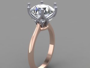
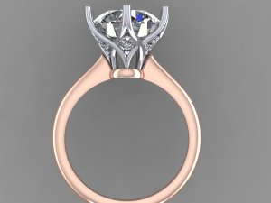
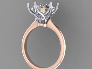
Well, this has been quite the journey. I have an update.

There were too many problems with the last design. The sticking point that could not be resolved was the top-down view. The metal was going to show from the top. I really wanted it to look like a solitaire from the top. Also, when they tried to snug the basket closer to the stone the pattern got closed up too much and didn't look good. The problem is that my stone is too small! Yes, my 9.5mm diamond was too small for this setting. :lol: The Tiffany inspiration ring was like 18 carats or something.

So, we decided to change it to a 6 prong. Can't do exactly the same design with 6 prongs. Anyway, here is the new direction. I have one more tweak I can do and still get the ring before xmas which my husband really wants.

Anything I am not seeing here? Any tweaks?

bmr1.jpg
bmr2.jpg
bmr3.jpg
bmr4.jpg
bmr5.jpg
 
Re: CADs are in for Tiffany Lotus inspired setting - opinion

I think that's lovely.
 
Re: CADs are in for Tiffany Lotus inspired setting - opinion

Ooh, I like it better with 6 prongs! The shank looks like it tapers pretty thin where it meets the head...is that what you want?
 
Re: CADs are in for Tiffany Lotus inspired setting - opinion

I think it looks exquisite and I think there are going to be a lot of calls for repeats of this design!
 
Re: CADs are in for Tiffany Lotus inspired setting - opinion

Niel|1387130439|3574735 said:
I think that's lovely.

Thanks Niel. :D
 
Re: CADs are in for Tiffany Lotus inspired setting - opinion

Laila619|1387132975|3574758 said:
Ooh, I like it better with 6 prongs! The shank looks like it tapers pretty thin where it meets the head...is that what you want?

Hi Laila. I like the 6 prongs better too. It really opens up the gallery.

I do like the taper because I think it flows well with the rest of the design. It's one of the elements of the original 8 prong that I really liked. I am wondering, however, if I should make the shank a little thicker so the taper is more dramatic and doesn't have to be so small (if that makes sense). I think the shank is in the 1.8-2mm range right now.
 
Re: CADs are in for Tiffany Lotus inspired setting - opinion

MissGotRocks|1387134569|3574774 said:
I think it looks exquisite and I think there are going to be a lot of calls for repeats of this design!

Thanks MGR! I would be flattered. Let's hope it comes out that nice!
 
Re: CADs are in for Tiffany Lotus inspired setting - opinion

valmanin|1387137363|3574800 said:
Laila619|1387132975|3574758 said:
Ooh, I like it better with 6 prongs! The shank looks like it tapers pretty thin where it meets the head...is that what you want?

Hi Laila. I like the 6 prongs better too. It really opens up the gallery.

I do like the taper because I think it flows well with the rest of the design. It's one of the elements of the original 8 prong that I really liked. I am wondering, however, if I should make the shank a little thicker so the taper is more dramatic and doesn't have to be so small (if that makes sense). I think the shank is in the 1.8-2mm range right now.

I probably would because I do tend to love a thicker shank. But up to you. Either way it'll be gorgeous!
 
Re: CADs are in for Tiffany Lotus inspired setting - opinion

Laila619|1387149696|3574904 said:
valmanin|1387137363|3574800 said:
Laila619|1387132975|3574758 said:
Ooh, I like it better with 6 prongs! The shank looks like it tapers pretty thin where it meets the head...is that what you want?

Hi Laila. I like the 6 prongs better too. It really opens up the gallery.

I do like the taper because I think it flows well with the rest of the design. It's one of the elements of the original 8 prong that I really liked. I am wondering, however, if I should make the shank a little thicker so the taper is more dramatic and doesn't have to be so small (if that makes sense). I think the shank is in the 1.8-2mm range right now.

I probably would because I do tend to love a thicker shank. But up to you. Either way it'll be gorgeous!

I will discuss it with Chris today. If I want this baby by Christmas (and I do), I need to have all changes made by tomorrow. :eek:
 
Re: CADs are in for Tiffany Lotus inspired setting - opinion

Wow, this is quite a transformation!

It looks very Mark Morrell-esque now ::) I see what you're saying about seeing metal from the top, and I can understand that having to squish the original design to avoid that could change the look and feel significantly. Are you happier with the shank/head meet? I remember the "meet to nowhere" was one of your concerns...

I like the idea of making the shank a bit wider to highlight the taper, and I'd consider lowering the stone a bit too, if that's possible without losing the two inflection points in the prongs?

I'm laughing at your 9.5mm stone being too small - gosh, it's not even a centimeter, what on earth are you supposed to DO with so little room?! :bigsmile:
 
Re: CADs are in for Tiffany Lotus inspired setting - opinion

It looks very gorgeous! I agree it is now much like Mark Morrell's rings, which are beautiful!
 
Re: CADs are in for Tiffany Lotus inspired setting - opinion

Yssie|1387220684|3575427 said:
Wow, this is quite a transformation!

It looks very Mark Morrell-esque now ::) I see what you're saying about seeing metal from the top, and I can understand that having to squish the original design to avoid that could change the look and feel significantly. Are you happier with the shank/head meet? I remember the "meet to nowhere" was one of your concerns...

I like the idea of making the shank a bit wider to highlight the taper, and I'd consider lowering the stone a bit too, if that's possible without losing the two inflection points in the prongs?

I'm laughing at your 9.5mm stone being too small - gosh, it's not even a centimeter, what on earth are you supposed to DO with so little room?! :bigsmile:
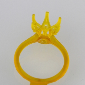
Ha ha! I was waiting for someone to point out the Mark Morrell inspiration. I have had the petite torchiere in my inspiration folder for a long time. Once we moved from the 8 prong to the 6 prong design, it became apparent we needed to cross the bases of the petals in order to fit them all (with the 8 prongs we didn't need that kind of room because half of the prongs started halfway up another prong if that makes sense). And then, voila, Mark Morrell. I have been assured that it will be different enough in proportion and that the wire work and overall look will be a bit more delicate than the PT. Plus, the overall shape is a little curvier.

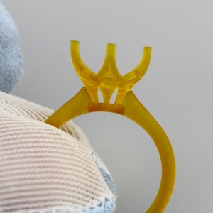
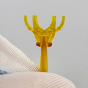
I think I am happy with how the shank and head meet. The shank tucks into the head, but the two metals don't completely join. Chris looked at the wax and felt that the shank was perfect...delicate. So, I guess I will trust him on this one. He feels like the size complements the overall look of the piece as is. 2mm tapering to 1.6mm.

Here are pics of the wax...

bp1.jpg
bp2.jpg
bp4.jpg
 
Re: CADs are in for Tiffany Lotus inspired setting - opinion

diamondseeker2006|1387234406|3575623 said:
It looks very gorgeous! I agree it is now much like Mark Morrell's rings, which are beautiful!

Thanks DS. I'm nervous, but getting excited too! At some point I just have to pull the trigger. ;)
 
Re: CADs are in for Tiffany Lotus inspired setting - opinion

Wax looks great ::)

What's the ETA?
 
Re: CADs are in for Tiffany Lotus inspired setting - opinion

I like how this is shaping up!
 
Re: CADs are in for Tiffany Lotus inspired setting - opinion

It's looking so great! I'm glad it's being kept more on the delicate side. Can't wait to see how it turns out!!!!
 
Re: CADs are in for Tiffany Lotus inspired setting - opinion

Yssie|1387251883|3575839 said:
Wax looks great ::)

What's the ETA?

If everything goes well...I should have it before Christmas. My deadline was all things finalized yesterday so they could get it finished before the Holidays. I was trying to hit the deadline, but not rush any decisions. Hard thing to do. But, honestly, I think I could tweak and tweak and tweak with these blown up images. I just had to pull the trigger. I trust Chris. He has been extremely patient and made all the changes I've asked for when they made sense. He thinks we are "there" so I had to leap!
 
GET 3 FREE HCA RESULTS JOIN THE FORUM. ASK FOR HELP
Top