shape
carat
color
clarity

First try at DIY invites. Opinions needed!

Status
Not open for further replies. Please create a new topic or request for this thread to be opened.

lilylover

Shiny_Rock
Joined
Nov 29, 2008
Messages
311
Hey everyone! After being over in LIW for months, I am finally able to move over into this group! We just got engaged two weeks ago last Thursday, but we are already getting a move on with all the planning.

We are hoping for an early June 2010 wedding. I have already decided that I wanted to do DIY invites. I am artsy so it''s fun for me as well as a way to say some money.

Here is what I have so far. It''s only the digital copy. I am hoping for it to be 2 pieces. The blue border will actually be a larger piece of blue paper underneath, with the cream & blue part being a smaller piece of paper on top. I plan on using some sort of textured paper. I haven''t figured out how I am going to attach the two pieces yet. Whether it be adhesive or with some sort of tie... hmm..
Oh, and it''ll be 5.25x5.25

Anyway, what do you guys think? Any suggestions or opinions? It''s my first try so be kind! :)
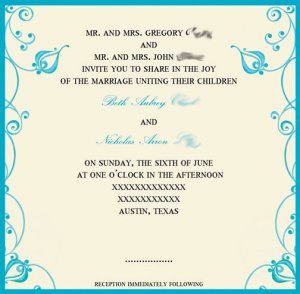
invite 3 copy.jpg
 

princessplease

Ideal_Rock
Joined
Feb 20, 2009
Messages
5,496
I LOVE them!!!! Such an amazing job!
 

Sparkalicious

Ideal_Rock
Joined
Nov 22, 2007
Messages
3,721
Lily - They are lovely! Nice job!

Congratulations on your engagement and welcome to BWW!
 

mrscushion

Ideal_Rock
Joined
Nov 15, 2008
Messages
3,309
They look very nice!
 

Erinleigh

Shiny_Rock
Joined
May 8, 2009
Messages
440
Hi lily, the invites look great!
Just a suggestion, it could be my monitor, but I think the text colour looks a little harsh against the pretty cream/blue background. Not that I''ve ever designed invites or anything, but do you think a charcoal grey text colour (or some shade of grey) might work? I feel like it might be a bit softer... just an idea :)
 

Morgie44

Brilliant_Rock
Joined
Dec 13, 2007
Messages
634
They look great! I do feel like the spacing is a little bit off though. I think there is a little too much white space between the last part of text nd the reception to follow line. I would space things out a little bit more, and also move the reception to follow line up a bit so it is equal distance from the edge of the paper as the text at the very top is. As for adhesive, I was very happy with the ballpoint adhesive pen from Martha Stewart''s craft line It worked great for me, because I was able to slide the panel part of my invitations around a bit on the backing, without it sticking for a few seconds, but once it dried, it was very strong.
 

CoralQuiz

Rough_Rock
Joined
Apr 5, 2009
Messages
90
Congrats on your engagement!!!!!!!!!! Exciting times are ahead
36.gif


I love the invites. The flower border is beautiful and the text says everything that it has to.

There''s a bit of white space but on the textured paper that will look gorgeous too! Invitations : done!
 

lilylover

Shiny_Rock
Joined
Nov 29, 2008
Messages
311
Thanks, everyone! I agree with all of your suggestions and will impliment them and then post here again to see what you think about the changes.

Oh, and Morige, thanks for the suggestion on adhesive!
 
Status
Not open for further replies. Please create a new topic or request for this thread to be opened.
Be a part of the community Get 3 HCA Results
Top