shape
carat
color
clarity

FCD CAD assistance request

RTFrog

Shiny_Rock
Joined
Nov 25, 2012
Messages
183
Hi Chrono,

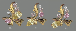
The second cad seems to have more depth to it. Which may be somewhat closer - definitely looks more close than the first mock-up.

With a project of this magnitude, and your feelings so far, maybe you can have them make a sterling mold first? :confused: Or if they have the capabilities, they could print out a 3d plastic version of it and try it on. This is where 3d design, printing, and jewelry cads / industry are starting to meld. Wearable prototypes could help make the decision easier.
 

minousbijoux

Super_Ideal_Rock
Premium
Joined
Aug 5, 2010
Messages
12,816
Well darnit! I like the delicacy better, but they are all too reminiscent now of the aliens from War of the Worlds :o :-o
 

chrono

Super_Ideal_Rock
Premium
Joined
Apr 22, 2004
Messages
38,364
A large leaf or several smaller leaves are supposed to cover up the tentacles. :lol: Sort of the way the aliens hide themselves in a human guise in to fool the eye before they get the jump on us and eat our brains out.
 

LoversKites

Brilliant_Rock
Joined
Nov 16, 2013
Messages
1,733
I'm sorry that this is not coming out as smoothly as you wished. How annoying :/
 

JewelFreak

Ideal_Rock
Joined
Sep 3, 2009
Messages
7,768
Chrono, I'm having a hard time picturing a ring from these CADs; can they possibly give you one with some color? -- maybe that would represent it easier. Basically, things appear to be kind of sticking out, so I'm not picturing how you'll wear it without its catching on everything. (Especially the one that looks like a shower head or an alien-suck-out-our-guts appendage. :lol: ) I'm sure with some sort of better drawing or CAD it would look entirely greater.

--- Laurie
 

FrekeChild

Super_Ideal_Rock
Joined
Dec 14, 2007
Messages
19,456
Yeah....I'm not getting it. I can imagine a leaf, and everything, but I'm just not feeling it.
 

chrono

Super_Ideal_Rock
Premium
Joined
Apr 22, 2004
Messages
38,364
I couldn't put a finger on it but I think I've figured out what is wrong and there's a LOT of it. I'm guessing I'll need at least 2 more CAD revisions.

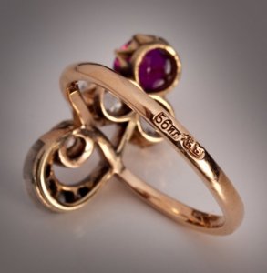
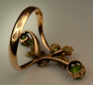
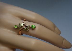
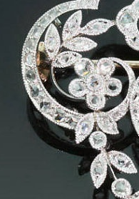
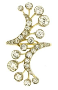
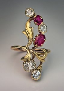
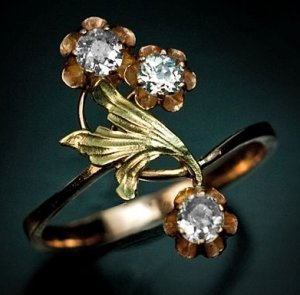
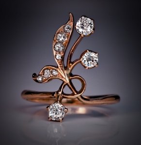
1. The stone settings are stock tube with butt ugly prongs. In looking the pictures below, all of them have a graceful "crown" with nice U or gentle V shapes in the profile. This allows multiple smaller prongs which do not overpower smaller sized stones.

2. The vines still look like thick ropes. Compare it to the pictures below. They look super thin face up (probably 0.5 mm?) but the strength is in the height of the metal. The vines are high up (2 mm?) but it doesn't matter because the ring has to be a certain height anyway to accommodate the depth of the stones. It looks like it is also thicker at the bottom but tapers towards the top.

3. The vines are not the same size throughout either. The taper, becoming thinner as it approaches the gem.

4. I don't like the little bezeled diamond to be facing away. I want to SEE my stones. I also dislike the tube look. :knockout:

Am I missing anything else?

56gold_ring.jpg

1368.jpg

art_nouveau_flower_ring3.jpg

ring_art_nouveau.jpg
 

thecat

Brilliant_Rock
Premium
Joined
Mar 19, 2014
Messages
1,483
In the 2nd cad, the diamonds are too far from each other. I can't visualise the finished piece with the 2nd cad.

I prefer diamonds to face inwards or neutral. By inward I mean, top and bottom diamonds should somehow give one the feeling that they're pointing towards the centre. By neutral, I mean the diamonds should be flat on the hand. When you look at it, there isn't a direction if it's neutral/flat on hand. But 2nd cad has stones facing all over and some doesn't face the wearer. On top of that, some stones are lifted off the finger, increasing damage potential. The diamonds should wrap around the finger, instead of flying away/up from the finger. Unless it's a special occasion piece where it's worn infrequently.
 

pyramid

Ideal_Rock
Premium
Joined
Nov 10, 2002
Messages
4,607
hippi_pixi|1395317148|3637848 said:
I agree with what everyone else has said but something is bothering me

that design is a capital L ...


This is a bit what I was thinking, my reaction right away was that is was like a £ sign. Then I thought, don't be stupid
most people are in America and will not be thinking that way.

I like the design but feel it looks a bit like a modern organic look and need to look more antique with more movement and
more designs maybe made on a smaller or narrower scale to get the look you want. Love the fact it will have fancy color diamonds.
 

chrono

Super_Ideal_Rock
Premium
Joined
Apr 22, 2004
Messages
38,364
TheCat,
Good point about the stones facing every which way. Although this is an occasional wear RHR, I still prefer something that sits close to the finger.

Pyramid,
Does the second set of CADs still look like a "£"?
 

minousbijoux

Super_Ideal_Rock
Premium
Joined
Aug 5, 2010
Messages
12,816
Chrono: good eye! I'm sure there are a few other things as well, but your list is an excellent start. Once they produce the next CAD, it will be easier to see the few remaining things that need tweaking (hopefully) and go from there.

I am pleased to say that yes, it is the evil bezel that got me all worked up - take that one away, and, with the other corrections you suggest, I would no longer be worried that it will suck my brains out when I'm not looking... :praise: :bigsmile:
 

RTFrog

Shiny_Rock
Joined
Nov 25, 2012
Messages
183
Hi Chrono:

Here's a couple more images that may help based on your comments about the latest revision. The vine type is much thinner, and the other shows a more milgrain leaf with the bezel that may be closer to what you want.

ChornoRing1.png
ChronoRing2.jpg
 

minousbijoux

Super_Ideal_Rock
Premium
Joined
Aug 5, 2010
Messages
12,816
Their CADs are just so far from your inspiration photos - do you think they are comfortable with this type of design?
 

chrono

Super_Ideal_Rock
Premium
Joined
Apr 22, 2004
Messages
38,364
RT,
I sent them the same links to Romanov and pictures showing the rings from all angles, yet they did not pick up on the vine and basket details. I do not want my stones bezeled though, preferring a crown basket for ease of cleaning.

Minou,
I don't know but I am going to persist for a bit longer. I know that most other jewellers would not even come close to what's been done so far. The design is so different and benches don't make these anymore, at least not in the US. If they are not comfortable with this style of design, they should be upfront with me but I will ask them this question. And don't worry, I'll save you from the Evil Bezel Eye that is planning to suck your brains out by banishing it from the design.
 

pyramid

Ideal_Rock
Premium
Joined
Nov 10, 2002
Messages
4,607
I have seen some really good ideas come out on this board from pricescopers, and maybe some of them
are very artistic. Wonder Chrono if you could draw out a sketch of what you want with the romanov design features, even
if very rough because someone may be able to get something from that and sketch out a design?
In the design with the stones placed, I felt the 3rd one where the pear was placed upside down, looked very odd and not
how I have ever seen it done. I feel it this was my ring, I would want to go to another designer, I can't see this becoming what I would want.
 

chrono

Super_Ideal_Rock
Premium
Joined
Apr 22, 2004
Messages
38,364
Pyramid,
The problem is that I don't know what I want and I am hoping that the designer and I can work together to come up with something beautiful.
 

minousbijoux

Super_Ideal_Rock
Premium
Joined
Aug 5, 2010
Messages
12,816
Chrono|1396981487|3649883 said:
RT,
I sent them the same links to Romanov and pictures showing the rings from all angles, yet they did not pick up on the vine and basket details. I do not want my stones bezeled though, preferring a crown basket for ease of cleaning.

Minou,
I don't know but I am going to persist for a bit longer. I know that most other jewellers would not even come close to what's been done so far. The design is so different and benches don't make these anymore, at least not in the US. If they are not comfortable with this style of design, they should be upfront with me but I will ask them this question. And don't worry, I'll save you from the Evil Bezel Eye that is planning to suck your brains out by banishing it from the design.

First of all, thank you for saving my/your life. :bigsmile:

Second, and far more importantly, your approach is a good one. While I would not suggest most PSers take this route of hoping a bench could design something so different, you have experience having your concepts come to life, and really did your due diligence when picking out the jeweler. I think you're smart to stick with them - just thought I should throw the question out as at one point you were wondering if you should scratch this plan. :))
 

digdeep

Brilliant_Rock
Premium
Joined
Apr 14, 2013
Messages
877
When you don't know (for sure) what you want.......it's hard to get anywhere fast. Keep communicating with the designer especially with what you like (to reinforce the things you want to see in the final ring) and what you want to discard. That should only leave modifications........that's what creative processes are. CAD's are great for expediting idea's, but I've never been good at translating to a 3D version. As mentioned earlier-- can they model the best one you like so far-(for a small fee)? That would give you a reality check. There is a wax carver through a jeweler that I used that produced a wax mold at a reasonable price. That would be another option if you have someone you know or can work with...........Good Luck! Creating 'stuff' isn't all rainbows and unicorn's in springtime.............. hang in there and pace yourself!
 

T L

Super_Ideal_Rock
Premium
Joined
Sep 20, 2008
Messages
25,218
Chrono|1396884199|3648975 said:
Time to put on your gloves for Round 2 of CADs. Ding! Ding! Ding!

These are still incomplete but lays down the basic structure of the ring. There will either be one large leaf covering most of the vines or several small leaves. I don't know what to make of the design. :sick: Can I get cold feet and just chicken out of this project? :knockout:

It's really hard to tell without the leaf or leaves in there. The leaves also have detail that you need to see so that you can properly assess their work.

Without the leaves, it looks like tentacles, like Minous said. It's a risk you may have to take, but it could be a costly risk. You have to weigh the odds.
 

GliderPoss

Ideal_Rock
Premium
Joined
Sep 25, 2008
Messages
2,936
I love the idea but agree the CADS just aren't up to scratch. I think the "C5" mockup was the best looking.
 

chrono

Super_Ideal_Rock
Premium
Joined
Apr 22, 2004
Messages
38,364
Thank you, everyone, for continuing to support and encourage me in this project. The designer should be in today, and I will call to bring these to his attention.

TheCat,
Unfortunately, I do not have confidence in GreenLake and I getting along well for this project. We did not jive during my last visit to their shop. I also found their work to not achieve the level of delicacy I am looking for. Mc2 will not accept outside stones so that is also out, not to mention probably at least 2x to 3x my budget.
[URL='https://www.pricescope.com/community/threads/green-lake-jewelry-works-and-joseph-jewelry-visit-report.198508/']https://www.pricescope.com/community/threads/green-lake-jewelry-works-and-joseph-jewelry-visit-report.198508/[/URL]
 

thecat

Brilliant_Rock
Premium
Joined
Mar 19, 2014
Messages
1,483
I'm sorry to hear that there aren't many suitable jewelers for the job. I hope your 3rd cad will capture all the elements you communicate to him.
 

chrono

Super_Ideal_Rock
Premium
Joined
Apr 22, 2004
Messages
38,364
Caysie,
Thank you! Thank you! Thank you! I hope no one is going to tell on you (and that your help is permitted by PS rules) and I'm saving your design in my folder ASAP just in case it gets deleted.
 

chrono

Super_Ideal_Rock
Premium
Joined
Apr 22, 2004
Messages
38,364
Just got off the telephone with Ryan of JJ and everything should be smooth sailing onwards. The reason for the different feel and look was partially my fault. :oops: When we met in Bellevue, I mentioned that I wanted to play around with the layout of design C2r, hoping to come up with something better. I also did not share sufficient information at that time (the Romanov links), hence the first CAD result. In a way, the time spent on it was not wasted because we both learned a lot from this experience.

I am much better at "reading" CAD than wax molds, probably because I work with CAD on a regular basis. Wax molds look like a green blob to me. :lol: Drawing leaves on CAD, especially something organic, takes a lot of time due the curves and details. This is why the designer sent the second set of "base" CAD to give me some idea where we are headed first, before investing the additional time to add the leaves. Once he's completed the adjustments based on our conversation, we will then decide if it is good enough to move on to adding the leaves. Hopefully, minor modifications is all that is needed then. Then he will make a more realistic render, adding colour to the metal and stones. Looks like we are still many steps away from that stage.

1. The tube /basket prongs will be changed to a crown style basket, which includes the pear. The little diamond probably has to remain a bezel because it is so tiny.

2. The vines will taper, becoming thinner, as it comes up above the finger the way a knife-edge ring does. This will look very similar to the example rings.

3. The shank will also taper as it approaches the stones and leaf (-ves).

4. The stones will be turned more inwards towards the eye but not be flat. It will still be molded to the shape of the finger, sitting as low as possible to the skin. The pear, oval and little diamond bezel will be adjusted. I think he is adding a leaf just under the little diamond bezel so it won't look odd just sticking out in nowhere land.

In short, everything will be made to look more refined and delicate. We've agreed to move away from the "caterpillar" design as it looks cramped, opting for the more open and spaced out feel of the other leaf design. I shared Caysie's beautiful sketch with the designer and we discussed it as well. The leaf is much more ornate than those I've shown him (lots more curls, splits and what not) and the proportions of the FCDs in the picture isn't accurate to what I have, so the actual ring design will not look like this. That said, the telephone call was very productive and I think we just took a giant step forward.

caterpillar.jpg

_16797.jpg

_16798.jpg

_311.png
 

minousbijoux

Super_Ideal_Rock
Premium
Joined
Aug 5, 2010
Messages
12,816
Yay for all your progress and your good conversations with JJ. I hope its smooth sailing from here on out. I too like the sketch. :))
 

derbygal

Ideal_Rock
Premium
Joined
Oct 15, 2010
Messages
2,183
Love where you are going with this. Can't wait to see it on your hand. :appl:
 

Upgradable

Ideal_Rock
Joined
Aug 15, 2004
Messages
5,537
I'm glad your phone convo helped you feel better about the project. The look of the 2nd CADs had me going :confused: It seems maybe the focus is broken up by trying to highlight each stone individually. What about having the three small round stones bead and bright set into a leaf, something like the rose gold example you've just posted above. The the larger oval and pear shaped stones can be the bud and flower, but pulling the whole design together?
 

JewelFreak

Ideal_Rock
Joined
Sep 3, 2009
Messages
7,768
Much better & I'm SO glad it's smoother sailing. A project like this is really creating a piece of art, which is never 1,2,3 quick. The drawing is great & the changes sound like you're really making progress. Yay!

--- Laurie
 
Be a part of the community Get 3 HCA Results
Top